Release notes: Cerebro/cerebroApp v1.3
Roman Hillje
12 March, 2021
Source:vignettes/release_notes_v1.3.Rmd
release_notes_v1.3.RmdIntroduction
This release of Cerebro/cerebroApp comes with some major changes, enough to justify a dedicated article. Here, I will go over the changes and motivations.
TL;DR: Possibly the best thing to happen in 2020!
Flexible grouping variables
Previous versions of Cerebro expected your cells to be grouped into different samples and clusters. Those were the two major grouping variables, without allowing the user to specify and visualize others. With data sets becoming more and more complex, containing several samples from different batches, cell types, etc., it became evident that this limitation can be a severe bottleneck in some situations. On the other hand, small data sets might consist of a single sample, making it unnecessary to analyze cells by sample since they all belong to the same. In Cerebro v1.3, users can specify one or multiple grouping variables through the groups parameter when exporting their data set. The user interface has been adapted in several places accordingly.
Dynamic table formatting
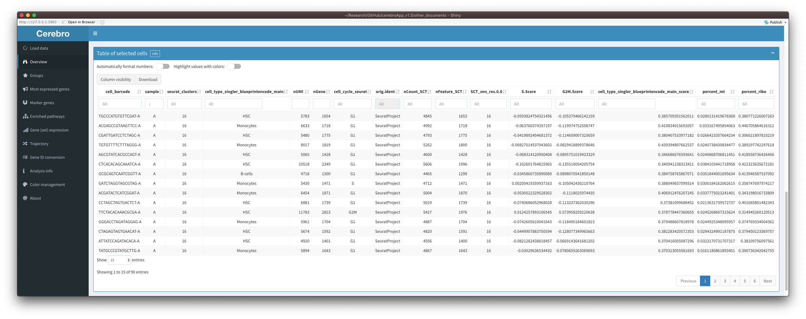
Another limitation of previous Cerebro versions is that tables of marker genes and enriched pathways are expected to be formatted in a very specific way. More or less, the only way to get a table to be displayed correctly was to generate it with pre-processing functions of cerebroApp, e.g. getMarkerGenes(). These functions are bound to a specific method, e.g. the FindAllMarkers() function of the Seurat package. Results from other methods generally don’t fit the expected format and will cause an error, even when stored in the right place in the Seurat object. The benefit of this limitation was that, since I knew the format of the tables, I was able to enhance them with colors and other visual clues. With the release of Cerebro v1.3, I have implemented a dynamic way of formatting and highlighting values that is agnostic of the table format. Number formatting and color highlighting can be switched on or off, and rely on guessing the column content based on a set of rules. For example, columns containing integers that are falsely stored as a different type, e.g. double, will be converted to integers to remove decimals. Another example are p-values, which are generally better represented in a scientific notation. This transition to dynamic table formatting means that now, you can export any table generated by any method - as long as it is a data frame - and visualize its content in Cerebro.
This is how the meta data table of selected cells in the “Overview” tab looks like with both options active:

And this is the same table with both options switched off:
Below you can find the details and actions of the two options:
Automatic formatting of numbers
Columns containing numeric values are split into those containing integers, p-values, logFC, percentages, and others. This is done based on the name of the column and the range of the values inside it. For example, p-values and percentages should never be smaller than 0 or greater than 1. Then, each category is formatted differently:
- Integers: remove decimal places; show thousand separator
- p-values: limit to 3 significant decimal places, scientific notation when useful
- logFC: round to 3 decimal places
- Percentage: show as percentage with 2 decimal places
- Others: round to 3 significant decimal places
Color highlighting
Columns are split into different categories in the same way as described above. However, color highlighting also applies to columns containing grouping variables and logicals/booleans.
- Grouping variables and cell cycle assignments: set background color to the colors specified in the “Color management” tab
- p-values: red color bar that fills the cell from the right
- Percentage: pink color bar that fills the cell from the right
- Integers, logFC and others: background color indicates value from white (min) to orange (max); only works when minimum and maximum values are not the same
- Logical:
TRUEis shown in green andFALSEin red
Export SCE/SingleCellExperiment objects
The Seurat framework is a great toolkit to analyze single cell data. But that doesn’t mean it is the only good analysis framework out there. Another step towards making Cerebro more flexible is to allow exporting SCE/SingleCellExperiment object for visualization in Cerebro. An example of the workflow can be found here.
Please note that pre-processing functions are still limited to Seurat object as an input. It is on the roadmap to adapt those functions.
The Cerebro_v1.3 class
Starting with v1.3, the data that is exported by cerebroApp and stored as a .crb file is organized in a dedicated class: Cerebro_v1.3 (based on R6 reference class). Given the increasing amount of data that can be exported and visualized, this appeard to be an inevitable step. Furthermore, it aims to improve backwards-compatibility between exported data and Cerebro interfaces because data is not accessed directly, but rather returned by the object through dedicated functions/methods that, even when changing data organization inside the object in the future, can keep their name and return the same output.
Since .crb files are just .rds files with a different extension, you can get an overview of an exported data set - to understand what it contains - by loading it into R and calling its print() function:
data_set <- readRDS('my_data_set.crb')
data_set$print()
You should then get an output similar to this:
class: Cerebro_v1.3
cerebroApp version: 1.3.0
experiment name: pbmc_Seurat
organism: hg
date of analysis: 2020-02-19
date of export: 2020-09-08
number of cells: 5,697
number of genes: 15,907
grouping variables (3): sample, seurat_clusters, cell_type_singler_blueprintencode_main
cell cycle variables (1): cell_cycle_seurat
projections (2): UMAP, UMAP_3D
trees (3): sample, seurat_clusters, cell_type_singler_blueprintencode_main
most expressed genes: sample, seurat_clusters, cell_type_singler_blueprintencode_main
marker genes:
  - cerebro_seurat (3): sample, seurat_clusters, cell_type_singler_blueprintencode_main
enriched pathways:
  - cerebro_seurat_enrichr (3): sample, seurat_clusters, cell_type_singler_blueprintencode_main,
  - cerebro_GSVA (3): sample, seurat_clusters, cell_type_singler_blueprintencode_main
trajectories:
  - monocle2 (1): highly_variable_genes
From this, you can tell when an object was originally exported, the number of cells and genes, what organism the cells were derived from, what grouping variables have been specified, the projections that can be accessed, whether it contains tables for most expressed genes, marker genes, and if so, which method was used to generate them, etc.
open and closed mode and pre-loading data
In the past months, I have been contacted by researchers who wanted to share their Cerebro data set with the public by hosting Cerebro on a web server and providing access to their data set. However, when hosting Cerebro on a server - without any changes to the source code - users would have the possibility to upload their own data set, which was not the intention. With this version of Cerebro, I introduced a new mode parameter when launching Cerebro, which can be set to closed to remove the “Load data” UI element, preventing others from uploading their own data.
Along with this, the new crb_file_to_load parameter allows you specify the path to a .crb file which will be loaded at the launch of Cerebro without having to select the file manually. Together, these two parameters allow you to give others access to your data without letting them use your server for their own data set.
You might also find the new welcome_message parameter useful, which allows you to create a custom welcome message that will be displayed when launching Cerebro. You can use this to introduce viewers to your data set and the experimental context that was used to derive it from.
You can find an example for the closed mode with a pre-loaded data set and a custom welcome message in this vignette.
User interface
Here, I will go through the changes to the different tabs in the UI.
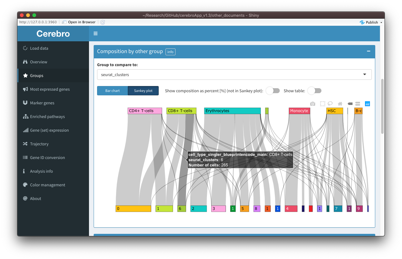
Groups
The new “Groups” tab replaces the previous “Samples” and “Clusters” tab in order to accommodate flexible number of grouping variables in the data set. The structure of this tab is very similar to the one previously used in the “Samples” and “Clusters” tabs, with the difference that now, at the top of the page, the user can select one of the grouping variables that have been provided when exporting the data set.
If a phylogenetic tree has been calculated to represent the relationship between the group levels, the tree is plotted with functions from the ape package. The plot is not interactive, but you have two different forms of representation (unrooted and phylogram). Moreover, additional parameters for the plot can be controlled through elements in the dropdown menu (gear icon) in the title bar.

The relationship between the selected grouping variable and another can be seen in the “Composition by other group” panel. For example, you can see how samples split into clusters, or clusters into cell types, assuming that those are among the grouping variables you specified when exporting the data. As in previous versions of Cerebro, this relationship is shown as a stacked bar chart. However, now you can also chose to visualize it as a Sankey plot, which sometimes makes relationships between the groups more apparent. Similarly, the plots related to the cell cycle have been combined - you can choose among the provided columns holding cell cycle assignments for cells (see the cell_cycle parameter in the exportFromSeurat() function) - and can be shown as bar charts or Sankey plots. As before, tables are hidden by default but can be shown using the switches above the plot, and you can switch between actual cell counts and percentage of cells (this option won’t affect the Sankey plot).
The new “Expression metrics” panel contains plots for the number of transcripts, number of expressed genes, and percentage of mitochondrial and ribosomal genes per group.
Most expressed genes, marker genes, enriched pathways
These tabs all still display the same content as before, however with a few small adjustments.
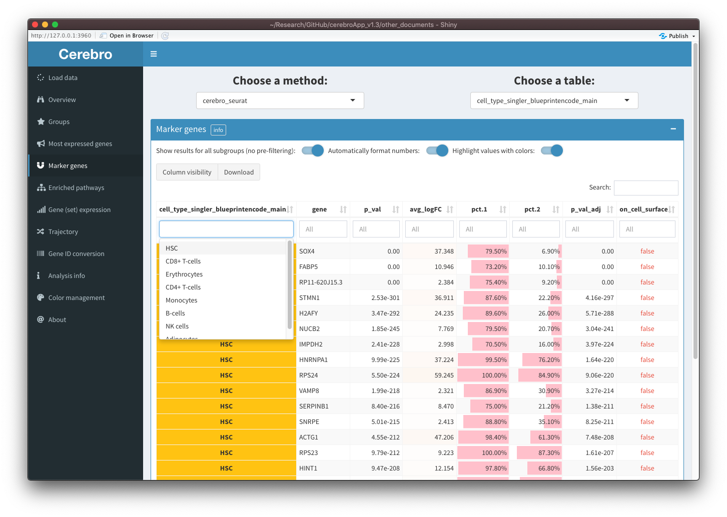
In the “Most expressed genes” tab, at the top of the page, you can select the grouping variable of interest. In the “Marker genes” and “Enriched pathways” tabs, before selecting the grouping variable, you have to choose the method that was used to generate the results. This allows you to export and visualize more results in Cerebro, while also keeping them structured.
In all three tabs, there is a switch that allows you to show results for all group levels of the selected grouping variable. When this switch is off, you will see a UI element that you can use to filter the table for the group level you want. When the switch is activated, the UI element for group level selection will disappear and the table will contain results for all group levels. You can then still filter the table for one or several group levels through the column filters. This can be useful when you want to collectively show the results for multiple group levels together. However, to improve performance for very large tables, you might prefer to filter the table using the UI element described above (pre-filtering).
In the “Marker genes” and “Enriched pathways” tabs, in addition to the group level filtering, you can toggle automatic number formatting and color highlighting in the table. For a more detailed description of these settings, please see the descriptions above. In summary, with these options activated, numbers will be formatted depending on what kind of values they are, and colors and color bars will be applied the numbers and grouping variables to facilitate interpretation.
Moreover, it is now possible to export results for marker genes / differentially expressed genes and enriched pathways generated other tools. You can find an example on how to do that in this vignette: Export and visualize custom tables and plots.
As in previous versions of Cerebro, you can export the tables in CSV or Excel format and hide columns using the “Column visibility” button.
Also note that, due to generating the tables with pure DT instead of also using the formattable package, you can use the column filters to specify ranges for columns containing numeric values.
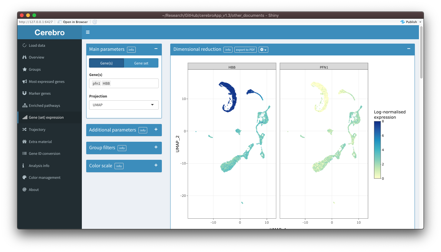
Gene (set) expression
The content of the “Gene expression” and “Gene set expression” tabs has been combined and now lives in a single tab. This made a lot of sense because the content was anyway almost the same. I wonder why I have created separate tabs in the first place. Now, in the parameter panel on the left, you can switch between the selection of genes and gene sets.
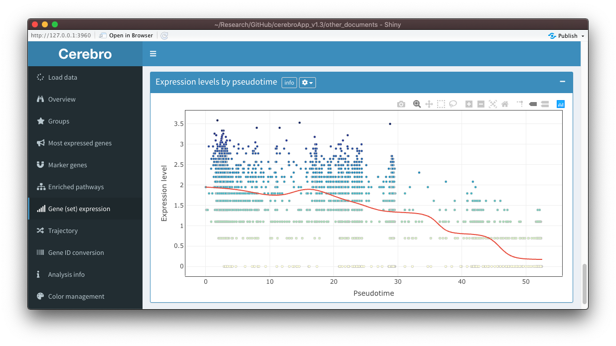
Also, you can now select an exported trajectory as the projection, allowing you to visualize expression along developmental trajectories. To address this question further, when a trajectory is selected as a projection, a new panel called “Expression levels by pseudotime” will be shown at the bottom of the tab. In this panel, you see the expression levels of the selected gene(s)/gene set as a function of pseudotime. A trend line is fitted on it to help you judge whether there could be a relationship between pseudotime and expression levels. You can control the parameters of the trend line through element in the dropdown menu (gear icon) in the title bar.
There is another new feature, however quite experimental at this points, that allows you to plot expression of multiple genes at the same time in separate facets. For this, you need to activate the option in the dropdown menu (gear icon) in the title bar and select at least 2 genes but no more than 8. You should then see a facet for each gene. This feature is experimental because there are still quite a few limitations. While exporting the plot to a PDF works, you can not do this with trajectories, it spams the console with messages, the hover info tooltip contains very limited information (position of a cell and the expression level), and all facets have the same color scale, which sometimes makes it difficult to interpret the plot when one gene has a much higher expression than the others. I will try to improve this feature in coming releases.
Trajectory
Similar to the “Marker genes” and “Enriched pathways” tabs, you now have to choose the method that was used to generate the trajectory, and then the specific trajectory from that method. Still, only trajectories from Monocle 2 are supported, but I am planning to implement support for trajectories from other methods.
In the “Distribution along pseudotime” panel, you can now choose a variable that you want to compare to pseudotime independently from the coloring variable in the projection. If you choose a categorical variable, e.g. clusters, you will see a distribution plot, which now is created with plotly directly. Instead, if you select a numerical variable, e.g. the number of transcripts (nUMI), you will see a scatter plot with a trend line fitted on it. In the dropdown menu (gear icon) in the the title bar, you can find options to control opacity of the density curve, deactive the trend line, and set parameters of the trend line.

The “States by group” panel works similar to the “Composition by other group” in the “Groups” tab, meaning that you can represent the relationship between the trajectory states and other grouping variables and cell cycle assignments as a bar chart or Sankey plot.
In the “Expression metrics” panel you can visualize the number of transcripts, number of expressed genes, and the percentage of mitochondrial and ribosomal transcripts for each state.
Note: This tab is only visible if any trajectory is present in the currently loaded data set.
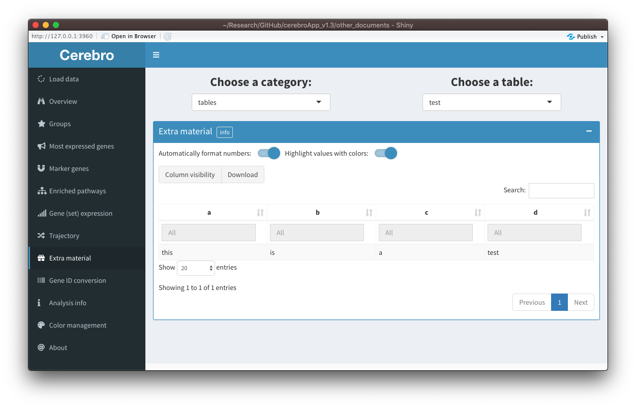
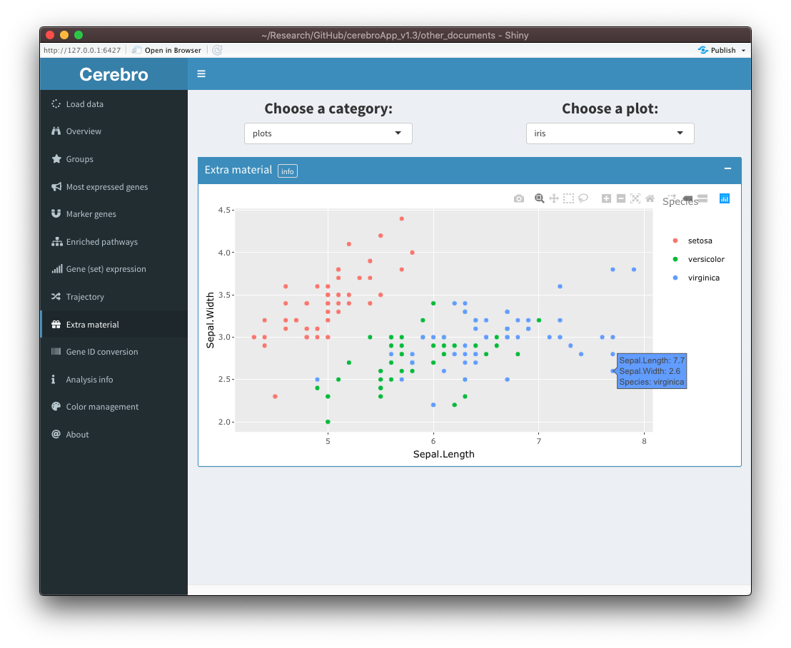
Extra material
In some cases, it is useful to share material with Cerebro users that doesn’t fit into any of the existing categories. For those cases, a new tab called “Extra material” has been created. It will only appear if extra material is present in the data set. At the moment, only tables (data frames) and plots (made with ggplot2) can be exported as extra material, but support for other types of content can be added in the future upon user request. You can see two examples below:
Have a look at this vignette if you would like to know how you can export your tables as additional material: Export and visualize custom tables and plots.
Note: This tab is only visible if any extra material is present in the currently loaded data set.
Miscellaneous
- Hover info in scatter plots, e.g. projections, now contain info about all grouping variables that were specified when exporting the data.
- There is a new info element below projection/trajectory plots that indicates how many cells have been selected. Note that the selection is maintained when changing the coloring variable, even though the selection box disappeared from the plot.
- Cells selected in the projection/trajectory plot in the “Overview” tab can be grouped separately from the selected coloring variable.
-
export to PDFbuttons now open a dialog that allows you to choose where to save the plot and how to name it. - In the “Color management” tab, color selection elements will be shown for all group levels of all grouping variables that were specified when exporting the data.
- In the “Analysis info” tab, the content is put together dynamically, allowing you to store, export, and display information more flexibly.
- Tables have more modern style and columns can be re-ordered by drag & drop. Please also note that
Infand-Infvalues in tables are replaced by999and-999, respectively, to avoid errors when formatting the columns. - Sliders to limit X-Y ranges in projection plots (“Overview” and “Gene (set) expression” tabs) have been moved to the dropdown menu (gear icon) in the respective title bars.
Other
- Different Cerebro version now have a designated launch function to allow them to have different package dependencies. The
launchCerebro()still exists and will call the specified Cerebro version. - Cerebro v1.3 no longer uses
ggtreeandformattable. - Pre-processing functions have been adapted to support different number of grouping variables, including just a single one. Moreover, they have been revised to improve performance and reduce memory use.
- When exporting data, expression counts can be stored as an
RleMatrix(see DelayedArray package). This means the expression matrix will not be loaded into memory and instead only requested parts will be read directly from the disk. This can be a useful for very large data sets. Of course, reading directly from disk instead of from memory reduces performance when calculating gene expression. - More log messages are printed to the console to hopefully improve tracking down errors experienced by users.
- Pre-processing and export functions are no longer compatible with Seurat object that were created before v3.0. If you still have older
Seuratobjects, you can update it using theUpdateSeuratObject()function of the Seurat package. - The “Trajectory” tab is now hidden if no trajectories were exported along with the data set.
Consequences
Backwards (in)compatibility
While the introduction of the Cerebro_v1.3 object hopefully provides more stability of the data organization in future releases, it also means that data sets exported with cerebroApp version older than v1.3 will not be properly shown in Cerebro v1.3. Moreover, due to the re-work of some pre-processing functions, it is necessary to perform the pre-processing again if you want to export data sets that you already pre-processed with older cerebroApp version.
Launching older cerebroApp versions
Package dependencies specific to older version of Cerebro have been moved from Imports to Suggests in order to minimize the number of packages that are installed by default. When you are trying to run a function that requires these packages, you will receive a notification.
Standalone version of Cerebro
The standalone version of Cerebro relied on the ColumbusCollaboratory/electron-quick-start repository. Unfortunately, the R version used in that framework is outdated by now. Some dependencies of Cerebro v1.3 are not compatible with that old R version. To make a standalone version of Cerebro v1.3, it is necessary to make a new R version, such as 4.0, portable. I have spent a considerable amount of time trying but not been able to achieve it. A promising project is the electricShine R package, but I didn’t manage to make it work with that either. Since the standalone version of Cerebro was one of its initial hallmarks, it is my goal to create a standalone version again in the future. Until then, I kindly ask for your patience. To compensate some of the consequences, I tried to make launching Cerebro from R more convenient (by providing additional parameters to load .crb file directly) and prepared a vignette explaining how to host Cerebro on shinyapps.io.