scRNA-seq analysis workflow
- Project status: closed
Preparation
Load R packages
library(tidyverse)
library(Seurat)
library(scran)
library(patchwork)
library(viridis)
library(ggforce)
library(gghalves)
library(ggridges)
library(scDblFinder)
library(SingleR)
Define colors
I have a custom color set that I like to use for discrete color scales. It’s two color palettes from https://flatuicolors.com merged together. We also define some colors for the cell cycle phases.
custom_colors <- list()

colors_dutch <- c(
  '#FFC312','#C4E538','#12CBC4','#FDA7DF','#ED4C67',
  '#F79F1F','#A3CB38','#1289A7','#D980FA','#B53471',
  '#EE5A24','#009432','#0652DD','#9980FA','#833471',
  '#EA2027','#006266','#1B1464','#5758BB','#6F1E51'
)

colors_spanish <- c(
  '#40407a','#706fd3','#f7f1e3','#34ace0','#33d9b2',
  '#2c2c54','#474787','#aaa69d','#227093','#218c74',
  '#ff5252','#ff793f','#d1ccc0','#ffb142','#ffda79',
  '#b33939','#cd6133','#84817a','#cc8e35','#ccae62'
)

custom_colors$discrete <- c(colors_dutch, colors_spanish)

custom_colors$cell_cycle <- setNames(
  c('#45aaf2', '#f1c40f', '#e74c3c', '#7f8c8d'),
  c('G1',      'S',       'G2M',     '-')
)
Helper functions
Format numbers
This is a function that will format numbers so they are easier to look at.
niceFormat <- function(number) {
  formatC(number, format = 'f', big.mark = ',', digits = 0)
}
Load transcript count matrix
This function allows us to load transcript count matrices stored in .mtx format, such as the output from Cell Ranger.
Importantly, this function collapses the counts from genes with the same name (they usually have different gene IDs which is why they were reported separately).
It is not always done like this.
Others keep the genes separate by adding a suffix to the duplicate gene names.
load10xData <- function(
  sample_name,
  path,
  max_number_of_cells = NULL
) {

  ## read transcript count matrix
  transcript_counts <- list.files(
      path,
      recursive = TRUE,
      full.names = TRUE
    ) %>%
    .[grep(., pattern = 'mtx')] %>%
    Matrix::readMM()

  ## read cell barcodes and assign as column names of transcript count matrix
  colnames(transcript_counts) <- list.files(
      path,
      recursive = TRUE,
      full.names = TRUE
    ) %>%
    .[grep(., pattern = 'barcodes')] %>%
    .[grep(., pattern = 'tsv')] %>%
    read_tsv(col_names = FALSE, col_types = cols()) %>%
    pull(1) %>%
    gsub(., pattern = '-[0-9]{1,2}', replacement = '') %>%
    paste0(., '-', sample_name)

  ## read gene names
  gene_names <- list.files(
      path,
      recursive = TRUE,
      full.names = TRUE
    ) %>%
    .[grep(., pattern = 'genes|features')] %>%
    read_tsv(col_names = FALSE, col_types = cols()) %>%
    pull(ifelse(ncol(.) > 1, 2, 1))

  ## if necessary, merge counts from different transcripts of the same gene
  if ( any(duplicated(gene_names)) == TRUE ) {

    ## get names of genes with multiple entries
    duplicated_gene_names <- unique(gene_names[which(duplicated(gene_names))])

    ## log message
    message(
      glue::glue(
        "{format(Sys.time(), '[%Y-%m-%d %H:%M:%S]')} Summing up counts for ",
        "{length(duplicated_gene_names)} genes with multiple entries."
      )
    )

    ## go through genes with multiple entries
    for ( i in duplicated_gene_names ) {

      ## extract transcripts counts for current gene
      tmp_counts <- transcript_counts[which(gene_names == i),]

      ## make sure at least 2 rows are present
      if ( nrow(tmp_counts) >= 2 ) {

        ## sum up counts in each cell
        tmp_counts_sum <- Matrix::colSums(tmp_counts)

        ## remove original counts from transcript matrix and the gene name from
        ## the list of gene names
        transcript_counts <- transcript_counts[-c(which(gene_names == i)),]
        gene_names <- gene_names[-c(which(gene_names == i))]

        ## add summed counts to end of transcript count matrix and current gene
        ## name to end of gene names
        transcript_counts <- rbind(transcript_counts, tmp_counts_sum)
        gene_names <- c(gene_names, i)
      }
    }
  }

  ## assign gene names as row names
  rownames(transcript_counts) <- gene_names

  ## down-sample cells if more cells than `max_number_of_cells` are present in
  ## count matrix
  if (
    !is.null(max_number_of_cells) &&
    is.numeric(max_number_of_cells) &&
    max_number_of_cells < ncol(transcript_counts)
  ) {
    temp_cells_to_keep <- base::sample(1:ncol(transcript_counts), max_number_of_cells)
    transcript_counts <- transcript_counts[,temp_cells_to_keep]
  }

  ##
  message(
    glue::glue(
      "{format(Sys.time(), '[%Y-%m-%d %H:%M:%S]')} Loaded counts for sample ",
      "{sample_name} with {niceFormat(ncol(transcript_counts))} cells and ",
      "{niceFormat(nrow(transcript_counts))} genes."
    )
  )

  ##
  return(transcript_counts)
}
Check if gene names are the same
When provided with a list of transcript count matrices, this function checks whether the gene names are the same in all the count matrices, which is an important premise for merging them.
sameGeneNames <- function(counts) {

  ## create place holder for gene names from each count matrix
  gene_names <- list()

  ## go through count matrices
  for ( i in names(counts) ) {

    ## extract gene names
    gene_names[[i]] <- rownames(counts[[i]])
  }

  ## check if all gene names are the same (using the first matrix as a reference
  ## for the others)
  return(all(sapply(gene_names, FUN = identical, gene_names[[1]])))
}
Table of nCount and nFeature by sample
This function outputs a table of mean and median transcripts and expressed genes for every sample in our data set.
averagenCountnFeature <- function(cells) {
  output <- tibble(
    'sample' = character(),
    'mean(nCount)' = numeric(),
    'median(nCount)' = numeric(),
    'mean(nFeature)' = numeric(),
    'median(nFeature)' = numeric()
  )
  for ( i in levels(cells$sample) ) {
    tmp <- tibble(
      'sample' = i,
      'mean(nCount)' = cells %>% filter(sample == i) %>% pull(nCount) %>% mean(),
      'median(nCount)' = cells %>% filter(sample == i) %>% pull(nCount) %>% median(),
      'mean(nFeature)' = cells %>% filter(sample == i) %>% pull(nFeature) %>% mean(),
      'median(nFeature)' = cells %>% filter(sample == i) %>% pull(nFeature) %>% median()
    )
    output <- bind_rows(output, tmp)
  }
  return(output)
}
Create output directories
Every output of this workflow is either stored in data or plots.
dir.create('data')
dir.create('plots')
Load data
First, we load every sample by itself using the previously specified load10xData() function.
We will randomly down-sample each sample to 2,000 cells for faster processing.
Sample-wise
sample_names <- list.dirs('raw_data', recursive = FALSE) %>% basename()

transcripts <- list(
  raw = list()
)

for ( i in sample_names ) {
  transcripts$raw[[i]] <- load10xData(
    i, paste0('raw_data/', i, '/'),
    max_number_of_cells = 2000
  )
}
# [2020-10-06 21:32:01] Summing up counts for 34 genes with multiple entries.
# [2020-10-06 21:32:10] Loaded counts for sample A with 2,000 cells and 33,660 genes.
# [2020-10-06 21:32:12] Summing up counts for 34 genes with multiple entries.
# [2020-10-06 21:32:19] Loaded counts for sample B with 2,000 cells and 33,660 genes.
# [2020-10-06 21:32:21] Summing up counts for 34 genes with multiple entries.
# [2020-10-06 21:32:28] Loaded counts for sample E with 2,000 cells and 33,660 genes.
Merge samples
Before being able to merge the transcript count matrices, we need to check whether the gene names are the same in each of them. This is important because if they are, then we can just glue the matrices together.
checkGeneNames(transcripts$raw)
# TRUE
Since all three samples used here were generated with the same software, the gene names are the same in each of them and so we can proceed with merging them.
Now, we merge the transcript counts from every sample by gene name.
transcripts$raw$merged <- do.call(cbind, transcripts$raw)

dim(transcripts$raw$merged)
# 33660  6000
NOTE: If the gene names are not the same, there are two strategies. You can convert the transcript count matrices to data frame format and then merge them using the full_join() function. Depending on the size of the data set you are working with, this might result in memory issues. Alternatively, you add missing genes filled with 0 counts to the matrices that are missing the gene. Before merging, you must then make sure that the genes are in the same order.
Below you can find an outline of the first procedure:
for ( i in sample_names ) {
  gene_names <- rownames(transcripts$raw[[i]])
  transcripts$raw[[i]] <- as.data.frame(as.matrix(transcripts$raw[[i]]))
  transcripts$raw[[i]] <- transcripts$raw[[i]] %>%
    mutate(gene = gene_names) %>%
    select(gene, everything())
}

transcripts$raw$merged <- full_join(transcripts$raw$A, transcripts$raw$B, by = "gene") %>%
  full_join(., transcripts$raw$E, by = "gene")

transcripts$raw$merged[ is.na(transcripts$raw$merged) ] <- 0
Quality control
Before we start the analysis, we will remove low-quality cells, duplicates, as well as weakly expressed genes from the merged transcript count matrix.
Filter cells
We start with the cells.
Prepare data
First, we collect the transcript count, expressed genes per cell, and percentage of mitochondrial transcripts per cell.
cells <- tibble(
  cell = colnames(transcripts$raw$merged),
  sample = colnames(transcripts$raw$merged) %>%
    strsplit('-') %>%
    vapply(FUN.VALUE = character(1), `[`, 2) %>%
    factor(levels = sample_names),
  nCount = colSums(transcripts$raw$merged),
  nFeature = colSums(transcripts$raw$merged != 0)
)

DataFrame(cells)
# DataFrame with 6000 rows and 4 columns
#                    cell   sample    nCount  nFeature
#             <character> <factor> <numeric> <integer>
# 1    AGTAGTCAGCTAAACA-A        A     11915       557
# 2    GCAAACTGTGTGCCTG-A        A      4745      1018
# 3    TTGGCAAAGGCAAAGA-A        A      4205      1027
# 4    CTACACCTCAACGAAA-A        A     11593       633
# 5    AGCCTAACAAGGTTCT-A        A      4756      1298
# ...                 ...      ...       ...       ...
# 5996 CCACCTAGTTAAAGAC-E        E      4941      1442
# 5997 AGGGAGTTCCTGTAGA-E        E      2405       699
# 5998 CATTCGCAGGTACTCT-E        E      2262       888
# 5999 TGATTTCAGGCTCAGA-E        E      2150       733
# 6000 CAGCTGGGTTATCGGT-E        E     21167      4030

mitochondrial_genes_here <- read_tsv(
    system.file('extdata/genes_mt_hg_name.tsv.gz', package = 'cerebroApp'),
    col_names = FALSE
  ) %>%
  filter(X1 %in% rownames(transcripts$raw$merged)) %>%
  pull(X1)

cells$percent_MT <- Matrix::colSums(transcripts$raw$merged[mitochondrial_genes_here,]) / Matrix::colSums(transcripts$raw$merged)

DataFrame(cells)
# DataFrame with 6000 rows and 5 columns
#                    cell   sample    nCount  nFeature percent_MT
#             <character> <factor> <numeric> <integer>  <numeric>
# 1    AGTAGTCAGCTAAACA-A        A     11915       557 0.00260176
# 2    GCAAACTGTGTGCCTG-A        A      4745      1018 0.02971549
# 3    TTGGCAAAGGCAAAGA-A        A      4205      1027 0.02354340
# 4    CTACACCTCAACGAAA-A        A     11593       633 0.00517554
# 5    AGCCTAACAAGGTTCT-A        A      4756      1298 0.06391926
# ...                 ...      ...       ...       ...        ...
# 5996 CCACCTAGTTAAAGAC-E        E      4941      1442  0.0333940
# 5997 AGGGAGTTCCTGTAGA-E        E      2405       699  0.0191268
# 5998 CATTCGCAGGTACTCT-E        E      2262       888  0.0539346
# 5999 TGATTTCAGGCTCAGA-E        E      2150       733  0.0232558
# 6000 CAGCTGGGTTATCGGT-E        E     21167      4030  0.0313223
We use our averagenCountnFeature() function to get an idea of the metrics per sample.
averagenCountnFeature(cells) %>% knitr::kable()
| sample | mean(nCount) | median(nCount) | mean(nFeature) | median(nFeature) |
|---|---|---|---|---|
| A | 9477.411 | 6277.5 | 1646.2530 | 1307.5 |
| B | 5164.258 | 3048.5 | 1082.4145 | 789.0 |
| E | 4362.592 | 3477.0 | 647.6505 | 583.0 |
Doublets
To identify doublets, we will use the scDblFinder package.
sce <- SingleCellExperiment(assays = list(counts = transcripts$raw$merged))
sce <- scDblFinder(sce)

cells$multiplet_class <- colData(sce)$scDblFinder.class
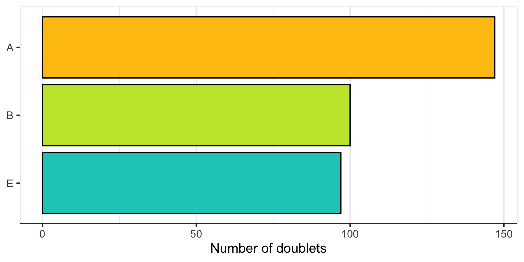
How many doublets do we find in each sample?
p <- cells %>%
  filter(multiplet_class != 'singlet') %>%
  group_by(sample) %>%
  summarize(count = n()) %>%
  ggplot(aes(x = sample, y = count, fill = sample)) +
  geom_col(color = 'black') +
  theme_bw() +
  scale_fill_manual(values = custom_colors$discrete) +
  scale_x_discrete(limits = rev(levels(cells$sample))) +
  scale_y_continuous(name = 'Number of doublets', labels = scales::comma) +
  theme(
    axis.title.y = element_blank(),
    panel.grid.major.y = element_blank(),
    panel.grid.minor.y = element_blank(),
    legend.position = 'none'
  ) +
  coord_flip()

ggsave(
  'plots/qc_number_of_doublets_by_sample.png',
  p, height = 3, width = 6
)
Below we see the distribution of nCount and nFeature by the multiplet class.
p1 <- ggplot(cells, aes(x = multiplet_class, y = nCount, fill = multiplet_class)) +
  geom_violin(draw_quantiles = c(0.5), scale = 'area', trim = FALSE) +
  theme_bw() +
  scale_fill_manual(values = custom_colors$discrete) +
  scale_x_discrete(limits = rev(levels(cells$multiplet_class))) +
  scale_y_continuous(labels = scales::comma) +
  labs(title = 'Number of transcripts', subtitle = 'linear scale') +
  theme(
    axis.title = element_blank(),
    panel.grid.major.y = element_blank(),
    panel.grid.minor.y = element_blank(),
    legend.position = 'none'
  ) +
  coord_flip()
p2 <- ggplot(cells, aes(x = multiplet_class, y = nCount, fill = multiplet_class)) +
  geom_violin(draw_quantiles = c(0.5), scale = 'area', trim = FALSE) +
  theme_bw() +
  scale_fill_manual(values = custom_colors$discrete) +
  scale_x_discrete(limits = rev(levels(cells$multiplet_class))) +
  scale_y_log10(labels = scales::comma) +
  labs(title = 'Number of transcripts', subtitle = 'log-scale') +
  theme(
    axis.title = element_blank(),
    panel.grid.major.y = element_blank(),
    panel.grid.minor.y = element_blank(),
    legend.position = 'none'
  ) +
  coord_flip()
p3 <- ggplot(cells, aes(x = multiplet_class, y = nFeature, fill = multiplet_class)) +
  geom_violin(draw_quantiles = c(0.5), scale = 'area', trim = FALSE) +
  theme_bw() +
  scale_fill_manual(values = custom_colors$discrete) +
  scale_x_discrete(limits = rev(levels(cells$multiplet_class))) +
  scale_y_continuous(labels = scales::comma) +
  labs(title = 'Number of expressed genes', subtitle = 'linear scale') +
  theme(
    axis.title = element_blank(),
    panel.grid.major.y = element_blank(),
    panel.grid.minor.y = element_blank(),
    legend.position = 'none'
  ) +
  coord_flip()
p4 <- ggplot(cells, aes(x = multiplet_class, y = nFeature, fill = multiplet_class)) +
  geom_violin(draw_quantiles = c(0.5), scale = 'area', trim = FALSE) +
  theme_bw() +
  scale_fill_manual(values = custom_colors$discrete) +
  scale_x_discrete(limits = rev(levels(cells$multiplet_class))) +
  scale_y_log10(labels = scales::comma) +
  labs(title = 'Number of expressed genes', subtitle = 'log-scale') +
  theme(
    axis.title = element_blank(),
    panel.grid.major.y = element_blank(),
    panel.grid.minor.y = element_blank(),
    legend.position = 'none'
  ) +
  coord_flip()

ggsave(
  'plots/qc_ncount_nfeature_by_multiplet_class.png',
  p1 + p3 +
  p2 + p4 + plot_layout(ncol = 2),
  height = 7, width = 10
)
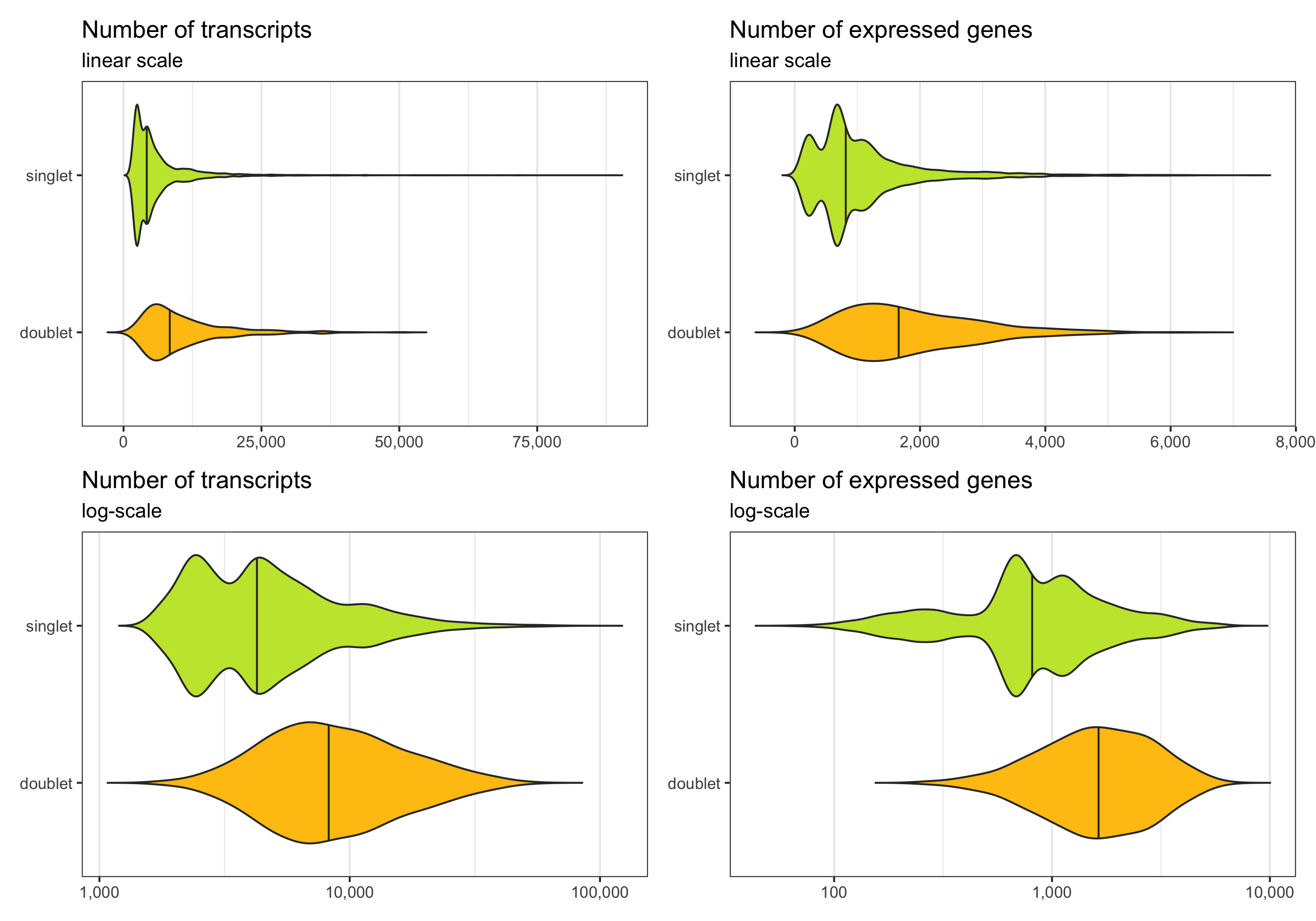
Now, we remove the doublets.
cells <- filter(cells, multiplet_class == 'singlet')
Before filtering
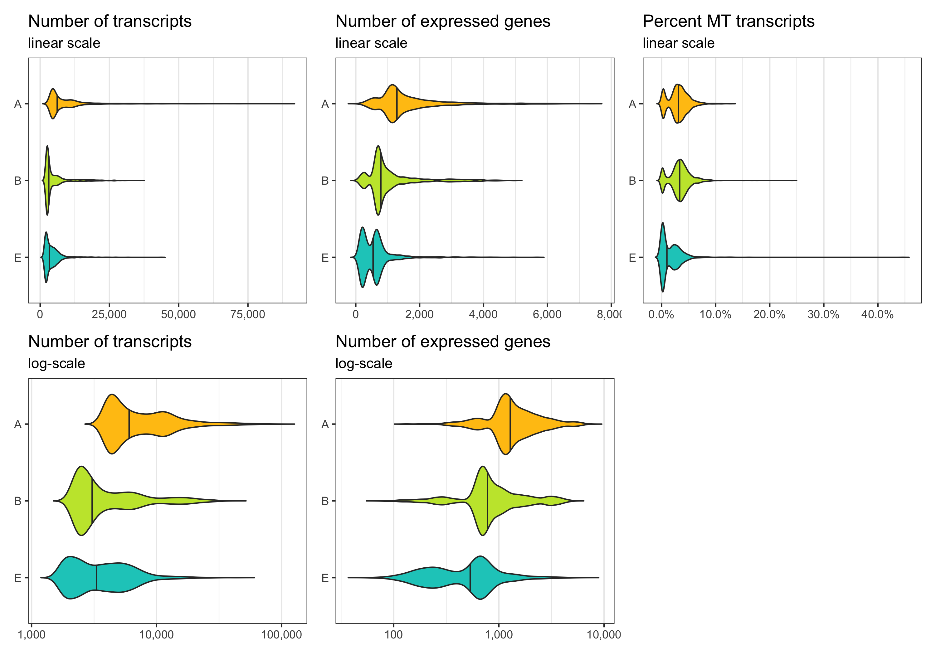
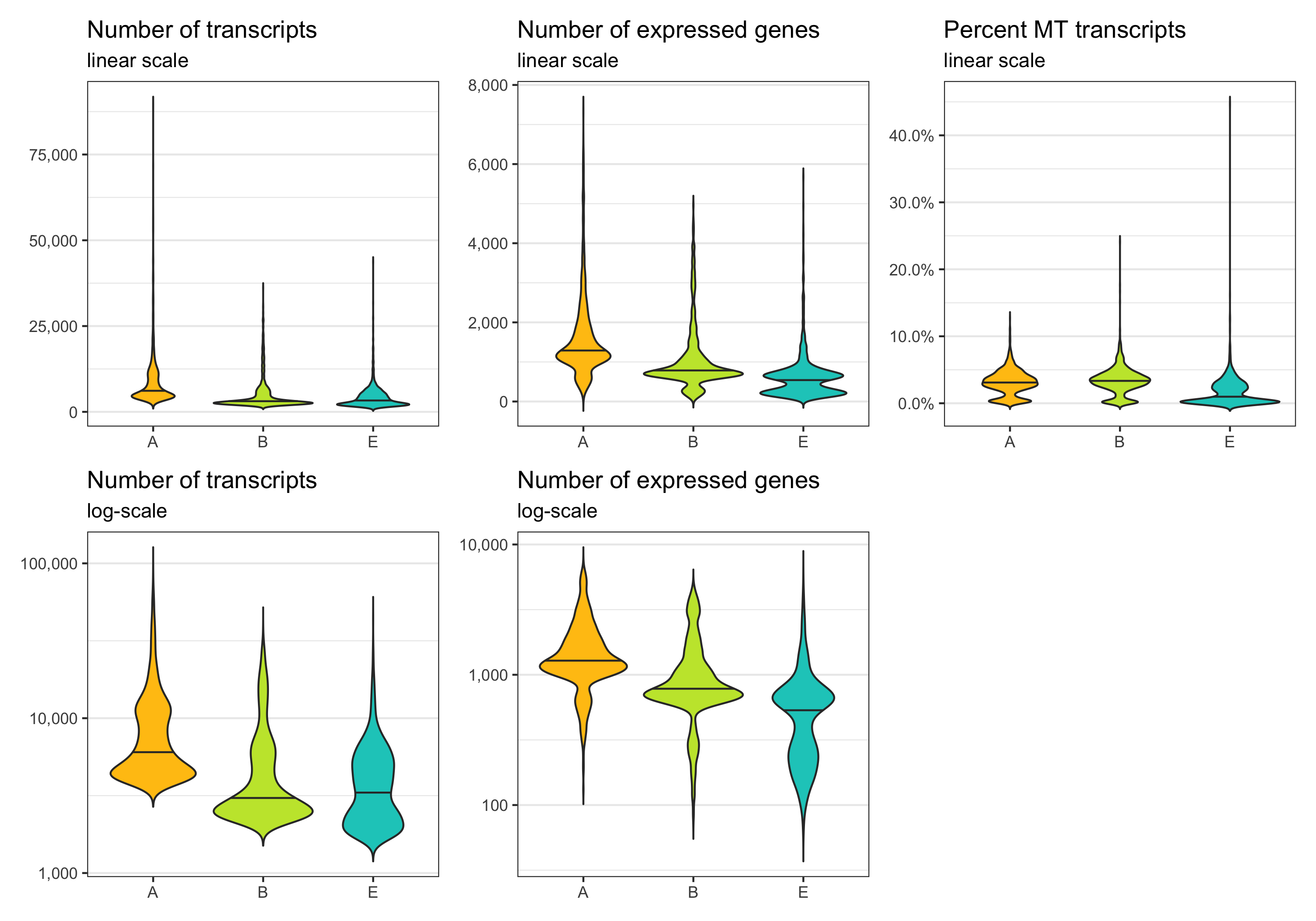
Before removing any cell, let’s look at the distribution of transcript count, expressed genes per cell, and percentage of mitochondrial transcripts per cell. These distributions can be represented in different ways. Which of them looks best depends on taste and dataset.
p1 <- ggplot(cells, aes(x = sample, y = nCount, fill = sample)) +
  geom_violin(draw_quantiles = c(0.5), scale = 'area', trim = FALSE) +
  theme_bw() +
  scale_fill_manual(values = custom_colors$discrete) +
  scale_x_discrete(limits = rev(levels(cells$sample))) +
  scale_y_continuous(labels = scales::comma) +
  labs(title = 'Number of transcripts', subtitle = 'linear scale') +
  theme(
    axis.title = element_blank(),
    panel.grid.major.y = element_blank(),
    panel.grid.minor.y = element_blank(),
    legend.position = 'none'
  ) +
  coord_flip()

p2 <- ggplot(cells, aes(x = sample, y = nCount, fill = sample)) +
  geom_violin(draw_quantiles = c(0.5), scale = 'area', trim = FALSE) +
  theme_bw() +
  scale_fill_manual(values = custom_colors$discrete) +
  scale_x_discrete(limits = rev(levels(cells$sample))) +
  scale_y_log10(labels = scales::comma) +
  labs(title = 'Number of transcripts', subtitle = 'log-scale') +
  theme(
    axis.title = element_blank(),
    panel.grid.major.y = element_blank(),
    panel.grid.minor.y = element_blank(),
    legend.position = 'none'
  ) +
  coord_flip()

p3 <- ggplot(cells, aes(x = sample, y = nFeature, fill = sample)) +
  geom_violin(draw_quantiles = c(0.5), scale = 'area', trim = FALSE) +
  theme_bw() +
  scale_fill_manual(values = custom_colors$discrete) +
  scale_x_discrete(limits = rev(levels(cells$sample))) +
  scale_y_continuous(labels = scales::comma) +
  labs(title = 'Number of expressed genes', subtitle = 'linear scale') +
  theme(
    axis.title = element_blank(),
    panel.grid.major.y = element_blank(),
    panel.grid.minor.y = element_blank(),
    legend.position = 'none'
  ) +
  coord_flip()

p4 <- ggplot(cells, aes(x = sample, y = nFeature, fill = sample)) +
  geom_violin(draw_quantiles = c(0.5), scale = 'area', trim = FALSE) +
  theme_bw() +
  scale_fill_manual(values = custom_colors$discrete) +
  scale_x_discrete(limits = rev(levels(cells$sample))) +
  scale_y_log10(labels = scales::comma) +
  labs(title = 'Number of expressed genes', subtitle = 'log-scale') +
  theme(
    axis.title = element_blank(),
    panel.grid.major.y = element_blank(),
    panel.grid.minor.y = element_blank(),
    legend.position = 'none'
  ) +
  coord_flip()

p5 <- ggplot(cells, aes(x = sample, y = percent_MT, fill = sample)) +
  geom_violin(draw_quantiles = c(0.5), scale = 'area', trim = FALSE) +
  theme_bw() +
  scale_fill_manual(values = custom_colors$discrete) +
  scale_x_discrete(limits = rev(levels(cells$sample))) +
  scale_y_continuous(labels = scales::percent) +
  labs(title = 'Percent MT transcripts', subtitle = 'linear scale') +
  theme(
    axis.title = element_blank(),
    panel.grid.major.y = element_blank(),
    panel.grid.minor.y = element_blank(),
    legend.position = 'none'
  ) +
  coord_flip()

ggsave(
  'plots/qc_histogram_ncount_nfeature_percentmt_before_filtering_1.png',
  p1 + p3 + p5 +
  p2 + p4 + plot_layout(ncol = 3),
  height = 7, width = 10
)
p1 <- ggplot(cells, aes(x = sample, y = nCount, fill = sample)) +
  geom_violin(draw_quantiles = c(0.5), scale = 'area', trim = FALSE) +
  theme_bw() +
  scale_fill_manual(values = custom_colors$discrete) +
  scale_y_continuous(labels = scales::comma) +
  labs(title = 'Number of transcripts', subtitle = 'linear scale') +
  theme(
    axis.title = element_blank(),
    panel.grid.major.x = element_blank(),
    panel.grid.minor.x = element_blank(),
    legend.position = 'none'
  )

p2 <- ggplot(cells, aes(x = sample, y = nCount, fill = sample)) +
  geom_violin(draw_quantiles = c(0.5), scale = 'area', trim = FALSE) +
  theme_bw() +
  scale_fill_manual(values = custom_colors$discrete) +
  scale_y_log10(labels = scales::comma) +
  labs(title = 'Number of transcripts', subtitle = 'log-scale') +
  theme(
    axis.title = element_blank(),
    panel.grid.major.x = element_blank(),
    panel.grid.minor.x = element_blank(),
    legend.position = 'none'
  )

p3 <- ggplot(cells, aes(x = sample, y = nFeature, fill = sample)) +
  geom_violin(draw_quantiles = c(0.5), scale = 'area', trim = FALSE) +
  theme_bw() +
  scale_fill_manual(values = custom_colors$discrete) +
  scale_y_continuous(labels = scales::comma) +
  labs(title = 'Number of expressed genes', subtitle = 'linear scale') +
  theme(
    axis.title = element_blank(),
    panel.grid.major.x = element_blank(),
    panel.grid.minor.x = element_blank(),
    legend.position = 'none'
  )

p4 <- ggplot(cells, aes(x = sample, y = nFeature, fill = sample)) +
  geom_violin(draw_quantiles = c(0.5), scale = 'area', trim = FALSE) +
  theme_bw() +
  scale_fill_manual(values = custom_colors$discrete) +
  scale_y_log10(labels = scales::comma) +
  labs(title = 'Number of expressed genes', subtitle = 'log-scale') +
  theme(
    axis.title = element_blank(),
    panel.grid.major.x = element_blank(),
    panel.grid.minor.x = element_blank(),
    legend.position = 'none'
  )

p5 <- ggplot(cells, aes(x = sample, y = percent_MT, fill = sample)) +
  geom_violin(draw_quantiles = c(0.5), scale = 'area', trim = FALSE) +
  theme_bw() +
  scale_fill_manual(values = custom_colors$discrete) +
  scale_y_continuous(labels = scales::percent) +
  labs(title = 'Percent MT transcripts', subtitle = 'linear scale') +
  theme(
    axis.title = element_blank(),
    panel.grid.major.x = element_blank(),
    panel.grid.minor.x = element_blank(),
    legend.position = 'none'
  )

ggsave(
  'plots/qc_histogram_ncount_nfeature_percentmt_before_filtering_2.png',
  p1 + p3 + p5 +
  p2 + p4 + plot_layout(ncol = 3),
  height = 7, width = 10
)
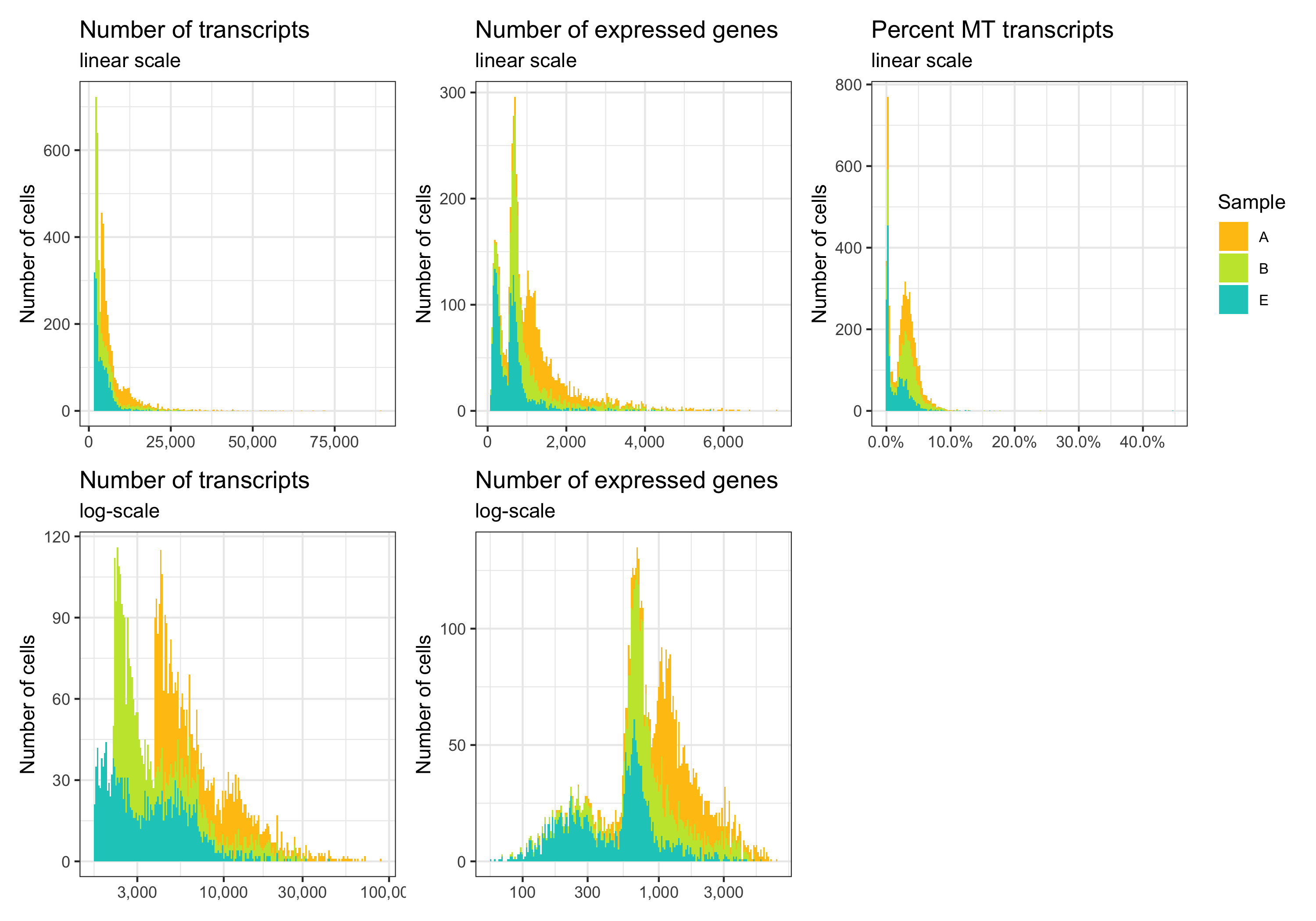
p1 <- ggplot(cells, aes(nCount, fill = sample)) +
  geom_histogram(bins = 200) +
  theme_bw() +
  scale_fill_manual(values = custom_colors$discrete) +
  scale_x_continuous(labels = scales::comma) +
  labs(title = 'Number of transcripts', subtitle = 'linear scale', y = 'Number of cells') +
  theme(legend.position = 'none', axis.title.x = element_blank())

p2 <- ggplot(cells, aes(nCount, fill = sample)) +
  geom_histogram(bins = 200) +
  theme_bw() +
  scale_fill_manual(values = custom_colors$discrete) +
  scale_x_log10(labels = scales::comma) +
  labs(title = 'Number of transcripts', subtitle = 'log-scale', y = 'Number of cells') +
  theme(legend.position = 'none', axis.title.x = element_blank())

p3 <- ggplot(cells, aes(nFeature, fill = sample)) +
  geom_histogram(bins = 200) +
  theme_bw() +
  scale_fill_manual(values = custom_colors$discrete) +
  scale_x_continuous(labels = scales::comma) +
  labs(title = 'Number of expressed genes', subtitle = 'linear scale', y = 'Number of cells') +
  theme(legend.position = 'none',axis.title.x = element_blank())

p4 <- ggplot(cells, aes(nFeature, fill = sample)) +
  geom_histogram(bins = 200) +
  theme_bw() +
  scale_fill_manual(values = custom_colors$discrete) +
  scale_x_log10(labels = scales::comma) +
  labs(title = 'Number of expressed genes', subtitle = 'log-scale', y = 'Number of cells', fill = 'Sample') +
  theme(legend.position = 'none', axis.title.x = element_blank())

p5 <- ggplot(cells, aes(percent_MT, fill = sample)) +
  geom_histogram(bins = 200) +
  theme_bw() +
  scale_x_continuous(labels = scales::percent) +
  scale_fill_manual(name = 'Sample', values = custom_colors$discrete) +
  labs(title = 'Percent MT transcripts', subtitle = 'linear scale', y = 'Number of cells') +
  theme(legend.position = 'right', axis.title.x = element_blank(), legend.text = element_text(size = 8))

ggsave(
  'plots/qc_histogram_ncount_nfeature_percentmt_before_filtering_3.png',
  p1 + p3 + p5 +
  p2 + p4 + plot_layout(ncol = 3),
  height = 7, width = 10
)
p1 <- ggplot(cells, aes(x = nCount, y = sample, fill = sample)) +
  geom_density_ridges(rel_min_height = 0.01, scale = 0.9, alpha = 0.8) +
  theme_ridges(center = TRUE) +
  scale_fill_manual(values = custom_colors$discrete) +
  scale_x_continuous(labels = scales::comma) +
  scale_y_discrete(expand = c(0.01, 0)) +
  labs(title = 'Number of transcripts', subtitle = 'linear scale', y = 'Density') +
  theme(legend.position = 'none', axis.title.x = element_blank())

p2 <- ggplot(cells, aes(x = nCount, y = sample, fill = sample)) +
  geom_density_ridges(rel_min_height = 0.01, scale = 0.9, alpha = 0.8) +
  theme_ridges(center = TRUE) +
  scale_fill_manual(values = custom_colors$discrete) +
  scale_x_log10(labels = scales::comma) +
  scale_y_discrete(expand = c(0.01, 0)) +
  labs(title = 'Number of transcripts', subtitle = 'log-scale', y = 'Density') +
  theme(legend.position = 'none', axis.title.x = element_blank())

p3 <- ggplot(cells, aes(x = nFeature, y = sample, fill = sample)) +
  geom_density_ridges(rel_min_height = 0.01, scale = 0.9, alpha = 0.8) +
  theme_ridges(center = TRUE) +
  scale_fill_manual(values = custom_colors$discrete) +
  scale_x_continuous(labels = scales::comma) +
  scale_y_discrete(expand = c(0.01, 0)) +
  labs(title = 'Number of expressed genes', subtitle = 'linear scale', y = 'Density') +
  theme(legend.position = 'none', axis.title.x = element_blank())

p4 <- ggplot(cells, aes(x = nFeature, y = sample, fill = sample)) +
  geom_density_ridges(rel_min_height = 0.01, scale = 0.9, alpha = 0.8) +
  theme_ridges(center = TRUE) +
  scale_fill_manual(values = custom_colors$discrete) +
  scale_x_log10(labels = scales::comma) +
  scale_y_discrete(expand = c(0.01, 0)) +
  labs(title = 'Number of expressed genes', subtitle = 'log-scale', y = 'Density') +
  theme(legend.position = 'none', axis.title.x = element_blank())

p5 <- ggplot(cells, aes(x = percent_MT, y = sample, fill = sample)) +
  geom_density_ridges(rel_min_height = 0.01, scale = 0.9, alpha = 0.8) +
  theme_ridges(center = TRUE) +
  scale_x_continuous(labels = scales::percent) +
  scale_fill_manual(values = custom_colors$discrete) +
  scale_y_discrete(expand = c(0.01, 0)) +
  labs(title = 'Percent MT transcripts', subtitle = 'linear scale', y = 'Density') +
  theme(
    legend.position = 'none',
    axis.title.x = element_blank(),
    axis.text.x = element_text(angle = 45, hjust = 1, vjust = 1)
  )

ggsave(
  'plots/qc_histogram_ncount_nfeature_percentmt_before_filtering_4.png',
  p1 + p3 + p5 +
  p2 + p4 + plot_layout(ncol = 3),
  height = 7, width = 10
)
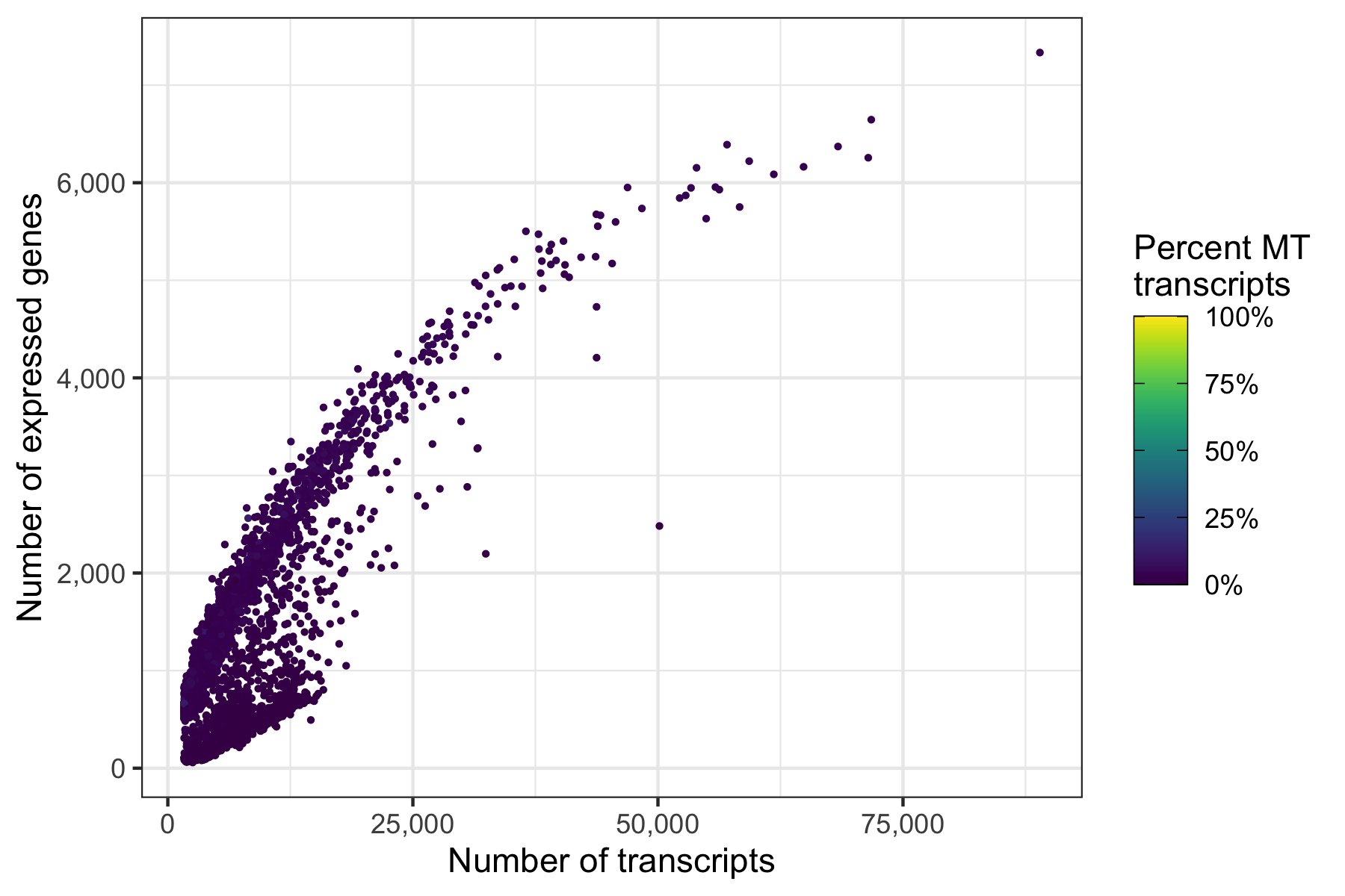
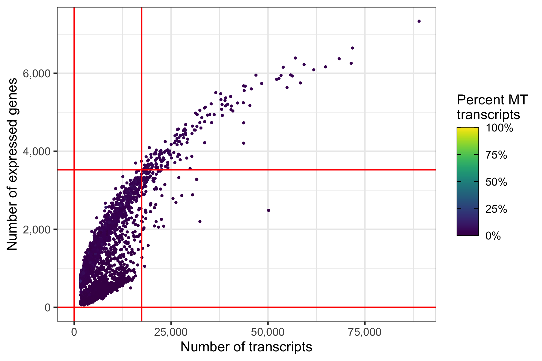
Another interesting relationship is the number of expressed genes over the number of transcripts per cell. This usually results in a curve as the one shown below. Sometimes there are a number of cells with a particular pattern, i.e. many expressed genes for the number of transcripts they have, which could be dying cells.
p <- ggplot(cells, aes(nCount, nFeature, color = percent_MT)) +
  geom_point(size = 0.5) +
  scale_x_continuous(name = 'Number of transcripts', labels = scales::comma) +
  scale_y_continuous(name = 'Number of expressed genes', labels = scales::comma) +
  theme_bw() +
  scale_color_viridis(
    name = 'Percent MT\ntranscripts',
    limits = c(0,1),
    labels = scales::percent,
    guide = guide_colorbar(frame.colour = 'black', ticks.colour = 'black')
  )

ggsave('plots/qc_nfeature_over_ncount_before_filtering.png', p, height = 4, width = 6)
Define thresholds
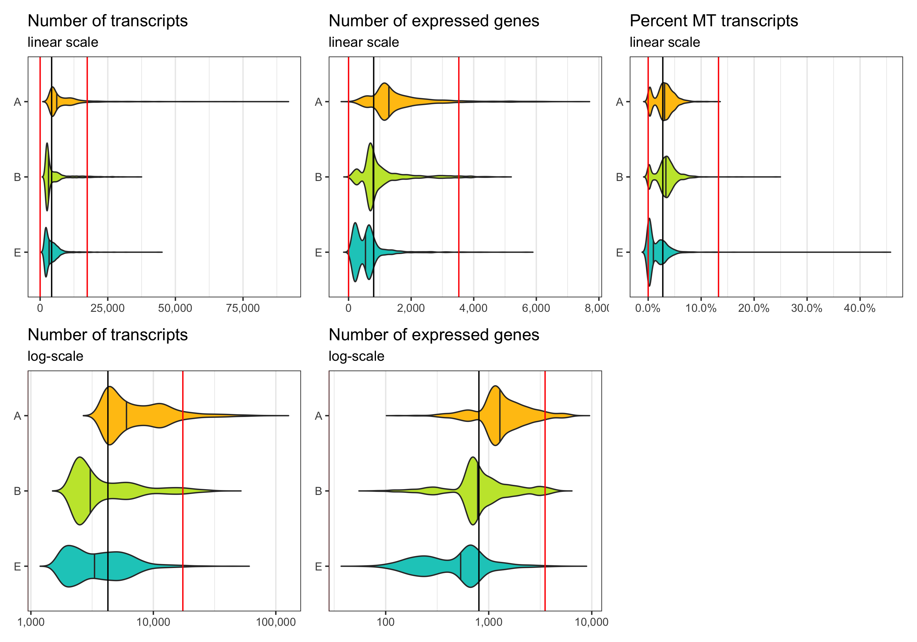
Now, we want to define lower and upper boundaries for the metrics we looked at. There are different ways to do that. One way is to go by eye, another to calculate median and MAD (median absolute deviation). If you decide to go with option 2, it is generally advised to stay within 3-5 MADs around the median [2]. Here, we will be generous and accept anything below median plus 5 times the MAD. We don’t need a lower boundary because the matrices have apparently been pre-filtered with acceptable lower boundaries for the number of transcripts and expressed genes per cell.
median_nCount <- median(cells$nCount)
# 4255
mad_nCount <- mad(cells$nCount)
# 2630.874

median_nFeature <- median(cells$nFeature)
# 803
mad_nFeature <- mad(cells$nFeature)
# 544.1142

median_percent_MT <- median(cells$percent_MT)
# 0.02760973
mad_percent_MT <- mad(cells$percent_MT)
# 0.02103674

thresholds_nCount <- c(0, median_nCount + 5*mad_nCount)
# 0.00 17409.37
thresholds_nFeature <- c(0, median_nFeature + 5*mad_nFeature)
# 0.000 3523.571
thresholds_percent_MT <- c(0, median_percent_MT + 5*mad_percent_MT)
# 0.0000000 0.1327934
Median and thresholds are shown in the plots below.
p1 <- ggplot(cells, aes(x = sample, y = nCount, fill = sample)) +
  geom_violin(draw_quantiles = c(0.5), scale = 'area', trim = FALSE) +
  geom_hline(yintercept = median_nCount, color = 'black') +
  geom_hline(yintercept = thresholds_nCount, color = 'red') +
  theme_bw() +
  scale_fill_manual(values = custom_colors$discrete) +
  scale_x_discrete(limits = rev(levels(cells$sample))) +
  scale_y_continuous(labels = scales::comma) +
  labs(title = 'Number of transcripts', subtitle = 'linear scale') +
  theme(
    axis.title = element_blank(),
    panel.grid.major.y = element_blank(),
    panel.grid.minor.y = element_blank(),
    legend.position = 'none'
  ) +
  coord_flip()

p2 <- ggplot(cells, aes(x = sample, y = nCount, fill = sample)) +
  geom_violin(draw_quantiles = c(0.5), scale = 'area', trim = FALSE) +
  geom_hline(yintercept = median_nCount, color = 'black') +
  geom_hline(yintercept = thresholds_nCount, color = 'red') +
  theme_bw() +
  scale_fill_manual(values = custom_colors$discrete) +
  scale_x_discrete(limits = rev(levels(cells$sample))) +
  scale_y_log10(labels = scales::comma) +
  labs(title = 'Number of transcripts', subtitle = 'log-scale') +
  theme(
    axis.title = element_blank(),
    panel.grid.major.y = element_blank(),
    panel.grid.minor.y = element_blank(),
    legend.position = 'none'
  ) +
  coord_flip()

p3 <- ggplot(cells, aes(x = sample, y = nFeature, fill = sample)) +
  geom_violin(draw_quantiles = c(0.5), scale = 'area', trim = FALSE) +
  geom_hline(yintercept = median_nFeature, color = 'black') +
  geom_hline(yintercept = thresholds_nFeature, color = 'red') +
  theme_bw() +
  scale_fill_manual(values = custom_colors$discrete) +
  scale_x_discrete(limits = rev(levels(cells$sample))) +
  scale_y_continuous(labels = scales::comma) +
  labs(title = 'Number of expressed genes', subtitle = 'linear scale') +
  theme(
    axis.title = element_blank(),
    panel.grid.major.y = element_blank(),
    panel.grid.minor.y = element_blank(),
    legend.position = 'none'
  ) +
  coord_flip()

p4 <- ggplot(cells, aes(x = sample, y = nFeature, fill = sample)) +
  geom_violin(draw_quantiles = c(0.5), scale = 'area', trim = FALSE) +
  geom_hline(yintercept = median_nFeature, color = 'black') +
  geom_hline(yintercept = thresholds_nFeature, color = 'red') +
  theme_bw() +
  scale_fill_manual(values = custom_colors$discrete) +
  scale_x_discrete(limits = rev(levels(cells$sample))) +
  scale_y_log10(labels = scales::comma) +
  labs(title = 'Number of expressed genes', subtitle = 'log-scale') +
  theme(
    axis.title = element_blank(),
    panel.grid.major.y = element_blank(),
    panel.grid.minor.y = element_blank(),
    legend.position = 'none'
  ) +
  coord_flip()

p5 <- ggplot(cells, aes(x = sample, y = percent_MT, fill = sample)) +
  geom_violin(draw_quantiles = c(0.5), scale = 'area', trim = FALSE) +
  geom_hline(yintercept = median_percent_MT, color = 'black') +
  geom_hline(yintercept = thresholds_percent_MT, color = 'red') +
  theme_bw() +
  scale_fill_manual(values = custom_colors$discrete) +
  scale_x_discrete(limits = rev(levels(cells$sample))) +
  scale_y_continuous(labels = scales::percent) +
  labs(title = 'Percent MT transcripts', subtitle = 'linear scale') +
  theme(
    axis.title = element_blank(),
    panel.grid.major.y = element_blank(),
    panel.grid.minor.y = element_blank(),
    legend.position = 'none'
  ) +
  coord_flip()

ggsave(
  'plots/qc_histogram_ncount_nfeature_percentmt_thresholds.png',
  p1 + p3 + p5 +
  p2 + p4 + plot_layout(ncol = 3),
  height = 7, width = 10
)
Same thresholds in the other representation.
p <- ggplot(cells, aes(nCount, nFeature, color = percent_MT)) +
  geom_point(size = 0.5) +
  geom_hline(yintercept = thresholds_nFeature, color = 'red') +
  geom_vline(xintercept = thresholds_nCount, color = 'red') +
  scale_x_continuous(name = 'Number of transcripts', labels = scales::comma) +
  scale_y_continuous(name = 'Number of expressed genes', labels = scales::comma) +
  theme_bw() +
  scale_color_viridis(
    name = 'Percent MT\ntranscripts',
    limits = c(0,1),
    labels = scales::percent,
    guide = guide_colorbar(frame.colour = 'black', ticks.colour = 'black')
  )

ggsave('plots/qc_nfeature_over_ncount_thresholds.png', p, height = 4, width = 6)
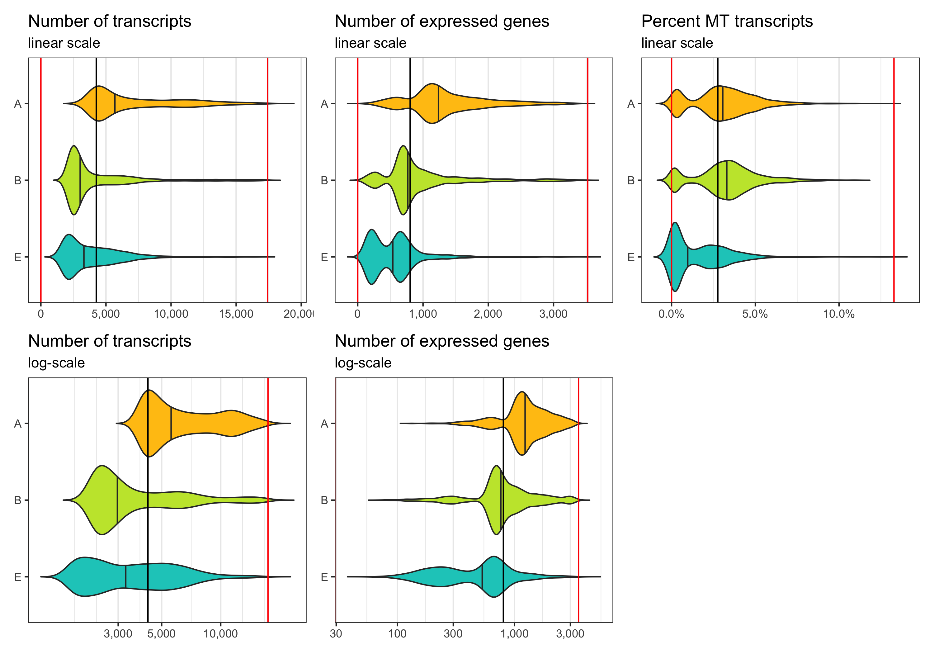
After filtering
Now we identify cells which meet the thresholds we identified.
Note that the violin plots extending beyond the indicated cut-offs does not mean that the filtering didn’t work.
The reason they do that is because the distribution is smoothened and I switched off trimming in the geom_violin() call.
cells_filtered <- cells %>%
  dplyr::filter(
    nCount >= thresholds_nCount[1],
    nCount <= thresholds_nCount[2],
    nFeature >= thresholds_nFeature[1],
    nFeature <= thresholds_nFeature[2],
    percent_MT >= thresholds_percent_MT[1],
    percent_MT <= thresholds_percent_MT[2]
  )

DataFrame(cells_filtered)
# DataFrame with 5395 rows and 6 columns
#                    cell   sample    nCount  nFeature percent_MT multiplet_class
#             <character> <factor> <numeric> <integer>  <numeric>     <character>
# 1    AGTAGTCAGCTAAACA-A        A     11915       557 0.00260176         singlet
# 2    TTGGCAAAGGCAAAGA-A        A      4205      1027 0.02354340         singlet
# 3    CTACACCTCAACGAAA-A        A     11593       633 0.00517554         singlet
# 4    TCAGATGTCAGCGACC-A        A      4056      1226 0.06854043         singlet
# 5    ACGAGCCAGAACTGTA-A        A      4580      1256 0.03340611         singlet
# ...                 ...      ...       ...       ...        ...             ...
# 5391 AGTCTTTTCGAGAACG-E        E      2397       876 0.06090947         singlet
# 5392 GTAGGCCCAAGGACAC-E        E      3064       149 0.00163185         singlet
# 5393 AGGGAGTTCCTGTAGA-E        E      2405       699 0.01912682         singlet
# 5394 CATTCGCAGGTACTCT-E        E      2262       888 0.05393457         singlet
# 5395 TGATTTCAGGCTCAGA-E        E      2150       733 0.02325581         singlet
p1 <- ggplot(cells_filtered, aes(x = sample, y = nCount, fill = sample)) +
  geom_violin(draw_quantiles = c(0.5), scale = 'area', trim = FALSE) +
  geom_hline(yintercept = median_nCount, color = 'black') +
  geom_hline(yintercept = thresholds_nCount, color = 'red') +
  theme_bw() +
  scale_fill_manual(values = custom_colors$discrete) +
  scale_x_discrete(limits = rev(levels(cells_filtered$sample))) +
  scale_y_continuous(labels = scales::comma) +
  labs(title = 'Number of transcripts', subtitle = 'linear scale') +
  theme(
    axis.title = element_blank(),
    panel.grid.major.y = element_blank(),
    panel.grid.minor.y = element_blank(),
    legend.position = 'none'
  ) +
  coord_flip()

p2 <- ggplot(cells_filtered, aes(x = sample, y = nCount, fill = sample)) +
  geom_violin(draw_quantiles = c(0.5), scale = 'area', trim = FALSE) +
  geom_hline(yintercept = median_nCount, color = 'black') +
  geom_hline(yintercept = thresholds_nCount, color = 'red') +
  theme_bw() +
  scale_fill_manual(values = custom_colors$discrete) +
  scale_x_discrete(limits = rev(levels(cells_filtered$sample))) +
  scale_y_log10(labels = scales::comma) +
  labs(title = 'Number of transcripts', subtitle = 'log-scale') +
  theme(
    axis.title = element_blank(),
    panel.grid.major.y = element_blank(),
    panel.grid.minor.y = element_blank(),
    legend.position = 'none'
  ) +
  coord_flip()

p3 <- ggplot(cells_filtered, aes(x = sample, y = nFeature, fill = sample)) +
  geom_violin(draw_quantiles = c(0.5), scale = 'area', trim = FALSE) +
  geom_hline(yintercept = median_nFeature, color = 'black') +
  geom_hline(yintercept = thresholds_nFeature, color = 'red') +
  theme_bw() +
  scale_fill_manual(values = custom_colors$discrete) +
  scale_x_discrete(limits = rev(levels(cells_filtered$sample))) +
  scale_y_continuous(labels = scales::comma) +
  labs(title = 'Number of expressed genes', subtitle = 'linear scale') +
  theme(
    axis.title = element_blank(),
    panel.grid.major.y = element_blank(),
    panel.grid.minor.y = element_blank(),
    legend.position = 'none'
  ) +
  coord_flip()

p4 <- ggplot(cells_filtered, aes(x = sample, y = nFeature, fill = sample)) +
  geom_violin(draw_quantiles = c(0.5), scale = 'area', trim = FALSE) +
  geom_hline(yintercept = median_nFeature, color = 'black') +
  geom_hline(yintercept = thresholds_nFeature, color = 'red') +
  theme_bw() +
  scale_fill_manual(values = custom_colors$discrete) +
  scale_x_discrete(limits = rev(levels(cells_filtered$sample))) +
  scale_y_log10(labels = scales::comma) +
  labs(title = 'Number of expressed genes', subtitle = 'log-scale') +
  theme(
    axis.title = element_blank(),
    panel.grid.major.y = element_blank(),
    panel.grid.minor.y = element_blank(),
    legend.position = 'none'
  ) +
  coord_flip()

p5 <- ggplot(cells_filtered, aes(x = sample, y = percent_MT, fill = sample)) +
  geom_violin(draw_quantiles = c(0.5), scale = 'area', trim = FALSE) +
  geom_hline(yintercept = median_percent_MT, color = 'black') +
  geom_hline(yintercept = thresholds_percent_MT, color = 'red') +
  theme_bw() +
  scale_fill_manual(values = custom_colors$discrete) +
  scale_x_discrete(limits = rev(levels(cells_filtered$sample))) +
  scale_y_continuous(labels = scales::percent) +
  labs(title = 'Percent MT transcripts', subtitle = 'linear scale') +
  theme(
    axis.title = element_blank(),
    panel.grid.major.y = element_blank(),
    panel.grid.minor.y = element_blank(),
    legend.position = 'none'
  ) +
  coord_flip()

ggsave(
  'plots/qc_histogram_ncount_nfeature_percentmt_filtered.png',
  p1 + p3 + p5 +
  p2 + p4 + plot_layout(ncol = 3),
  height = 7, width = 10
)
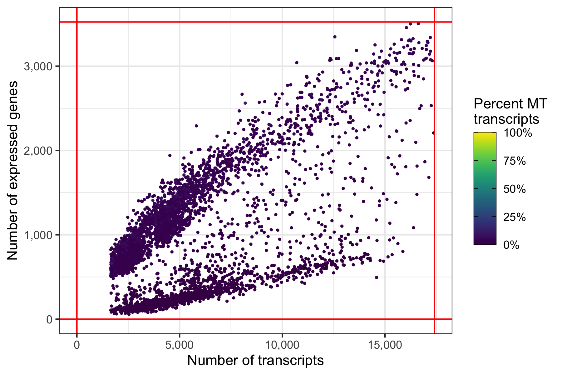
And again, another representation that now clearly highlights the lower boundaries that have been used to filter the cells in the samples.
p <- ggplot(cells_filtered, aes(nCount, nFeature, color = percent_MT)) +
  geom_point(size = 0.5) +
  geom_hline(yintercept = thresholds_nFeature, color = 'red') +
  geom_vline(xintercept = thresholds_nCount, color = 'red') +
  scale_x_continuous(name = 'Number of transcripts', labels = scales::comma) +
  scale_y_continuous(name = 'Number of expressed genes', labels = scales::comma) +
  theme_bw() +
  scale_color_viridis(
    name = 'Percent MT\ntranscripts',
    limits = c(0,1),
    labels = scales::percent,
    guide = guide_colorbar(frame.colour = 'black', ticks.colour = 'black')
  )

ggsave('plots/qc_nfeature_over_ncount_filtered.png', p, height = 4, width = 6)
cells_to_keep <- cells_filtered$cell
length(cells_to_keep)
# 5395
Out of the 6,000 cells we loaded from the three samples, we have 5,395 cells left after filtering.
Filter genes
As mentioned earlier, we will also remove genes which are expressed in fewer than 5 cells.
genes <- tibble(
  gene = rownames(transcripts$raw$merged),
  count = Matrix::rowSums(transcripts$raw$merged),
  cells = Matrix::rowSums(transcripts$raw$merged != 0)
)

genes_to_keep <- genes %>% dplyr::filter(cells >= 5) %>% pull(gene)
length(genes_to_keep)
# 16406
Applying this filter reduces the number of genes from ~33,000 to 16,406 genes.
Generate filtered transcript matrix
Here, we generate the new, filtered transcript count matrix.
transcripts$raw$filtered <- transcripts$raw$merged[genes_to_keep,cells_to_keep]

cells_per_sample_after_filtering <- tibble(
  sample = character(),
  before = numeric(),
  after = numeric()
)

for ( i in sample_names ) {
  tmp <- tibble(
    sample = i,
    before = grep(colnames(transcripts$raw$merged), pattern = paste0('-', i, '$')) %>% length(),
    after = grep(colnames(transcripts$raw$filtered), pattern = paste0('-', i, '$')) %>% length()
  )
  cells_per_sample_after_filtering <- bind_rows(cells_per_sample_after_filtering, tmp)
}

knitr::kable(cells_per_sample_after_filtering)
In the table below we see how many cells we had in every sample before and after filtering:
| sample | before | after |
|---|---|---|
| A | 2000 | 1696 |
| B | 2000 | 1818 |
| E | 2000 | 1881 |
Create Seurat object
Having the transcript count matrix ready, we can now initialize our Seurat object. Right after, we store the sample assignment for every cell in the meta data.
seurat <- CreateSeuratObject(
  counts = transcripts$raw$filtered,
  min.cells = 0,
  min.features = 0
)

seurat@meta.data$sample <- Cells(seurat) %>%
  strsplit('-') %>%
  vapply(FUN.VALUE = character(1), `[`, 2) %>%
  factor(levels = sample_names)
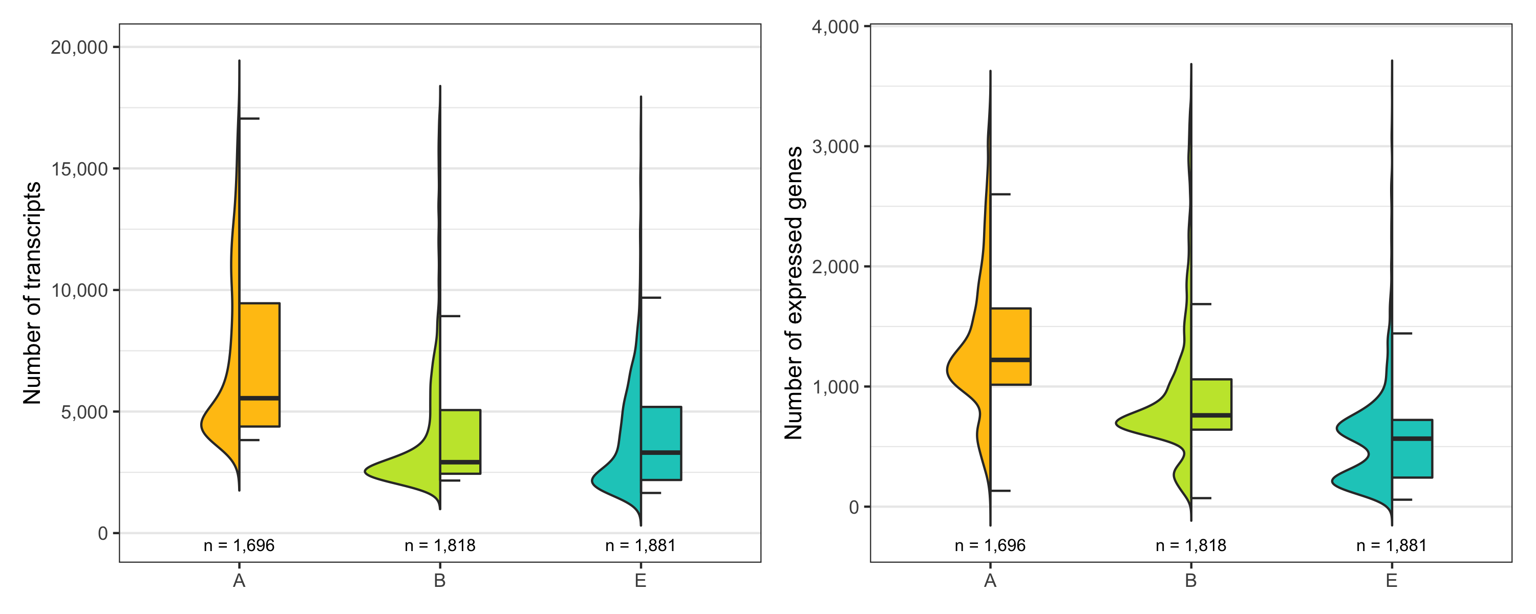
Just to be sure, let’s look at the distribution of number of transcripts and expressed genes per cell by sample once more.
temp_labels <- seurat@meta.data %>%
  group_by(sample) %>%
  tally()

p1 <- ggplot() +
  geom_half_violin(
    data = seurat@meta.data, aes(sample, nCount_RNA, fill = sample),
    side = 'l', show.legend = FALSE, trim = FALSE
  ) +
  geom_half_boxplot(
    data = seurat@meta.data, aes(sample, nCount_RNA, fill = sample),
    side = 'r', outlier.color = NA, width = 0.4, show.legend = FALSE
  ) +
  geom_text(
    data = temp_labels,
    aes(x = sample, y = -Inf, label = paste0('n = ', format(n, big.mark = ',', trim = TRUE)), vjust = -1),
    color = 'black', size = 2.8
  ) +
  scale_color_manual(values = custom_colors$discrete) +
  scale_fill_manual(values = custom_colors$discrete) +
  scale_y_continuous(labels = scales::comma, expand = c(0.08,0)) +
  theme_bw() +
  labs(x = '', y = 'Number of transcripts') +
  theme(
    panel.grid.major.x = element_blank(),
    axis.title.x = element_blank()
  )

p2 <- ggplot() +
  geom_half_violin(
    data = seurat@meta.data, aes(sample, nFeature_RNA, fill = sample),
    side = 'l', show.legend = FALSE, trim = FALSE
  ) +
  geom_half_boxplot(
    data = seurat@meta.data, aes(sample, nFeature_RNA, fill = sample),
    side = 'r', outlier.color = NA, width = 0.4, show.legend = FALSE
  ) +
  geom_text(
    data = temp_labels,
    aes(x = sample, y = -Inf, label = paste0('n = ', format(n, big.mark = ',', trim = TRUE)), vjust = -1),
    color = 'black', size = 2.8
  ) +
  scale_color_manual(values = custom_colors$discrete) +
  scale_fill_manual(values = custom_colors$discrete) +
  scale_y_continuous(
    name = 'Number of expressed genes',
    labels = scales::comma, expand = c(0.08,0)
  ) +
  theme_bw() +
  theme(
    panel.grid.major.x = element_blank(),
    axis.title.x = element_blank()
  )

ggsave(
  'plots/ncount_nfeature_by_sample.png',
  p1 + p2 + plot_layout(ncol = 2), height = 4, width = 10
)
Normalize expression data
Next, we normalize the raw transcript counts (so that every cell has the same number of transcripts) and apply a log-scale.
This can be done in different ways with different tools.
The SCTransform() and NormalizeData() methods from the Seurat package and the logNormCounts() function from scran seem to work well.
seurat <- SCTransform(seurat, assay = 'RNA')
sce <- SingleCellExperiment(list(counts = seurat@assays$RNA@counts))
sce <- scater::logNormCounts(sce)

seurat@assays$RNA@data <- as(logcounts(sce), 'dgCMatrix')
seurat <- NormalizeData(
  seurat,
  assay = 'RNA',
  normalization.method = 'LogNormalize',
  scale.factor = median(seurat@meta.data$nCount_RNA)
)
(Optional) Data integration
In some cases, e.g. when there are evident batch effects due to different preparation techniques, it might make sense to integrate data sets. Again, many methods exist to perform this task. The data integration procedure built into the Seurat package has proven to work well [3] and I’ve personally had good experience with it. For the samples analyzed here, we don’t need it though and will skip this part.
seurat_list <- SplitObject(seurat, split.by = 'sample')

seurat_list <- lapply(
  X = seurat_list,
  FUN = function(x) {
    x <- SCTransform(x)
  }
)

seurat_features <- SelectIntegrationFeatures(
  seurat_list,
  nfeatures = 3000
)

seurat_list <- PrepSCTIntegration(
  seurat_list,
  anchor.features = seurat_features
)

seurat_anchors <- FindIntegrationAnchors(
  object.list = seurat_list,
  anchor.features = seurat_features,
  normalization.method = 'SCT',
  reference = which(grepl(names(seurat_list), pattern = 'AML') == FALSE)
)

seurat <- IntegrateData(
  anchorset = seurat_anchors,
  normalization.method = 'SCT'
)

seurat@meta.data$sample <- Cells(seurat) %>%
  strsplit('-') %>%
  vapply(FUN.VALUE = character(1), `[`, 2)
seurat@meta.data$sample <- seurat@meta.data$sample %>%
  factor(levels = sample_names[which(sample_names %in% .)])
seurat_list <- SplitObject(seurat, split.by = 'sample')

seurat_list <- lapply(
  X = seurat_list,
  FUN = function(x) {
    x <- SCTransform(x)
  }
)

seurat_features <- SelectIntegrationFeatures(
  seurat_list,
  nfeatures = 3000
)

seurat_list <- PrepSCTIntegration(
  seurat_list,
  anchor.features = seurat_features
)

seurat_list <- lapply(
  X = seurat_list,
  FUN = RunPCA,
  verbose = FALSE,
  features = seurat_features
)

seurat_anchors <- FindIntegrationAnchors(
  object.list = seurat_list,
  anchor.features = seurat_features,
  normalization.method = 'SCT',
  reduction = 'rpca',
  reference = which(grepl(names(seurat_list), pattern = 'AML') == FALSE)
)

seurat <- IntegrateData(
  anchorset = seurat_anchors,
  normalization.method = 'SCT'
)

seurat@meta.data$sample <- Cells(seurat) %>%
  strsplit('-') %>%
  vapply(FUN.VALUE = character(1), `[`, 2)
seurat@meta.data$sample <- seurat@meta.data$sample %>%
  factor(levels = sample_names[which(sample_names %in% .)])
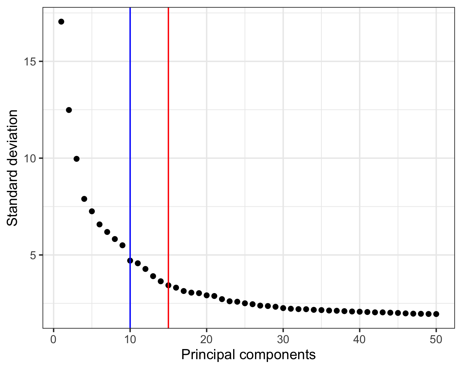
Principal component analysis
Principal component analysis (PCA) is frequently used as a first step to reduce the dimensionality of the data set.
Here, we calculate the first 50 principal components.
Then, we must choose how many to continue the analysis with.
In a recent paper by Germain et al. [2], it is suggested to use the maxLikGlobalDimEst() function from the intrinsicDimension package to test the dimensionality of the data set.
For this, one must also choose a value for the parameter k.
In my experience, values in the range of 10-20 give reasonable and not too different results.
In the plot of the PCA results shown below, I highlight the output value of maxLikGlobalDimEst() (blue line), which here is close to 10.
In my opinion, that is an underestimation so I will proceed with the first 15 PCs (red line).
Also, it is generally better to be generous with PCs as compared to using too few.
seurat <- RunPCA(seurat, assay = 'SCT', npcs = 50)

intrinsicDimension::maxLikGlobalDimEst(seurat@reductions$pca@cell.embeddings, k = 10)
# 10.44694

p <- tibble(
    PC = 1:50,
    stdev = seurat@reductions$pca@stdev
  ) %>%
  ggplot(aes(PC, stdev)) +
  geom_point() +
  geom_vline(xintercept = 10, color = 'blue') +
  geom_vline(xintercept = 15, color = 'red') +
  theme_bw() +
  labs(x = 'Principal components', y = 'Standard deviation')

ggsave('plots/principal_components.png', p, height = 4, width = 5)
Clustering
Time to identify clusters of cells with relatively homogeneous transcription profiles.
Define cluster
We use the FindNeighbors() and FindClusters() functions built into Seurat to cluster the cells in our data set.
seurat <- FindNeighbors(seurat, reduction = 'pca', dims = 1:15)
seurat <- FindClusters(seurat, resolution = 0.8)
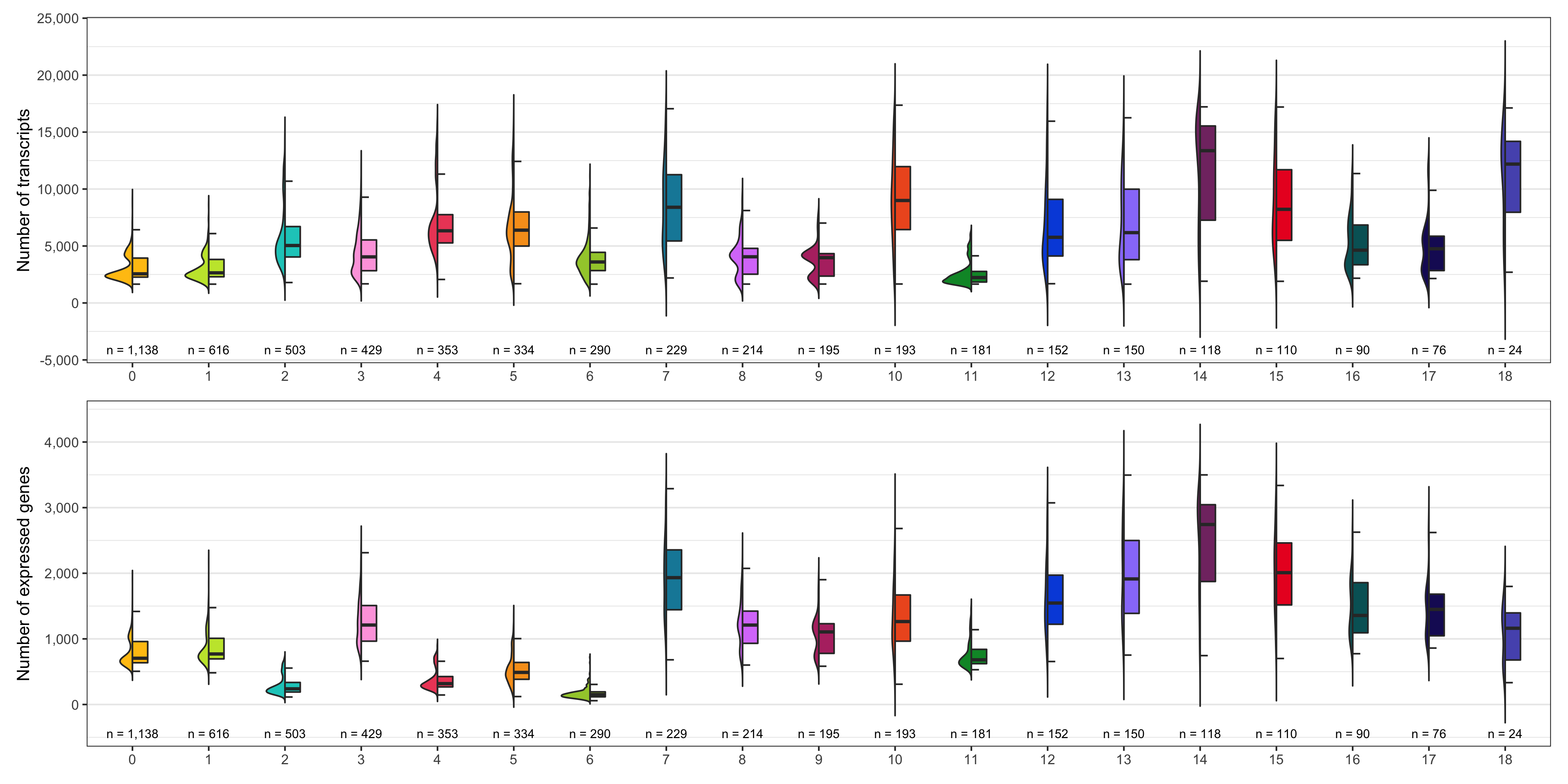
Number of transcripts and expressed genes
As we did for the samples, we check the average number of transcripts and expressed genes for every cluster.
temp_labels <- seurat@meta.data %>%
  group_by(seurat_clusters) %>%
  tally()

p1 <- ggplot() +
  geom_half_violin(
    data = seurat@meta.data, aes(seurat_clusters, nCount_RNA, fill = seurat_clusters),
    side = 'l', show.legend = FALSE, trim = FALSE
  ) +
  geom_half_boxplot(
    data = seurat@meta.data, aes(seurat_clusters, nCount_RNA, fill = seurat_clusters),
    side = 'r', outlier.color = NA, width = 0.4, show.legend = FALSE
  ) +
  geom_text(
    data = temp_labels,
    aes(x = seurat_clusters, y = -Inf, label = paste0('n = ', format(n, big.mark = ',', trim = TRUE)), vjust = -1),
    color = 'black', size = 2.8
  ) +
  scale_color_manual(values = custom_colors$discrete) +
  scale_fill_manual(values = custom_colors$discrete) +
  scale_y_continuous(name = 'Number of transcripts', labels = scales::comma, expand = c(0.08, 0)) +
  theme_bw() +
  theme(
    panel.grid.major.x = element_blank(),
    axis.title.x = element_blank()
  )

p2 <- ggplot() +
  geom_half_violin(
    data = seurat@meta.data, aes(seurat_clusters, nFeature_RNA, fill = seurat_clusters),
    side = 'l', show.legend = FALSE, trim = FALSE
  ) +
  geom_half_boxplot(
    data = seurat@meta.data, aes(seurat_clusters, nFeature_RNA, fill = seurat_clusters),
    side = 'r', outlier.color = NA, width = 0.4, show.legend = FALSE
  ) +
  geom_text(
    data = temp_labels,
    aes(x = seurat_clusters, y = -Inf, label = paste0('n = ', format(n, big.mark = ',', trim = TRUE)), vjust = -1),
    color = 'black', size = 2.8
  ) +
  scale_color_manual(values = custom_colors$discrete) +
  scale_fill_manual(values = custom_colors$discrete) +
  scale_y_continuous(name = 'Number of expressed genes', labels = scales::comma, expand = c(0.08, 0)) +
  theme_bw() +
  theme(
    panel.grid.major.x = element_blank(),
    axis.title.x = element_blank()
  )

ggsave(
  'plots/ncount_nfeature_by_cluster.png',
  p1 + p2 + plot_layout(ncol = 1),
  height = 7, width = 14
)
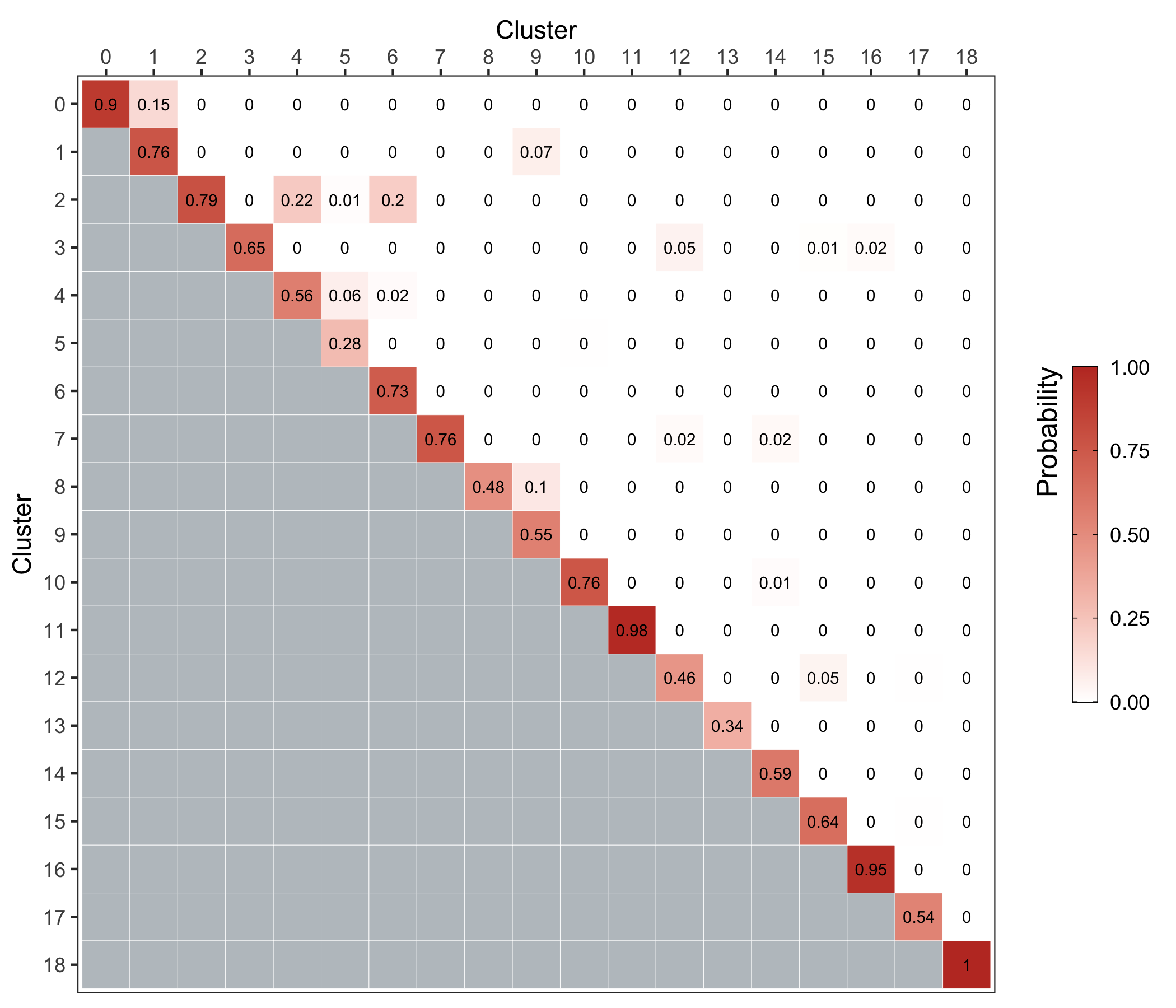
Cluster stability
We use the bootstrapCluster() function from the scran package as described here.
We represent the co-assignment probabilities as a heatmap.
sce <- as.SingleCellExperiment(seurat)
reducedDim(sce, 'PCA_sub') <- reducedDim(sce, 'PCA')[,1:15, drop = FALSE]

ass_prob <- bootstrapCluster(sce, FUN = function(x) {
    g <- buildSNNGraph(x, use.dimred = 'PCA_sub')
    igraph::cluster_walktrap(g)$membership
  },
  clusters = sce$seurat_clusters
)

p <- ass_prob %>%
  as_tibble() %>%
  rownames_to_column(var = 'cluster_1') %>%
  pivot_longer(
    cols = 2:ncol(.),
    names_to = 'cluster_2',
    values_to = 'probability'
  ) %>%
  mutate(
    cluster_1 = as.character(as.numeric(cluster_1) - 1),
    cluster_1 = factor(cluster_1, levels = rev(unique(cluster_1))),
    cluster_2 = factor(cluster_2, levels = unique(cluster_2))
  ) %>%
  ggplot(aes(cluster_2, cluster_1, fill = probability)) +
  geom_tile(color = 'white') +
  geom_text(aes(label = round(probability, digits = 2)), size = 2.5) +
  scale_x_discrete(name = 'Cluster', position = 'top') +
  scale_y_discrete(name = 'Cluster') +
  scale_fill_gradient(
    name = 'Probability', low = 'white', high = '#c0392b', na.value = '#bdc3c7',
    limits = c(0,1),
    guide = guide_colorbar(
      frame.colour = 'black', ticks.colour = 'black', title.position = 'left',
      title.theme = element_text(hjust = 1, angle = 90),
      barwidth = 0.75, barheight = 10
    )
  ) +
  coord_fixed() +
  theme_bw() +
  theme(
    legend.position = 'right',
    panel.grid.major = element_blank()
  )

ggsave('plots/cluster_stability.png', p, height = 6, width = 7)
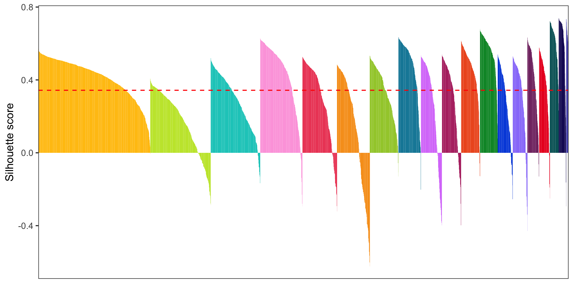
Silhouette plot
- General info about a silhouette plot: link
- Code to calculate silhouette score (from Seurat people): link
library(cluster)

distance_matrix <- dist(Embeddings(seurat[['pca']])[, 1:15])
clusters <- seurat@meta.data$seurat_clusters
silhouette <- silhouette(as.numeric(clusters), dist = distance_matrix)
seurat@meta.data$silhouette_score <- silhouette[,3]

mean_silhouette_score <- mean(seurat@meta.data$silhouette_score)

p <- seurat@meta.data %>%
  mutate(barcode = rownames(.)) %>%
  arrange(seurat_clusters,-silhouette_score) %>%
  mutate(barcode = factor(barcode, levels = barcode)) %>%
  ggplot() +
  geom_col(aes(barcode, silhouette_score, fill = seurat_clusters), show.legend = FALSE) +
  geom_hline(yintercept = mean_silhouette_score, color = 'red', linetype = 'dashed') +
  scale_x_discrete(name = 'Cells') +
  scale_y_continuous(name = 'Silhouette score') +
  scale_fill_manual(values = custom_colors$discrete) +
  theme_bw() +
  theme(
    axis.title.x = element_blank(),
    axis.text.x = element_blank(),
    axis.ticks.x = element_blank(),
    panel.grid.major = element_blank(),
    panel.grid.minor = element_blank()
  )
ggsave('plots/silhouette_plot.png', p, height = 4, width = 8)
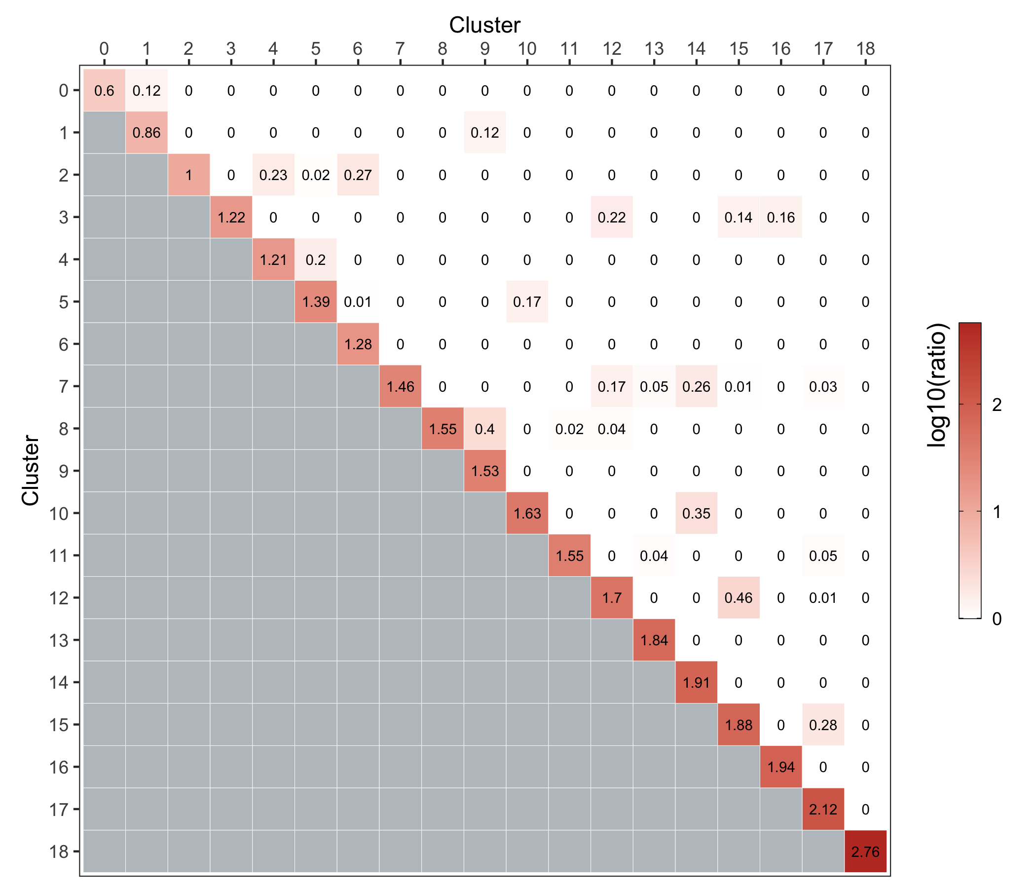
Cluster similarity
Here, we use the clusterModularity() function from the scran package as described here.
The heatmap below shows the difference between the observed and expected edge weights between each cluster pair.
sce <- as.SingleCellExperiment(seurat)

reducedDim(sce, 'PCA_sub') <- reducedDim(sce, 'PCA')[,1:15, drop = FALSE]

g <- scran::buildSNNGraph(sce, use.dimred = 'PCA_sub')

ratio <- scran::clusterModularity(g, seurat@meta.data$seurat_clusters, as.ratio = TRUE)

ratio_to_plot <- log10(ratio+1)

p <- ratio_to_plot %>%
  as_tibble() %>%
  rownames_to_column(var = 'cluster_1') %>%
  pivot_longer(
    cols = 2:ncol(.),
    names_to = 'cluster_2',
    values_to = 'probability'
  ) %>%
  mutate(
    cluster_1 = as.character(as.numeric(cluster_1) - 1),
    cluster_1 = factor(cluster_1, levels = rev(unique(cluster_1))),
    cluster_2 = factor(cluster_2, levels = unique(cluster_2))
  ) %>%
  ggplot(aes(cluster_2, cluster_1, fill = probability)) +
  geom_tile(color = 'white') +
  geom_text(aes(label = round(probability, digits = 2)), size = 2.5) +
  scale_x_discrete(name = 'Cluster', position = 'top') +
  scale_y_discrete(name = 'Cluster') +
  scale_fill_gradient(
    name = 'log10(ratio)', low = 'white', high = '#c0392b', na.value = '#bdc3c7',
    guide = guide_colorbar(
      frame.colour = 'black', ticks.colour = 'black', title.position = 'left',
      title.theme = element_text(hjust = 1, angle = 90),
      barwidth = 0.75, barheight = 10
    )
  ) +
  coord_fixed() +
  theme_bw() +
  theme(
    legend.position = 'right',
    panel.grid.major = element_blank()
  )

ggsave('plots/cluster_similarity.png', p, height = 6, width = 7)
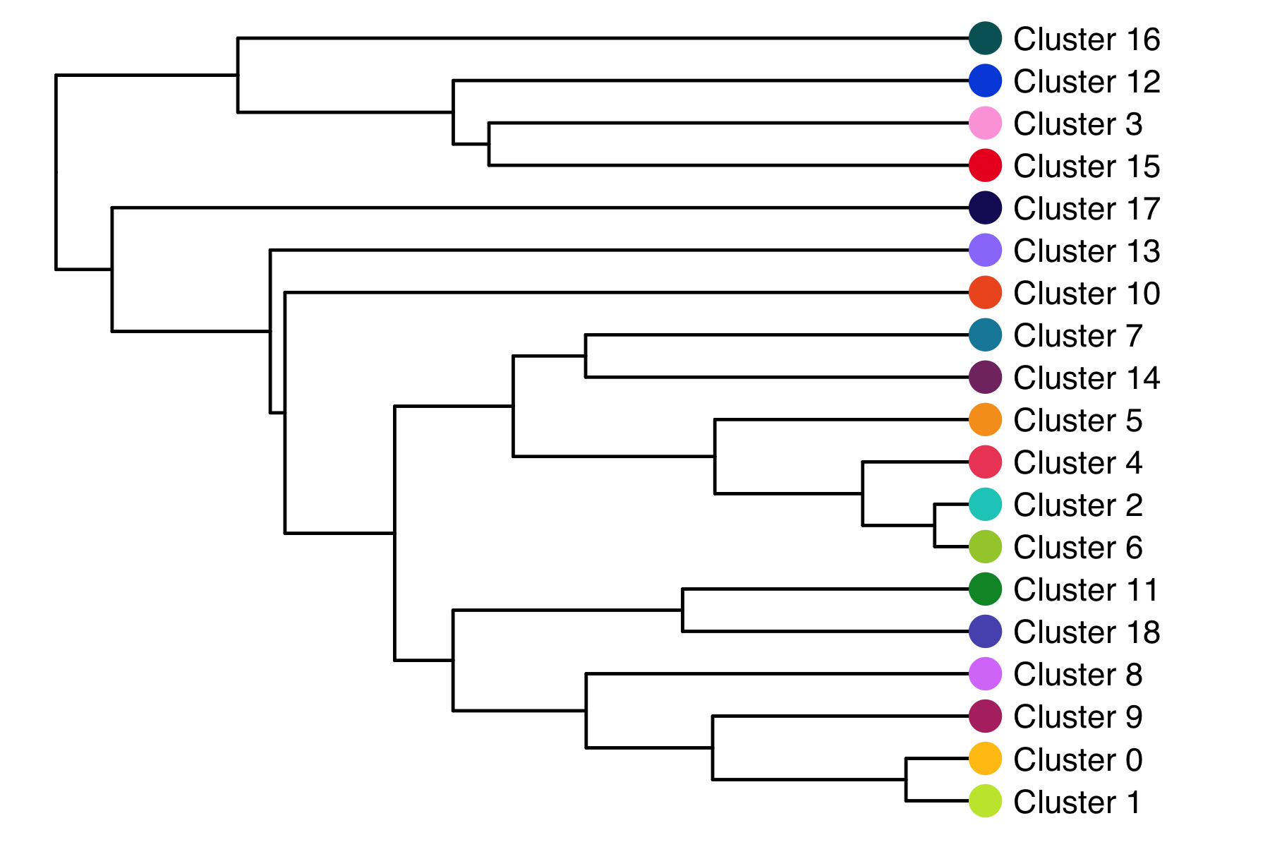
Cluster tree
The relationship (similarity) between clusters can be represented in a cluster tree. I find this useful to identify which clusters might be candidates for merging.
seurat <- BuildClusterTree(
  seurat,
  dims = 1:15,
  reorder = FALSE,
  reorder.numeric = FALSE
)

tree <- seurat@tools$BuildClusterTree
tree$tip.label <- paste0("Cluster ", tree$tip.label)

p <- ggtree::ggtree(tree, aes(x, y)) +
  scale_y_reverse() +
  ggtree::geom_tree() +
  ggtree::theme_tree() +
  ggtree::geom_tiplab(offset = 1) +
  ggtree::geom_tippoint(color = custom_colors$discrete[1:length(tree$tip.label)], shape = 16, size = 5) +
  coord_cartesian(clip = 'off') +
  theme(plot.margin = unit(c(0,2.5,0,0), 'cm'))

ggsave('plots/cluster_tree.png', p, height = 4, width = 6)
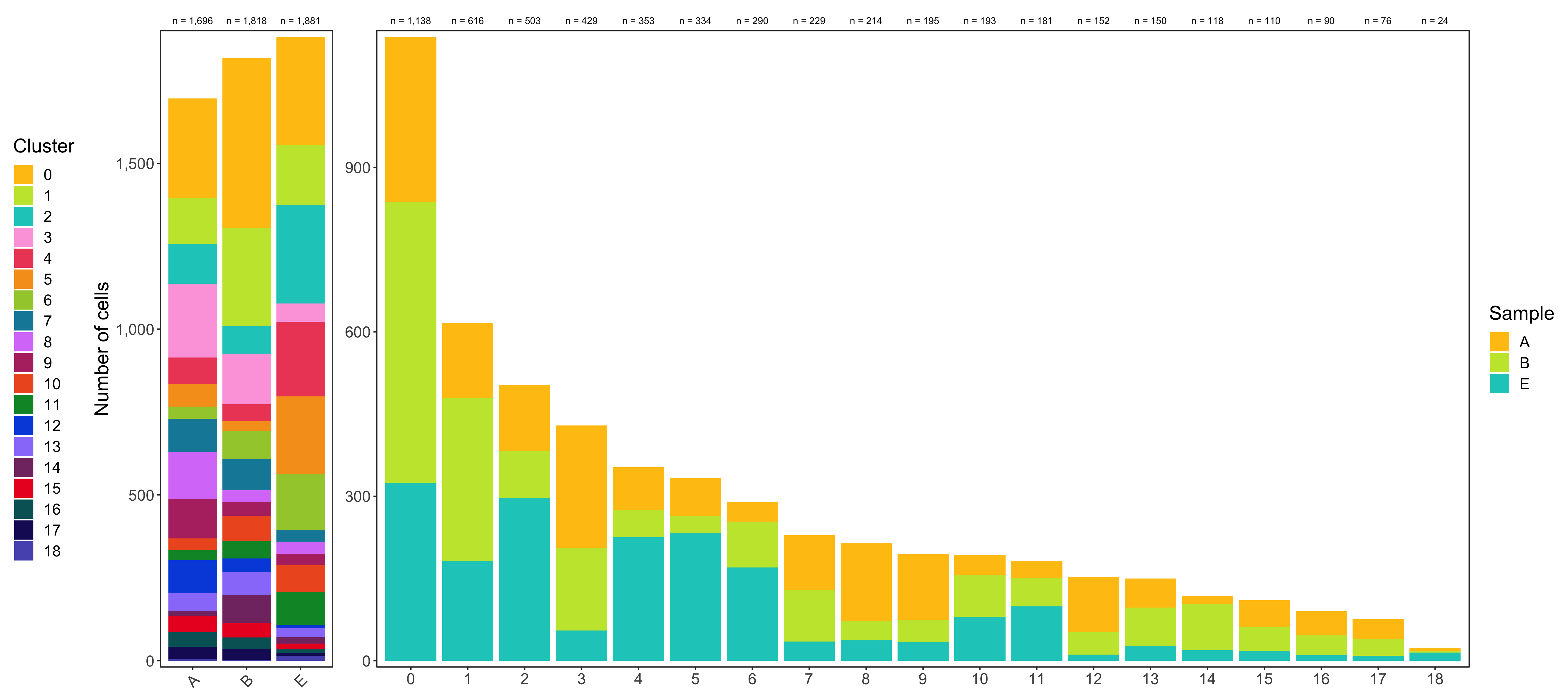
Composition of samples and clusters
Having two major groupings for our cells (sample and cluster), we can now check the composition of each with respect to the other, i.e. how are samples composed by clusters and how are cluster composed by samples? This gives us an idea whether some clusters are specific to one sample.
Samples:
table_samples_by_clusters <- seurat@meta.data %>%
group_by(sample, seurat_clusters) %>%
summarize(count = n()) %>%
spread(seurat_clusters, count, fill = 0) %>%
ungroup() %>%
mutate(total_cell_count = rowSums(.[c(2:ncol(.))])) %>%
dplyr::select(c('sample', 'total_cell_count', everything())) %>%
arrange(factor(sample, levels = levels(seurat@meta.data$sample)))
knitr::kable(table_samples_by_clusters)
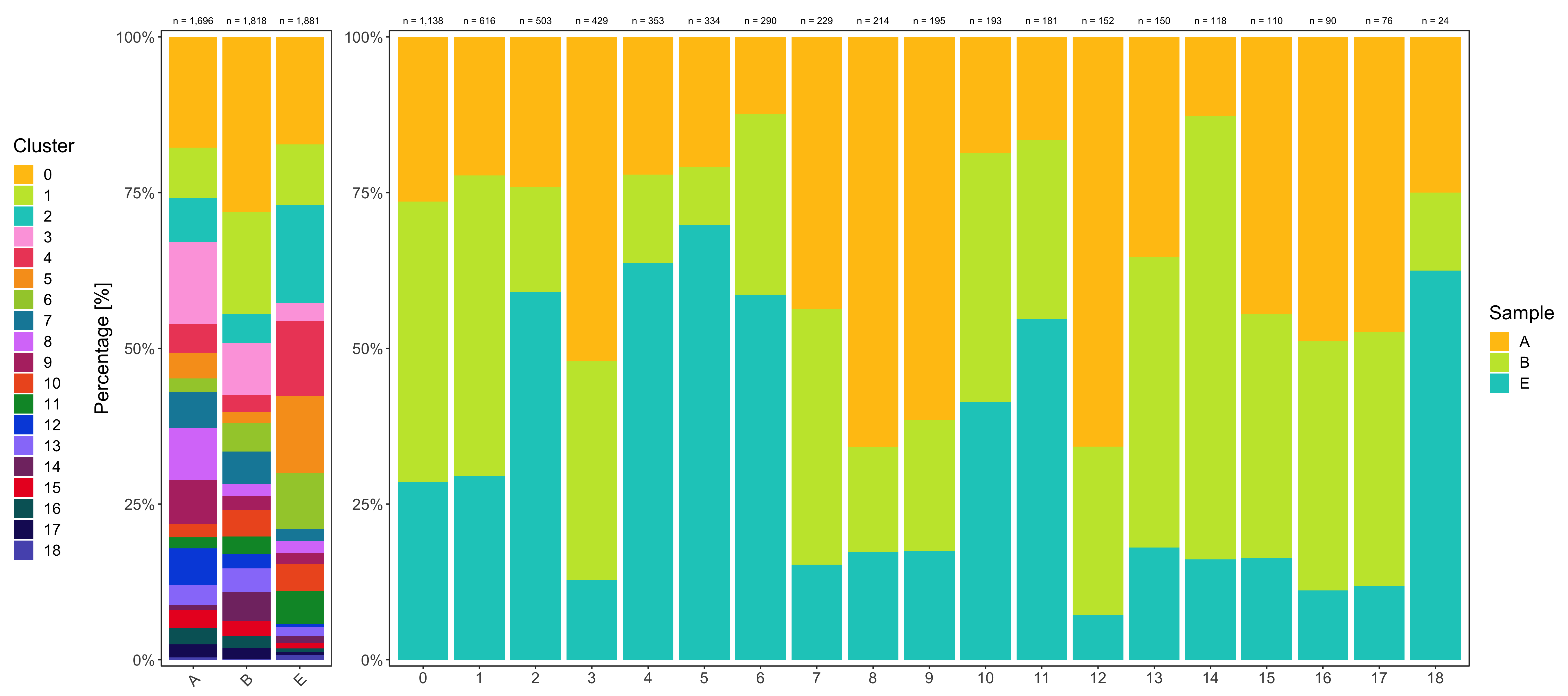
# |sample | total_cell_count| 0| 1| 2| 3| 4| 5| 6| 7| 8| 9| 10| 11| 12| 13| 14| 15| 16| 17| 18|
# |:------|----------------:|---:|---:|---:|---:|---:|---:|---:|---:|---:|---:|--:|--:|---:|--:|--:|--:|--:|--:|--:|
# |A | 1696| 301| 137| 121| 223| 78| 70| 36| 100| 141| 120| 36| 30| 100| 53| 15| 49| 44| 36| 6|
# |B | 1818| 512| 297| 85| 151| 50| 31| 84| 94| 36| 41| 77| 52| 41| 70| 84| 43| 36| 31| 3|
# |E | 1881| 325| 182| 297| 55| 225| 233| 170| 35| 37| 34| 80| 99| 11| 27| 19| 18| 10| 9| 15|
Clusters:
table_clusters_by_samples <- seurat@meta.data %>%
  dplyr::rename('cluster' = 'seurat_clusters') %>%
  group_by(cluster, sample) %>%
  summarize(count = n()) %>%
  spread(sample, count, fill = 0) %>%
  ungroup() %>%
  mutate(total_cell_count = rowSums(.[c(2:ncol(.))])) %>%
  select(c('cluster', 'total_cell_count', everything())) %>%
  arrange(factor(cluster, levels = levels(seurat@meta.data$seurat_clusters)))

knitr::kable(table_clusters_by_samples)
# |cluster | total_cell_count|   A|   B|   E|
# |:-------|----------------:|---:|---:|---:|
# |0       |             1138| 301| 512| 325|
# |1       |              616| 137| 297| 182|
# |2       |              503| 121|  85| 297|
# |3       |              429| 223| 151|  55|
# |4       |              353|  78|  50| 225|
# |5       |              334|  70|  31| 233|
# |6       |              290|  36|  84| 170|
# |7       |              229| 100|  94|  35|
# |8       |              214| 141|  36|  37|
# |9       |              195| 120|  41|  34|
# |10      |              193|  36|  77|  80|
# |11      |              181|  30|  52|  99|
# |12      |              152| 100|  41|  11|
# |13      |              150|  53|  70|  27|
# |14      |              118|  15|  84|  19|
# |15      |              110|  49|  43|  18|
# |16      |               90|  44|  36|  10|
# |17      |               76|  36|  31|   9|
# |18      |               24|   6|   3|  15|
Shown below is the composition of samples/clusters by actual number of cells.
temp_labels <- seurat@meta.data %>%
  group_by(sample) %>%
  tally()

p1 <- table_samples_by_clusters %>%
  select(-c('total_cell_count')) %>%
  reshape2::melt(id.vars = 'sample') %>%
  mutate(sample = factor(sample, levels = levels(seurat@meta.data$sample))) %>%
  ggplot(aes(sample, value)) +
  geom_bar(aes(fill = variable), position = 'stack', stat = 'identity') +
  geom_text(
    data = temp_labels,
    aes(x = sample, y = Inf, label = paste0('n = ', format(n, big.mark = ',', trim = TRUE)), vjust = -1),
    color = 'black', size = 2.8
  ) +
  scale_fill_manual(name = 'Cluster', values = custom_colors$discrete) +
  scale_y_continuous(name = 'Number of cells', labels = scales::comma, expand = c(0.01, 0)) +
  coord_cartesian(clip = 'off') +
  theme_bw() +
  theme(
    legend.position = 'left',
    plot.title = element_text(hjust = 0.5),
    text = element_text(size = 16),
    panel.grid.major = element_blank(),
    panel.grid.minor = element_blank(),
    axis.title.x = element_blank(),
    axis.text.x = element_text(angle = 45, hjust = 1, vjust = 1),
    plot.margin = margin(t = 20, r = 0, b = 0, l = 0, unit = 'pt')
  )

temp_labels <- seurat@meta.data %>%
  group_by(seurat_clusters) %>%
  tally() %>%
  dplyr::rename('cluster' = seurat_clusters)

p2 <- table_clusters_by_samples %>%
  select(-c('total_cell_count')) %>%
  reshape2::melt(id.vars = 'cluster') %>%
  mutate(cluster = factor(cluster, levels = levels(seurat@meta.data$seurat_clusters))) %>%
  ggplot(aes(cluster, value)) +
  geom_bar(aes(fill = variable), position = 'stack', stat = 'identity') +
  geom_text(
    data = temp_labels,
    aes(x = cluster, y = Inf, label = paste0('n = ', format(n, big.mark = ',', trim = TRUE)), vjust = -1),
    color = 'black', size = 2.8
  ) +
  scale_fill_manual(name = 'Sample', values = custom_colors$discrete) +
  scale_y_continuous(labels = scales::comma, expand = c(0.01, 0)) +
  coord_cartesian(clip = 'off') +
  theme_bw() +
  theme(
    legend.position = 'right',
    plot.title = element_text(hjust = 0.5),
    text = element_text(size = 16),
    panel.grid.major = element_blank(),
    panel.grid.minor = element_blank(),
    axis.title = element_blank(),
    plot.margin = margin(t = 20, r = 0, b = 0, l = 10, unit = 'pt')
  )

ggsave(
  'plots/composition_samples_clusters_by_number.png',
  p1 + p2 +
  plot_layout(ncol = 2, widths = c(
    seurat@meta.data$sample %>% unique() %>% length(),
    seurat@meta.data$seurat_clusters %>% unique() %>% length()
  )),
  width = 18, height = 8
)
Shown below is the composition of samples/clusters by percent of cells.
temp_labels <- seurat@meta.data %>%
  group_by(sample) %>%
  tally()

p1 <- table_samples_by_clusters %>%
  select(-c('total_cell_count')) %>%
  reshape2::melt(id.vars = 'sample') %>%
  mutate(sample = factor(sample, levels = levels(seurat@meta.data$sample))) %>%
  ggplot(aes(sample, value)) +
  geom_bar(aes(fill = variable), position = 'fill', stat = 'identity') +
  geom_text(
    data = temp_labels,
    aes(x = sample, y = Inf, label = paste0('n = ', format(n, big.mark = ',', trim = TRUE)), vjust = -1),
    color = 'black', size = 2.8
  ) +
  scale_fill_manual(name = 'Cluster', values = custom_colors$discrete) +
  scale_y_continuous(name = 'Percentage [%]', labels = scales::percent_format(), expand = c(0.01,0)) +
  coord_cartesian(clip = 'off') +
  theme_bw() +
  theme(
    legend.position = 'left',
    plot.title = element_text(hjust = 0.5),
    text = element_text(size = 16),
    panel.grid.major = element_blank(),
    panel.grid.minor = element_blank(),
    axis.title.x = element_blank(),
    axis.text.x = element_text(angle = 45, hjust = 1, vjust = 1),
    plot.margin = margin(t = 20, r = 0, b = 0, l = 0, unit = 'pt')
  )

temp_labels <- seurat@meta.data %>%
  group_by(seurat_clusters) %>%
  tally() %>%
  dplyr::rename('cluster' = seurat_clusters)

p2 <- table_clusters_by_samples %>%
  select(-c('total_cell_count')) %>%
  reshape2::melt(id.vars = 'cluster') %>%
  mutate(cluster = factor(cluster, levels = levels(seurat@meta.data$seurat_clusters))) %>%
  ggplot(aes(cluster, value)) +
  geom_bar(aes(fill = variable), position = 'fill', stat = 'identity') +
  geom_text(
    data = temp_labels, aes(x = cluster, y = Inf, label = paste0('n = ', format(n, big.mark = ',', trim = TRUE)), vjust = -1),
    color = 'black', size = 2.8
  ) +
  scale_fill_manual(name = 'Sample', values = custom_colors$discrete) +
  scale_y_continuous(name = 'Percentage [%]', labels = scales::percent_format(), expand = c(0.01,0)) +
  coord_cartesian(clip = 'off') +
  theme_bw() +
  theme(
    legend.position = 'right',
    plot.title = element_text(hjust = 0.5),
    text = element_text(size = 16),
    panel.grid.major = element_blank(),
    panel.grid.minor = element_blank(),
    axis.title = element_blank(),
    plot.margin = margin(t = 20, r = 0, b = 0, l = 10, unit = 'pt')
  )

ggsave(
  'plots/composition_samples_clusters_by_percent.png',
  p1 + p2 +
  plot_layout(ncol = 2, widths = c(
    seurat@meta.data$sample %>% unique() %>% length(),
    seurat@meta.data$seurat_clusters %>% unique() %>% length()
  )),
  width = 18, height = 8
)
Cell cycle analysis
Using the CellCycleScoring() function of Seurat, we can assign a cell cycle phase (G1, S, G2M) to every cell.
Infer cell cycle status
seurat <- CellCycleScoring(
  seurat,
  assay = 'SCT',
  s.features = cc.genes$s.genes,
  g2m.features = cc.genes$g2m.genes
)

seurat@meta.data$cell_cycle_seurat <- seurat@meta.data$Phase
seurat@meta.data$Phase <- NULL
seurat@meta.data$cell_cycle_seurat <- factor(
  seurat@meta.data$cell_cycle_seurat, levels = c('G1', 'S', 'G2M')
)
Composition of samples and clusters by cell cycle
Now check the cell cycle phase distribution for every sample and cluster.
Samples:
table_samples_by_cell_cycle <- seurat@meta.data %>%
  group_by(sample, cell_cycle_seurat) %>%
  summarize(count = n()) %>%
  spread(cell_cycle_seurat, count, fill = 0) %>%
  ungroup() %>%
  mutate(total_cell_count = rowSums(.[c(2:ncol(.))])) %>%
  dplyr::select(c('sample', 'total_cell_count', everything())) %>%
  arrange(factor(sample, levels = levels(seurat@meta.data$cell_cycle_seurat)))

knitr::kable(table_samples_by_cell_cycle)
# |sample | total_cell_count|   G1|   S| G2M|
# |:------|----------------:|----:|---:|---:|
# |A      |             1696| 1159| 334| 203|
# |B      |             1818| 1001| 413| 404|
# |E      |             1881| 1303| 278| 300|
Clusters:
table_clusters_by_cell_cycle <- seurat@meta.data %>%
  dplyr::rename(cluster = seurat_clusters) %>%
  group_by(cluster, cell_cycle_seurat) %>%
  summarize(count = n()) %>%
  spread(cell_cycle_seurat, count, fill = 0) %>%
  ungroup() %>%
  mutate(total_cell_count = rowSums(.[c(2:ncol(.))])) %>%
  dplyr::select(c('cluster', 'total_cell_count', everything())) %>%
  arrange(factor(cluster, levels = levels(seurat@meta.data$cell_cycle_seurat)))

knitr::kable(table_clusters_by_cell_cycle)
# |cluster | total_cell_count|  G1|   S| G2M|
# |:-------|----------------:|---:|---:|---:|
# |0       |             1138| 814| 201| 123|
# |1       |              616| 417| 105|  94|
# |2       |              503| 322|  97|  84|
# |3       |              429| 381|   6|  42|
# |4       |              353| 232|  70|  51|
# |5       |              334| 253|  28|  53|
# |6       |              290| 179|  46|  65|
# |7       |              229| 146|  71|  12|
# |8       |              214| 171|  20|  23|
# |9       |              195| 133|  38|  24|
# |10      |              193|   0|  47| 146|
# |11      |              181| 130|  29|  22|
# |12      |              152|  34|  76|  42|
# |13      |              150|  21|  74|  55|
# |14      |              118|   0|  76|  42|
# |15      |              110|  62|  29|  19|
# |16      |               90|  84|   2|   4|
# |17      |               76|  61|   9|   6|
# |18      |               24|  23|   1|   0|
Shown below is the composition of samples/clusters by actual number of cells.
temp_labels <- seurat@meta.data %>%
  group_by(sample) %>%
  tally()

p1 <- table_samples_by_cell_cycle %>%
  select(-c('total_cell_count')) %>%
  reshape2::melt(id.vars = 'sample') %>%
  mutate(sample = factor(sample, levels = levels(seurat@meta.data$sample))) %>%
  ggplot(aes(sample, value)) +
  geom_bar(aes(fill = variable), position = 'stack', stat = 'identity') +
  geom_text(
    data = temp_labels,
    aes(x = sample, y = Inf, label = paste0('n = ', format(n, big.mark = ',', trim = TRUE)), vjust = -1),
    color = 'black', size = 2.8
  ) +
  scale_fill_manual(name = 'Cell cycle', values = custom_colors$cell_cycle) +
  scale_y_continuous(name = 'Number of cells', labels = scales::comma, expand = c(0.01,0)) +
  coord_cartesian(clip = 'off') +
  theme_bw() +
  theme(
    legend.position = 'none',
    plot.title = element_text(hjust = 0.5),
    text = element_text(size = 16),
    panel.grid.major = element_blank(),
    panel.grid.minor = element_blank(),
    axis.title.x = element_blank(),
    axis.text.x = element_text(angle = 45, hjust = 1, vjust = 1),
    plot.margin = margin(t = 20, r = 0, b = 0, l = 0, unit = 'pt')
  )

temp_labels <- seurat@meta.data %>%
  group_by(seurat_clusters) %>%
  tally() %>%
  dplyr::rename('cluster' = seurat_clusters)

p2 <- table_clusters_by_cell_cycle %>%
  select(-c('total_cell_count')) %>%
  reshape2::melt(id.vars = 'cluster') %>%
  mutate(cluster = factor(cluster, levels = levels(seurat@meta.data$seurat_clusters))) %>%
  ggplot(aes(cluster, value)) +
  geom_bar(aes(fill = variable), position = 'stack', stat = 'identity') +
  geom_text(
    data = temp_labels,
    aes(x = cluster, y = Inf, label = paste0('n = ', format(n, big.mark = ',', trim = TRUE)), vjust = -1),
    color = 'black', size = 2.8
  ) +
  scale_fill_manual(name = 'Cell cycle', values = custom_colors$cell_cycle) +
  scale_y_continuous(name = 'Number of cells', labels = scales::comma, expand = c(0.01,0)) +
  coord_cartesian(clip = 'off') +
  theme_bw() +
  theme(
    legend.position = 'right',
    plot.title = element_text(hjust = 0.5),
    text = element_text(size = 16),
    panel.grid.major = element_blank(),
    panel.grid.minor = element_blank(),
    axis.title = element_blank(),
    plot.margin = margin(t = 20, r = 0, b = 0, l = 10, unit = 'pt')
  )

ggsave(
  'plots/composition_samples_clusters_by_cell_cycle_by_number.png',
  p1 + p2 +
  plot_layout(ncol = 2, widths = c(
    seurat@meta.data$sample %>% unique() %>% length(),
    seurat@meta.data$seurat_clusters %>% unique() %>% length()
  )),
  width = 18, height = 8
)
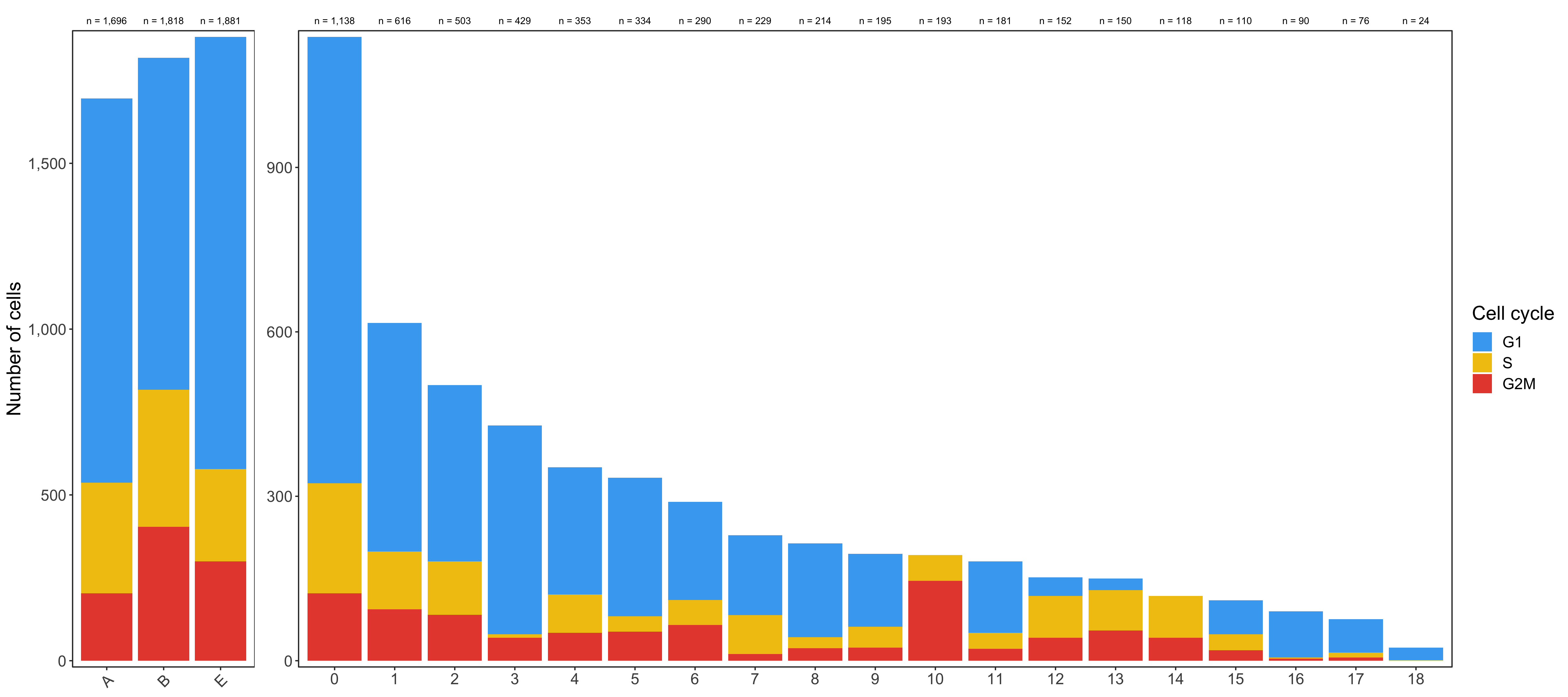
Shown below is the composition of samples/clusters by percent of cells.
temp_labels <- seurat@meta.data %>%
  group_by(sample) %>%
  tally()

p1 <- table_samples_by_cell_cycle %>%
  select(-c('total_cell_count')) %>%
  reshape2::melt(id.vars = 'sample') %>%
  mutate(sample = factor(sample, levels = levels(seurat@meta.data$sample))) %>%
  ggplot(aes(sample, value)) +
  geom_bar(aes(fill = variable), position = 'fill', stat = 'identity') +
  geom_text(
    data = temp_labels,
    aes(x = sample, y = Inf, label = paste0('n = ', format(n, big.mark = ',', trim = TRUE)), vjust = -1),
    color = 'black', size = 2.8
  ) +
  scale_fill_manual(name = 'Cell cycle', values = custom_colors$cell_cycle) +
  scale_y_continuous(name = 'Percentage [%]', labels = scales::percent_format(), expand = c(0.01,0)) +
  coord_cartesian(clip = 'off') +
  theme_bw() +
  theme(
    legend.position = 'none',
    plot.title = element_text(hjust = 0.5),
    text = element_text(size = 16),
    panel.grid.major = element_blank(),
    panel.grid.minor = element_blank(),
    axis.title.x = element_blank(),
    axis.text.x = element_text(angle = 45, hjust = 1, vjust = 1),
    plot.margin = margin(t = 20, r = 0, b = 0, l = 0, unit = 'pt')
  )

temp_labels <- seurat@meta.data %>%
  group_by(seurat_clusters) %>%
  tally() %>%
  dplyr::rename('cluster' = seurat_clusters)

p2 <- table_clusters_by_cell_cycle %>%
  select(-c('total_cell_count')) %>%
  reshape2::melt(id.vars = 'cluster') %>%
  mutate(cluster = factor(cluster, levels = levels(seurat@meta.data$seurat_clusters))) %>%
  ggplot(aes(cluster, value)) +
  geom_bar(aes(fill = variable), position = 'fill', stat = 'identity') +
  geom_text(
    data = temp_labels,
    aes(x = cluster, y = Inf, label = paste0('n = ', format(n, big.mark = ',', trim = TRUE)), vjust = -1),
    color = 'black', size = 2.8
  ) +
  scale_fill_manual(name = 'Cell cycle', values = custom_colors$cell_cycle) +
  scale_y_continuous(name = 'Percentage [%]', labels = scales::percent_format(), expand = c(0.01,0)) +
  coord_cartesian(clip = 'off') +
  theme_bw() +
  theme(
    legend.position = 'right',
    plot.title = element_text(hjust = 0.5),
    text = element_text(size = 16),
    panel.grid.major = element_blank(),
    panel.grid.minor = element_blank(),
    axis.title = element_blank(),
    plot.margin = margin(t = 20, r = 0, b = 0, l = 10, unit = 'pt')
  )

ggsave(
  'plots/composition_samples_clusters_by_cell_cycle_by_percent.png',
  p1 + p2 +
  plot_layout(ncol = 2, widths = c(
    seurat@meta.data$sample %>% unique() %>% length(),
    seurat@meta.data$seurat_clusters %>% unique() %>% length()
  )),
  width = 18, height = 8
)
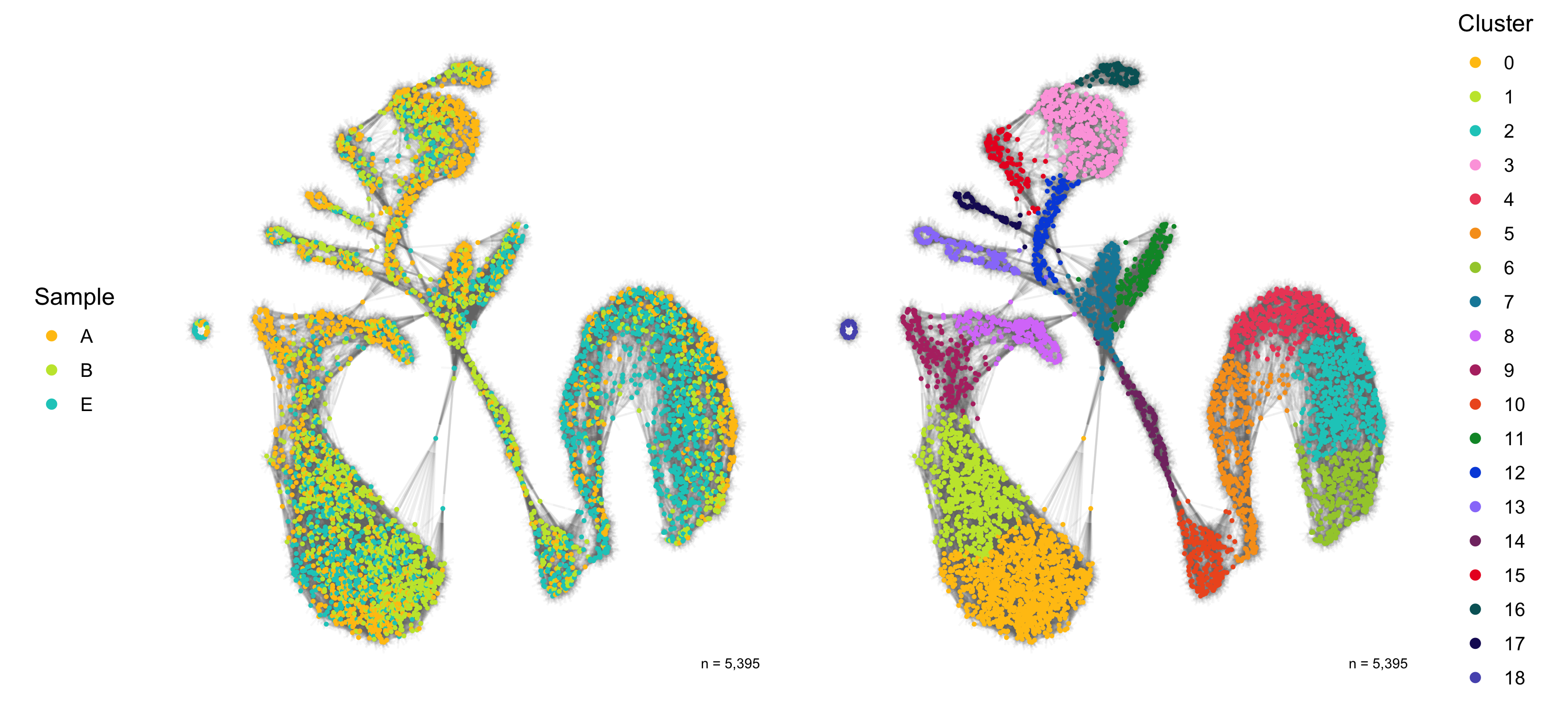
Dimensional reduction
Here, we represent the transcription profiles of all cells in the data set in a 2D or 3D projection, typically using the t-SNE or UMAP methods.
SNN graph
The SNN graph was calculated earlier in the FindNeighbors() function.
library(ggnetwork)

SCT_snn <- seurat@graphs$SCT_snn %>%
  as.matrix() %>%
  ggnetwork() %>%
  left_join(seurat@meta.data %>% mutate(vertex.names = rownames(.)), by = 'vertex.names')

p1 <- ggplot(SCT_snn, aes(x = x, y = y, xend = xend, yend = yend)) +
  geom_edges(color = 'grey50', alpha = 0.05) +
  geom_nodes(aes(color = sample), size = 0.5) +
  scale_color_manual(
    name = 'Sample', values = custom_colors$discrete,
    guide = guide_legend(ncol = 1, override.aes = list(size = 2))
  ) +
  theme_blank() +
  theme(legend.position = 'left') +
  annotate(
    geom = 'text', x = Inf, y = -Inf,
    label = paste0('n = ', format(nrow(seurat@meta.data), big.mark = ',', trim = TRUE)),
    vjust = -1.5, hjust = 1.25, color = 'black', size = 2.5
  )

p2 <- ggplot(SCT_snn, aes(x = x, y = y, xend = xend, yend = yend)) +
  geom_edges(color = 'grey50', alpha = 0.05) +
  geom_nodes(aes(color = seurat_clusters), size = 0.5) +
  scale_color_manual(
    name = 'Cluster', values = custom_colors$discrete,
    guide = guide_legend(ncol = 1, override.aes = list(size = 2))
  ) +
  theme_blank() +
  theme(legend.position = 'right') +
  annotate(
    geom = 'text', x = Inf, y = -Inf,
    label = paste0('n = ', format(nrow(seurat@meta.data), big.mark = ',', trim = TRUE)),
    vjust = -1.5, hjust = 1.25, color = 'black', size = 2.5
  )

ggsave(
  'plots/snn_graph_by_sample_cluster.png',
  p1 + p2 + plot_layout(ncol = 2),
  height = 5, width = 11
)
UMAP
Calculate UMAP
He we calculate the UMAP using the same 15 PCs we have also used for clustering.
seurat <- RunUMAP(
  seurat,
  reduction.name = 'UMAP',
  reduction = 'pca',
  dims = 1:15,
  n.components = 2,
  seed.use = 100
)
Overview
After calculation of the UMAP, we plot it while coloring the cells by the number of transcripts, sample, cluster, and cell cycle.
plot_umap_by_nCount <- bind_cols(seurat@meta.data, as.data.frame(seurat@reductions$UMAP@cell.embeddings)) %>%
  ggplot(aes(UMAP_1, UMAP_2, color = nCount_RNA)) +
  geom_point(size = 0.2) +
  theme_bw() +
  scale_color_viridis(
    guide = guide_colorbar(frame.colour = 'black', ticks.colour = 'black'),
    labels = scales::comma,
  ) +
  labs(color = 'Number of\ntranscripts') +
  theme(legend.position = 'left') +
  coord_fixed() +
  annotate(
    geom = 'text', x = Inf, y = -Inf,
    label = paste0('n = ', format(nrow(seurat@meta.data), big.mark = ',', trim = TRUE)),
    vjust = -1.5, hjust = 1.25, color = 'black', size = 2.5
  )

plot_umap_by_sample <- bind_cols(seurat@meta.data, as.data.frame(seurat@reductions$UMAP@cell.embeddings)) %>%
  ggplot(aes(UMAP_1, UMAP_2, color = sample)) +
  geom_point(size = 0.2) +
  theme_bw() +
  scale_color_manual(values = custom_colors$discrete) +
  labs(color = 'Sample') +
  guides(colour = guide_legend(override.aes = list(size = 2))) +
  theme(legend.position = 'right') +
  coord_fixed() +
  annotate(
    geom = 'text', x = Inf, y = -Inf,
    label = paste0('n = ', format(nrow(seurat@meta.data), big.mark = ',', trim = TRUE)),
    vjust = -1.5, hjust = 1.25, color = 'black', size = 2.5
  )

plot_umap_by_cluster <- bind_cols(seurat@meta.data, as.data.frame(seurat@reductions$UMAP@cell.embeddings)) %>%
  ggplot(aes(UMAP_1, UMAP_2, color = seurat_clusters)) +
  geom_point(size = 0.2) +
  theme_bw() +
  scale_color_manual(
    name = 'Cluster', values = custom_colors$discrete,
    guide = guide_legend(ncol = 2, override.aes = list(size = 2))
  ) +
  theme(legend.position = 'left') +
  coord_fixed() +
  annotate(
    geom = 'text', x = Inf, y = -Inf,
    label = paste0('n = ', format(nrow(seurat@meta.data), big.mark = ',', trim = TRUE)),
    vjust = -1.5, hjust = 1.25, color = 'black', size = 2.5
  )

plot_umap_by_cell_cycle <- bind_cols(seurat@meta.data, as.data.frame(seurat@reductions$UMAP@cell.embeddings)) %>%
  ggplot(aes(UMAP_1, UMAP_2, color = cell_cycle_seurat)) +
  geom_point(size = 0.2) +
  theme_bw() +
  scale_color_manual(values = custom_colors$cell_cycle) +
  labs(color = 'Cell cycle') +
  guides(colour = guide_legend(override.aes = list(size = 2))) +
  theme(legend.position = 'right') +
  coord_fixed() +
  annotate(
    geom = 'text', x = Inf, y = -Inf,
    label = paste0('n = ', format(nrow(seurat@meta.data), big.mark = ',', trim = TRUE)),
    vjust = -1.5, hjust = 1.25, color = 'black', size = 2.5
  )

ggsave(
  'plots/umap.png',
  plot_umap_by_nCount + plot_umap_by_sample +
  plot_umap_by_cluster + plot_umap_by_cell_cycle +
  plot_layout(ncol = 2),
  height = 6,
  width = 8.5
)
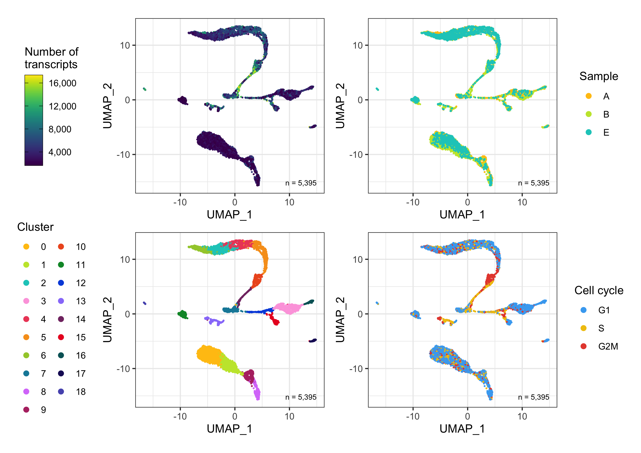
Samples
To understand how much the samples overlap, we plot the UMAP again and split the samples in different panels. Evidently, they overlap very well.
temp_labels <- seurat@meta.data %>%
  group_by(sample) %>%
  tally()

p <- bind_cols(seurat@meta.data, as.data.frame(seurat@reductions$UMAP@cell.embeddings)) %>%
  ggplot(aes(UMAP_1, UMAP_2, color = sample)) +
  geom_point(size = 0.2, show.legend = FALSE) +
  geom_text(
    data = temp_labels,
    aes(x = Inf, y = -Inf, label = paste0('n = ', format(n, big.mark = ',', trim = TRUE)), vjust = -1.5, hjust = 1.25),
    color = 'black', size = 2.8
  ) +
  theme_bw() +
  scale_color_manual(values = custom_colors$discrete) +
  coord_fixed() +
  theme(
    legend.position = 'none',
    strip.text = element_text(face = 'bold', size = 10)
  ) +
  facet_wrap(~sample, ncol = 5)

ggsave(
  'plots/umap_by_sample_split.png',
  p,
  height = 4,
  width = 10
)
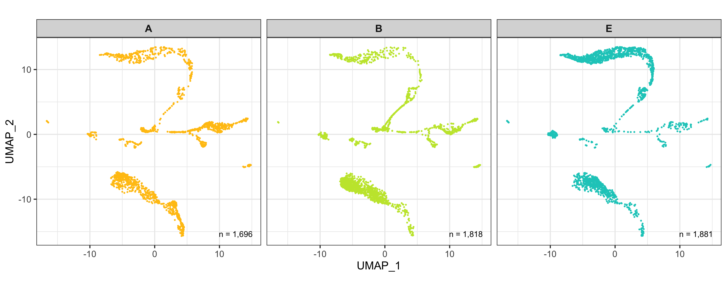
Clusters
Instead, for the clusters we simply add a label to the geometric center of each cluster.
UMAP_centers_cluster <- tibble(
    UMAP_1 = as.data.frame(seurat@reductions$UMAP@cell.embeddings)$UMAP_1,
    UMAP_2 = as.data.frame(seurat@reductions$UMAP@cell.embeddings)$UMAP_2,
    cluster = seurat@meta.data$seurat_clusters
  ) %>%
  group_by(cluster) %>%
  summarize(x = median(UMAP_1), y = median(UMAP_2))

p <- bind_cols(seurat@meta.data, as.data.frame(seurat@reductions$UMAP@cell.embeddings)) %>%
  ggplot(aes(UMAP_1, UMAP_2, color = seurat_clusters)) +
  geom_point(size = 0.2) +
  geom_label(
    data = UMAP_centers_cluster,
    mapping = aes(x, y, label = cluster),
    size = 4.5,
    fill = 'white',
    color = 'black',
    fontface = 'bold',
    alpha = 0.5,
    label.size = 0,
    show.legend = FALSE
  ) +
  theme_bw() +
  scale_color_manual(
    name = 'Cluster', values = custom_colors$discrete,
    guide = guide_legend(override.aes = list(size = 2))
  ) +
  theme(legend.position = 'right') +
  coord_fixed() +
  annotate(
    geom = 'text', x = Inf, y = -Inf,
    label = paste0('n = ', format(nrow(seurat@meta.data), big.mark = ',', trim = TRUE)),
    vjust = -1.5, hjust = 1.25, color = 'black', size = 2.5
  )

ggsave(
  'plots/umap_by_clusters.png',
  p, height = 5.5, width = 5.5
)
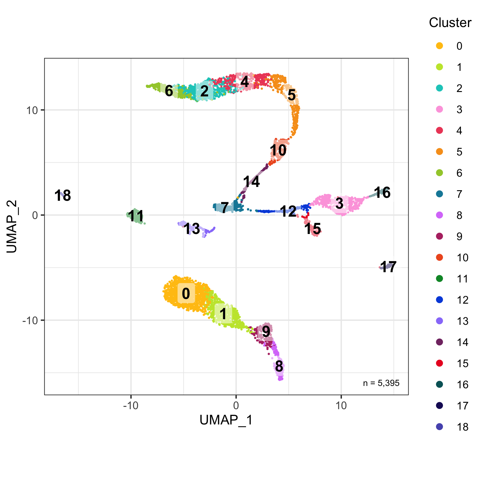
Poincaré map (work-in-progress)
For now, please check my blog article “Animating the dynamics of training a Poincaré map”.
Cell type annotation with SingleR
Cell inference can be performed with many tools.
Personally, I find SingleR very useful because it has given good results in my experiments and because it provides multiple pre-trained reference data sets.
Assign labels
First, we assign a label to each cell using the BlueprintEncodeData() data as a reference.
We then extract the labels and assignment scores and add them to the Seurat object.
library(SingleR)

singler_ref <- BlueprintEncodeData()

singler_results_blueprintencode_main <- SingleR::SingleR(
  test = GetAssayData(seurat, assay = 'SCT', slot = 'data'),
  ref = singler_ref,
  labels = singler_ref@colData@listData$label.main
)

saveRDS(singler_results_blueprintencode_main, "data/singler_results_blueprintencode_main.rds")

p <- plotScoreHeatmap(
    singler_results_blueprintencode_main,
    show.labels = TRUE,
    annotation_col = data.frame(
      donor = seurat@meta.data$sample,
      row.names = rownames(singler_results_blueprintencode_main)
    )
  )

ggsave(
  'plots/singler_score_heatmap_blueprintencode_main.png', p,
  height = 11, width = 14
)

seurat@meta.data$cell_type_singler_blueprintencode_main <- singler_results_blueprintencode_main@listData$labels

singler_scores <- singler_results_blueprintencode_main@listData$scores %>%
  as_tibble() %>%
  dplyr::mutate(assigned_score = NA)

for ( i in seq_len(nrow(singler_scores)) ) {
  singler_scores$assigned_score[i] <- singler_scores[[singler_results_blueprintencode_main@listData$labels[i]]][i]
}

seurat@meta.data$cell_type_singler_blueprintencode_main_score <- singler_scores$assigned_score
Assignment score by sample, cluster and cell type
Here, we plot the assignment score for every sample, cluster, and cell type.
temp_labels <- seurat@meta.data %>%
  group_by(sample) %>%
  tally()

p1 <- ggplot() +
  geom_half_violin(
    data = seurat@meta.data,
    aes(
      x = sample,
      y = cell_type_singler_blueprintencode_main_score,
      fill = sample
    ),
    side = 'l', show.legend = FALSE, trim = FALSE
  ) +
  geom_half_boxplot(
    data = seurat@meta.data,
    aes(
      x = sample,
      y = cell_type_singler_blueprintencode_main_score,
      fill = sample
    ),
    side = 'r', outlier.color = NA, width = 0.4, show.legend = FALSE
  ) +
  geom_text(
    data = temp_labels,
    aes(
      x = sample,
      y = -Inf,
      label = paste0('n = ', format(n, big.mark = ',', trim = TRUE)),
      vjust = -1
    ),
    color = 'black', size = 2.8
  ) +
  scale_color_manual(values = custom_colors$discrete) +
  scale_fill_manual(values = custom_colors$discrete) +
  scale_y_continuous(
    name = 'Assignment score',
    labels = scales::comma,
    limits = c(0,1)
  ) +
  theme_bw() +
  labs(title = 'Samples') +
  theme(
    axis.text.x = element_text(angle = 45, hjust = 1, vjust = 1),
    axis.title.x = element_blank(),
    panel.grid.major.x = element_blank()
  )

temp_labels <- seurat@meta.data %>%
  group_by(seurat_clusters) %>%
  tally()

p2 <- ggplot() +
  geom_half_violin(
    data = seurat@meta.data,
    aes(
      x = seurat_clusters,
      y = cell_type_singler_blueprintencode_main_score,
      fill = seurat_clusters
    ),
    side = 'l', show.legend = FALSE, trim = FALSE
  ) +
  geom_half_boxplot(
    data = seurat@meta.data,
    aes(
      x = seurat_clusters,
      y = cell_type_singler_blueprintencode_main_score,
      fill = seurat_clusters
    ),
    side = 'r', outlier.color = NA, width = 0.4, show.legend = FALSE
  ) +
  geom_text(
    data = temp_labels,
    aes(
      x = seurat_clusters,
      y = -Inf,
      label = paste0('n = ', format(n, big.mark = ',', trim = TRUE)),
      vjust = -1
    ),
    color = 'black', size = 2.8
  ) +
  scale_color_manual(values = custom_colors$discrete) +
  scale_fill_manual(values = custom_colors$discrete) +
  scale_y_continuous(
    name = 'Assignment score',
    labels = scales::comma,
    limits = c(0,1)
  ) +
  labs(title = 'Clusters') +
  theme_bw() +
  theme(
    axis.title.x = element_blank(),
    panel.grid.major.x = element_blank()
  )

temp_labels <- seurat@meta.data %>%
  group_by(cell_type_singler_blueprintencode_main) %>%
  tally()

p3 <- ggplot() +
  geom_half_violin(
    data = seurat@meta.data,
    aes(
      x = cell_type_singler_blueprintencode_main,
      y = cell_type_singler_blueprintencode_main_score,
      fill = cell_type_singler_blueprintencode_main
    ),
    side = 'l', show.legend = FALSE, trim = FALSE
  ) +
  geom_half_boxplot(
    data = seurat@meta.data,
    aes(
      x = cell_type_singler_blueprintencode_main,
      y = cell_type_singler_blueprintencode_main_score,
      fill = cell_type_singler_blueprintencode_main
    ),
    side = 'r', outlier.color = NA, width = 0.4, show.legend = FALSE
  ) +
  geom_text(
    data = temp_labels,
    aes(
      x = cell_type_singler_blueprintencode_main,
      y = -Inf,
      label = paste0('n = ', format(n, big.mark = ',', trim = TRUE)),
      vjust = -1
    ),
    color = 'black', size = 2.8
  ) +
  scale_color_manual(values = custom_colors$discrete) +
  scale_fill_manual(values = custom_colors$discrete) +
  scale_y_continuous(
    name = 'Assignment score',
    labels = scales::comma,
    limits = c(0,1)
  ) +
  labs(title = 'Cell types') +
  theme_bw() +
  theme(
    axis.title.x = element_blank(),
    panel.grid.major.x = element_blank()
  )

ggsave(
  'plots/singler_blueprintencode_main_assignment_scores_by_sample_cluster_cell_type.png',
  p1 + p2 + p3 + plot_layout(ncol = 1), height = 13, width = 16
)
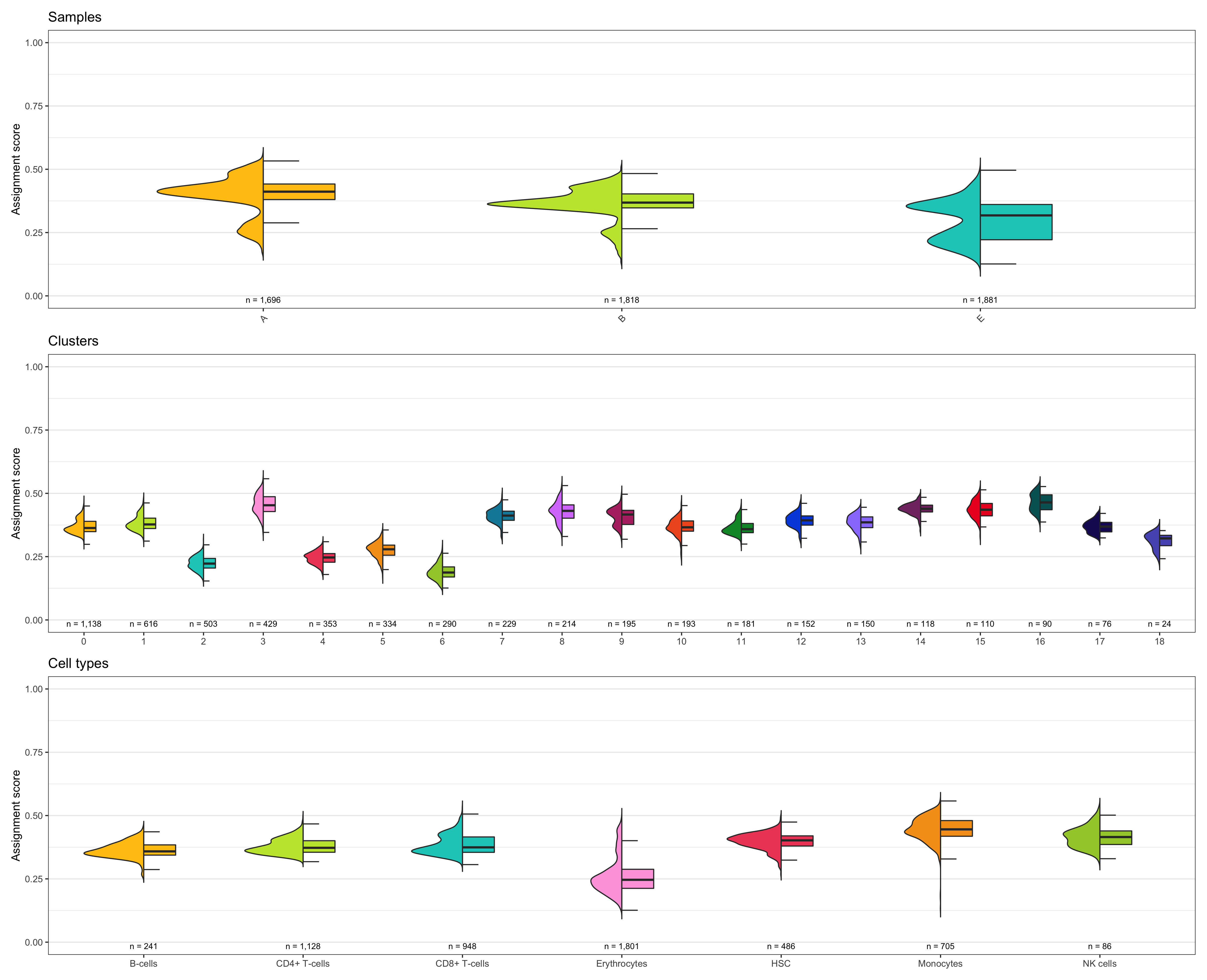
Composition of samples and clusters by cell type
Then, we check how samples and clusters are composed in terms of identified cell types.
table_samples_by_cell_type <- seurat@meta.data %>%
  dplyr::group_by(sample, cell_type_singler_blueprintencode_main) %>%
  dplyr::summarize(count = n()) %>%
  tidyr::spread(cell_type_singler_blueprintencode_main, count, fill = 0) %>%
  dplyr::ungroup() %>%
  dplyr::mutate(total_cell_count = rowSums(.[c(2:ncol(.))])) %>%
  dplyr::select(c("sample", "total_cell_count", dplyr::everything()))

table_samples_by_cell_type %>% knitr::kable()
# |sample | total_cell_count| B-cells| CD4+ T-cells| CD8+ T-cells| Erythrocytes| HSC| Monocytes| NK cells|
# |:------|----------------:|-------:|------------:|------------:|------------:|---:|---------:|--------:|
# |A      |             1696|      45|          328|          336|          357| 225|       370|       35|
# |B      |             1818|      74|          484|          377|          415| 196|       247|       25|
# |E      |             1881|     122|          316|          235|         1029|  65|        88|       26|

table_clusters_by_cell_type <- seurat@meta.data %>%
  dplyr::group_by(seurat_clusters, cell_type_singler_blueprintencode_main) %>%
  dplyr::rename(cluster = seurat_clusters) %>%
  dplyr::summarize(count = n()) %>%
  tidyr::spread(cell_type_singler_blueprintencode_main, count, fill = 0) %>%
  dplyr::ungroup() %>%
  dplyr::mutate(total_cell_count = rowSums(.[c(2:ncol(.))])) %>%
  dplyr::select(c("cluster", "total_cell_count", dplyr::everything()))

table_clusters_by_cell_type %>% knitr::kable()
# |cluster | total_cell_count| B-cells| CD4+ T-cells| CD8+ T-cells| Erythrocytes| HSC| Monocytes| NK cells|
# |:-------|----------------:|-------:|------------:|------------:|------------:|---:|---------:|--------:|
# |0       |             1138|       1|          733|          403|            0|   1|         0|        0|
# |1       |              616|       0|          387|          229|            0|   0|         0|        0|
# |2       |              503|       0|            0|            0|          503|   0|         0|        0|
# |3       |              429|       0|            0|            0|            0|   0|       429|        0|
# |4       |              353|       0|            0|            0|          353|   0|         0|        0|
# |5       |              334|       0|            0|            0|          334|   0|         0|        0|
# |6       |              290|       0|            0|            0|          287|   0|         3|        0|
# |7       |              229|       0|            0|            0|           11| 218|         0|        0|
# |8       |              214|       0|            0|          129|            0|   0|         0|       85|
# |9       |              195|       0|            8|          186|            0|   0|         0|        1|
# |10      |              193|       0|            0|            0|          193|   0|         0|        0|
# |11      |              181|     178|            0|            1|            0|   2|         0|        0|
# |12      |              152|       0|            0|            0|            0|  84|        68|        0|
# |13      |              150|      34|            0|            0|            5| 111|         0|        0|
# |14      |              118|       0|            0|            0|          114|   4|         0|        0|
# |15      |              110|       0|            0|            0|            0|  21|        89|        0|
# |16      |               90|       0|            0|            0|            0|   0|        90|        0|
# |17      |               76|       7|            0|            0|            0|  43|        26|        0|
# |18      |               24|      21|            0|            0|            1|   2|         0|        0|
Shown below is the composition of samples/clusters by actual number of cells.
temp_labels <- seurat@meta.data %>%
  group_by(sample) %>%
  tally()

p1 <- table_samples_by_cell_type %>%
  select(-c('total_cell_count')) %>%
  reshape2::melt(id.vars = 'sample') %>%
  mutate(sample = factor(sample, levels = levels(seurat@meta.data$sample))) %>%
  ggplot(aes(sample, value)) +
  geom_bar(aes(fill = variable), position = 'stack', stat = 'identity', show.legend = FALSE) +
  geom_text(
    data = temp_labels,
    aes(
      x = sample,
      y = Inf,
      label = paste0('n = ', format(n, big.mark = ',', trim = TRUE)),
      vjust = -1
    ),
    color = 'black', size = 2.8
  ) +
  scale_fill_manual(name = 'Cell type', values = custom_colors$discrete) +
  scale_y_continuous(
    name = 'Number of cells',
    labels = scales::comma,
    expand = c(0.01,0)
  ) +
  coord_cartesian(clip = 'off') +
  theme_bw() +
  theme(
    legend.position = 'none',
    plot.title = element_text(hjust = 0.5),
    text = element_text(size = 16),
    panel.grid.major = element_blank(),
    panel.grid.minor = element_blank(),
    axis.title.x = element_blank(),
    axis.text.x = element_text(angle = 45, hjust = 1, vjust = 1),
    plot.margin = margin(t = 20, r = 0, b = 0, l = 0, unit = 'pt')
  )

temp_labels <- seurat@meta.data %>%
  group_by(seurat_clusters) %>%
  tally() %>%
  dplyr::rename('cluster' = seurat_clusters)

p2 <- table_clusters_by_cell_type %>%
  select(-c('total_cell_count')) %>%
  reshape2::melt(id.vars = 'cluster') %>%
  mutate(cluster = factor(cluster, levels = levels(seurat@meta.data$seurat_clusters))) %>%
  ggplot(aes(cluster, value)) +
  geom_bar(aes(fill = variable), position = 'stack', stat = 'identity') +
  geom_text(
    data = temp_labels,
    aes(
      x = cluster,
      y = Inf,
      label = paste0('n = ', format(n, big.mark = ',', trim = TRUE)),
      vjust = -1
    ), color = 'black', size = 2.8
  ) +
  scale_fill_manual(name = 'Cell type', values = custom_colors$discrete) +
  scale_y_continuous(
    name = 'Number of cells',
    labels = scales::comma,
    expand = c(0.01,0)
  ) +
  coord_cartesian(clip = 'off') +
  theme_bw() +
  theme(
    legend.position = 'right',
    plot.title = element_text(hjust = 0.5),
    text = element_text(size = 16),
    panel.grid.major = element_blank(),
    panel.grid.minor = element_blank(),
    axis.title = element_blank(),
    plot.margin = margin(t = 20, r = 0, b = 0, l = 10, unit = 'pt')
  )

ggsave(
  'plots/composition_samples_clusters_by_cell_type_singler_blueprintencode_main_by_number.png',
  p1 + p2 +
  plot_layout(ncol = 2, widths = c(
    seurat@meta.data$sample %>% unique() %>% length(),
    seurat@meta.data$seurat_clusters %>% unique() %>% length()
  )),
  width = 18, height = 8
)
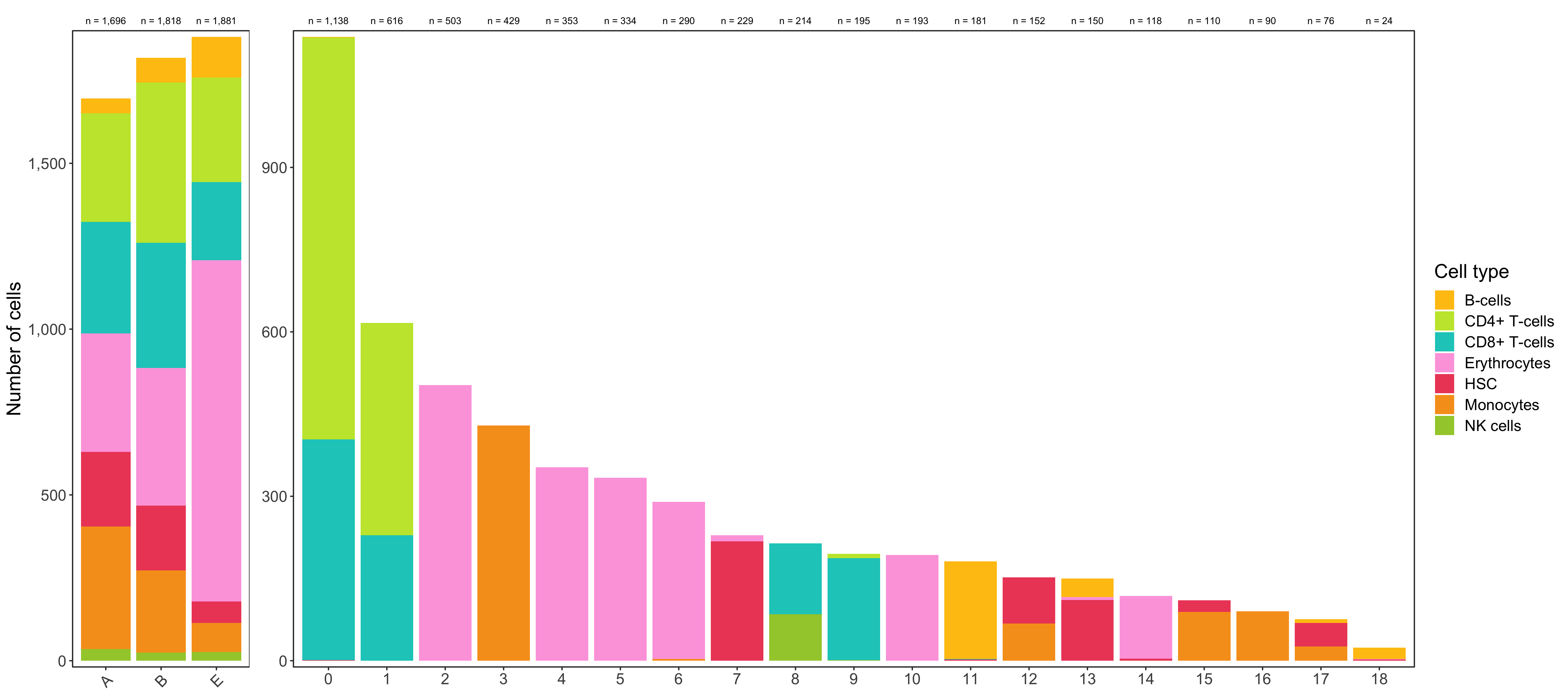
Shown below is the composition of samples/clusters by percent of cells.
temp_labels <- seurat@meta.data %>%
  group_by(sample) %>%
  tally()

p1 <- table_samples_by_cell_type %>%
  select(-c('total_cell_count')) %>%
  reshape2::melt(id.vars = 'sample') %>%
  mutate(sample = factor(sample, levels = levels(seurat@meta.data$sample))) %>%
  ggplot(aes(sample, value)) +
  geom_bar(aes(fill = variable), position = 'fill', stat = 'identity', show.legend = FALSE) +
  geom_text(
    data = temp_labels,
    aes(
      x = sample,
      y = Inf,
      label = paste0('n = ', format(n, big.mark = ',', trim = TRUE)),
      vjust = -1
    ),
    color = 'black', size = 2.8
  ) +
  scale_fill_manual(name = 'Cell type', values = custom_colors$discrete) +
  scale_y_continuous(
    name = 'Percentage [%]',
    labels = scales::percent_format(),
    expand = c(0.01,0)
  ) +
  coord_cartesian(clip = 'off') +
  theme_bw() +
  theme(
    legend.position = 'none',
    plot.title = element_text(hjust = 0.5),
    text = element_text(size = 16),
    panel.grid.major = element_blank(),
    panel.grid.minor = element_blank(),
    axis.title.x = element_blank(),
    axis.text.x = element_text(angle = 45, hjust = 1, vjust = 1),
    plot.margin = margin(t = 20, r = 0, b = 0, l = 0, unit = 'pt')
  )

temp_labels <- seurat@meta.data %>%
  group_by(seurat_clusters) %>%
  tally() %>%
  dplyr::rename('cluster' = seurat_clusters)

p2 <- table_clusters_by_cell_type %>%
  select(-c('total_cell_count')) %>%
  reshape2::melt(id.vars = 'cluster') %>%
  mutate(cluster = factor(cluster, levels = levels(seurat@meta.data$seurat_clusters))) %>%
  ggplot(aes(cluster, value)) +
  geom_bar(aes(fill = variable), position = 'fill', stat = 'identity') +
  geom_text(
    data = temp_labels,
    aes(
      x = cluster,
      y = Inf,
      label = paste0('n = ', format(n, big.mark = ',', trim = TRUE)),
      vjust = -1
    ),
    color = 'black', size = 2.8
  ) +
  scale_fill_manual(name = 'Cell type', values = custom_colors$discrete) +
  scale_y_continuous(
    name = 'Percentage [%]',
    labels = scales::percent_format(),
    expand = c(0.01,0)
  ) +
  coord_cartesian(clip = 'off') +
  theme_bw() +
  theme(
    legend.position = 'right',
    plot.title = element_text(hjust = 0.5),
    text = element_text(size = 16),
    panel.grid.major = element_blank(),
    panel.grid.minor = element_blank(),
    axis.title = element_blank(),
    plot.margin = margin(t = 20, r = 0, b = 0, l = 10, unit = 'pt')
  )

ggsave(
  'plots/composition_samples_clusters_by_cell_type_singler_blueprintencode_main_by_percent.png',
  p1 + p2 +
  plot_layout(ncol = 2, widths = c(
    seurat@meta.data$sample %>% unique() %>% length(),
    seurat@meta.data$seurat_clusters %>% unique() %>% length()
  )),
  width = 18, height = 8
)
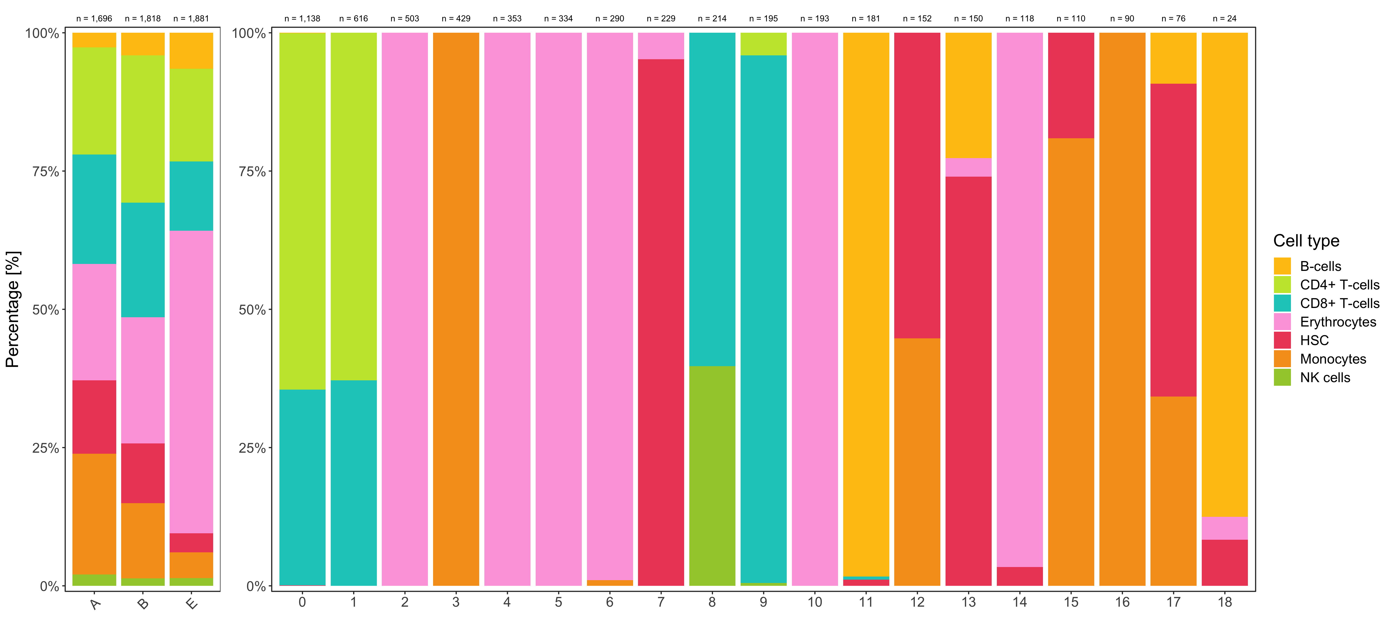
Alluvial plots
Samples by clusters.
## get sample and cluster names
samples <- levels(seurat@meta.data$sample)
clusters <- levels(seurat@meta.data$seurat_clusters)

## create named vector holding the color assignments for both samples and
## clusters
color_assignments <- setNames(
  c(custom_colors$discrete[1:length(samples)], custom_colors$discrete[1:length(clusters)]),
  c(samples,clusters)
)

## prepare data for the plot; factor() calls are necessary for the right order
## of columns (first samples then clusters) and boxes within each column (
## cluster 1, 2, 3, ..., not 1, 10, 11, ...)
data <- seurat@meta.data %>%
  group_by(sample,seurat_clusters) %>%
  tally() %>%
  ungroup() %>%
  gather_set_data(1:2) %>%
  dplyr::mutate(
    x = factor(x, levels = unique(x)),
    y = factor(y, levels = unique(y))
  )

DataFrame(data)
# DataFrame with 114 rows and 6 columns
#       sample seurat_clusters         n        id               x        y
#     <factor>        <factor> <integer> <integer>        <factor> <factor>
# 1          A               0       301         1          sample        A
# 2          A               1       137         2          sample        A
# 3          A               2       121         3          sample        A
# 4          A               3       223         4          sample        A
# 5          A               4        78         5          sample        A
# ...      ...             ...       ...       ...             ...      ...
# 110        E              14        19        53 seurat_clusters       14
# 111        E              15        18        54 seurat_clusters       15
# 112        E              16        10        55 seurat_clusters       16
# 113        E              17         9        56 seurat_clusters       17
# 114        E              18        15        57 seurat_clusters       18

## create sample and cluster labels; hjust defines whether a label will be
## aligned to the right (1) or to the left (0); the nudge_x parameter is used
## to move the label outside of the boxes
data_labels <- tibble(
    group = c(
      rep('sample', length(samples)),
      rep('seurat_clusters', length(clusters))
    )
 ) %>%
  mutate(
    hjust = ifelse(group == 'sample', 1, 0),
    nudge_x = ifelse(group == 'sample', -0.1, 0.1)
  )

DataFrame(data_labels)
# DataFrame with 22 rows and 3 columns
#               group     hjust   nudge_x
#         <character> <numeric> <numeric>
# 1            sample         1      -0.1
# 2            sample         1      -0.1
# 3            sample         1      -0.1
# 4   seurat_clusters         0       0.1
# 5   seurat_clusters         0       0.1
# ...             ...       ...       ...
# 18  seurat_clusters         0       0.1
# 19  seurat_clusters         0       0.1
# 20  seurat_clusters         0       0.1
# 21  seurat_clusters         0       0.1
# 22  seurat_clusters         0       0.1

## create plot
p1 <- ggplot(data, aes(x, id = id, split = y, value = n)) +
  geom_parallel_sets(aes(fill = seurat_clusters), alpha = 0.75, axis.width = 0.15) +
  geom_parallel_sets_axes(aes(fill = y), color = 'black', axis.width = 0.1) +
  geom_text(
    aes(y = n, split = y), stat = 'parallel_sets_axes', fontface = 'bold',
    hjust = data_labels$hjust, nudge_x = data_labels$nudge_x
  ) +
  scale_x_discrete(labels = c('Sample','Cluster')) +
  scale_fill_manual(values = color_assignments) +
  theme_bw() +
  theme(
    legend.position = 'none',
    axis.title = element_blank(),
    axis.text.x = element_text(face = 'bold', colour = 'black', size = 15),
    axis.text.y = element_blank(),
    axis.ticks = element_blank(),
    panel.grid.major = element_blank(),
    panel.grid.minor = element_blank(),
    panel.border = element_blank()
  )
Clusters by cell types.
clusters <- levels(seurat@meta.data$seurat_clusters)
cell_types <- sort(unique(seurat@meta.data$cell_type_singler_blueprintencode_main))

color_assignments <- setNames(
  c(custom_colors$discrete[1:length(clusters)], custom_colors$discrete[1:length(cell_types)]),
  c(clusters,cell_types)
)

data <- seurat@meta.data %>%
  dplyr::rename(cell_type = cell_type_singler_blueprintencode_main) %>%
  dplyr::mutate(cell_type = factor(cell_type, levels = cell_types)) %>%
  group_by(seurat_clusters, cell_type) %>%
  tally() %>%
  ungroup() %>%
  gather_set_data(1:2) %>%
  dplyr::mutate(
    x = factor(x, levels = unique(x)),
    y = factor(y, levels = c(clusters,cell_types))
  )

data_labels <- tibble(
    group = c(
      rep('seurat_clusters', length(clusters)),
      rep('cell_type', length(cell_types))
    )
 ) %>%
  mutate(
    hjust = ifelse(group == 'seurat_clusters', 1, 0),
    nudge_x = ifelse(group == 'seurat_clusters', -0.1, 0.1)
  )

p2 <- ggplot(data, aes(x, id = id, split = y, value = n)) +
  geom_parallel_sets(aes(fill = seurat_clusters), alpha = 0.75, axis.width = 0.15) +
  geom_parallel_sets_axes(aes(fill = y), color = 'black', axis.width = 0.1) +
  geom_text(
    aes(y = n, split = y), stat = 'parallel_sets_axes', fontface = 'bold',
    hjust = data_labels$hjust, nudge_x = data_labels$nudge_x
  ) +
  scale_x_discrete(labels = c('Cluster','Cell type')) +
  scale_fill_manual(values = color_assignments) +
  theme_bw() +
  theme(
    legend.position = 'none',
    axis.title = element_blank(),
    axis.text.x = element_text(face = 'bold', colour = 'black', size = 15),
    axis.text.y = element_blank(),
    axis.ticks = element_blank(),
    panel.grid.major = element_blank(),
    panel.grid.minor = element_blank(),
    panel.border = element_blank()
  )
Combine the two plots.
ggsave(
  'plots/samples_clusters_cell_types_alluvial.png',
  p1 + p2 + plot_layout(ncol = 2),
  height = 6, width = 8
)
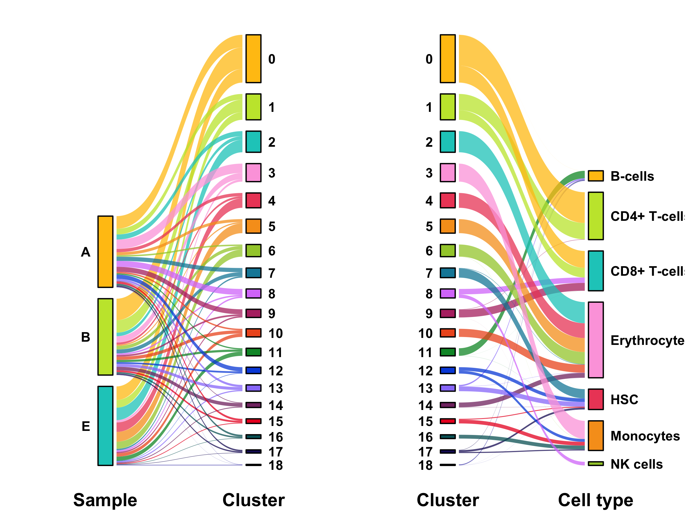
Notes: It’s currently not possible to scale the columns to equal heights with ggforce.
For example, I would expect the “Samples” columns to reach equal height as the “Cluster” column by increasing the gap size since it’s the same number of total cells.
Anyway, I think it’s still the best tool in R to make alluvial plots.
UMAP by cell type
Similar to the UMAP plot of clusters, we add cell type labels to the UMAP.
UMAP_centers_cell_type <- tibble(
    UMAP_1 = as.data.frame(seurat@reductions$UMAP@cell.embeddings)$UMAP_1,
    UMAP_2 = as.data.frame(seurat@reductions$UMAP@cell.embeddings)$UMAP_2,
    cell_type = seurat@meta.data$cell_type_singler_blueprintencode_main
  ) %>%
  group_by(cell_type) %>%
  summarize(x = median(UMAP_1), y = median(UMAP_2))

p <- bind_cols(seurat@meta.data, as.data.frame(seurat@reductions$UMAP@cell.embeddings)) %>%
  ggplot(aes(UMAP_1, UMAP_2, color = cell_type_singler_blueprintencode_main)) +
  geom_point(size = 0.2) +
  geom_label(
    data = UMAP_centers_cell_type,
    mapping = aes(x, y, label = cell_type),
    size = 3.5,
    fill = 'white',
    color = 'black',
    fontface = 'bold',
    alpha = 0.5,
    label.size = 0,
    show.legend = FALSE
  ) +
  theme_bw() +
  expand_limits(x = c(-22,15)) +
  scale_color_manual(values = custom_colors$discrete) +
  labs(color = 'Cell type') +
  guides(colour = guide_legend(override.aes = list(size = 2))) +
  theme(legend.position = 'right') +
  coord_fixed() +
  annotate(
    geom = 'text', x = Inf, y = -Inf,
    label = paste0('n = ', format(nrow(seurat@meta.data), big.mark = ',', trim = TRUE)),
    vjust = -1.5, hjust = 1.25, color = 'black', size = 2.5
  )

ggsave(
  'plots/umap_by_cell_type_singler_blueprintencode_main.png',
  p,
  height = 4,
  width = 6
)
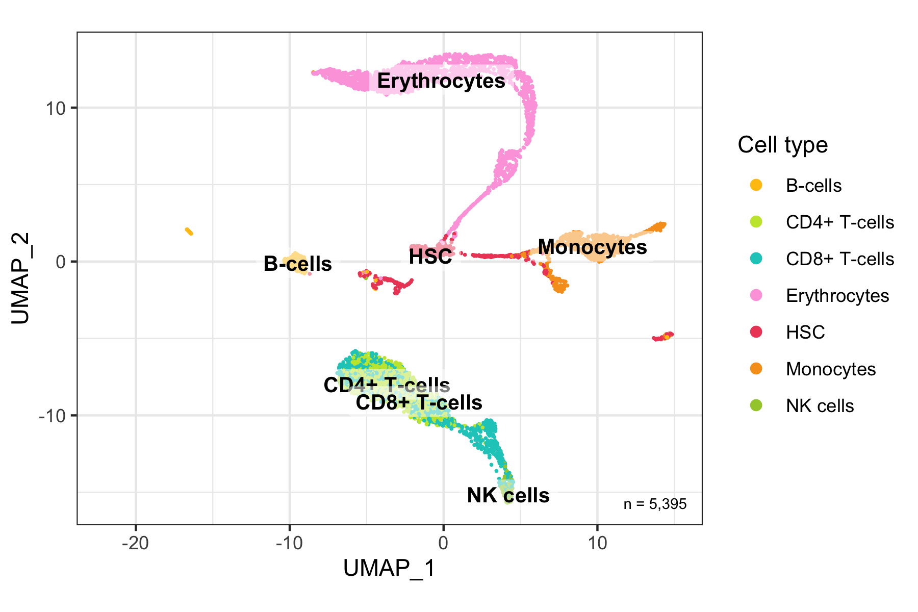
To understand whether cell types overlap in the UMAP (which would be hard to see in the previous plot), we also plot the same and split the panels by cell type.
temp_labels <- seurat@meta.data %>%
  group_by(cell_type_singler_blueprintencode_main) %>%
  tally()

p <- bind_cols(seurat@meta.data, as.data.frame(seurat@reductions$UMAP@cell.embeddings)) %>%
  ggplot(aes(UMAP_1, UMAP_2, color = cell_type_singler_blueprintencode_main)) +
  geom_point(size = 0.2, show.legend = FALSE) +
  geom_text(
    data = temp_labels,
    aes(
      x = Inf,
      y = -Inf,
      label = paste0('n = ', format(n, big.mark = ',', trim = TRUE)),
      vjust = -1.5,
      hjust = 1.25
    ),
    color = 'black', size = 2.8
  ) +
  theme_bw() +
  scale_color_manual(values = custom_colors$discrete) +
  labs(color = 'Cell type') +
  guides(colour = guide_legend(override.aes = list(size = 2))) +
  coord_fixed() +
  facet_wrap(~cell_type_singler_blueprintencode_main, ncol = 4) +
  theme(
    legend.position = 'right',
    strip.text = element_text(face = 'bold', size = 10)
  )

ggsave(
  'plots/umap_by_cell_type_singler_blueprintencode_main_split.png',
  p, height = 5, width = 8
)
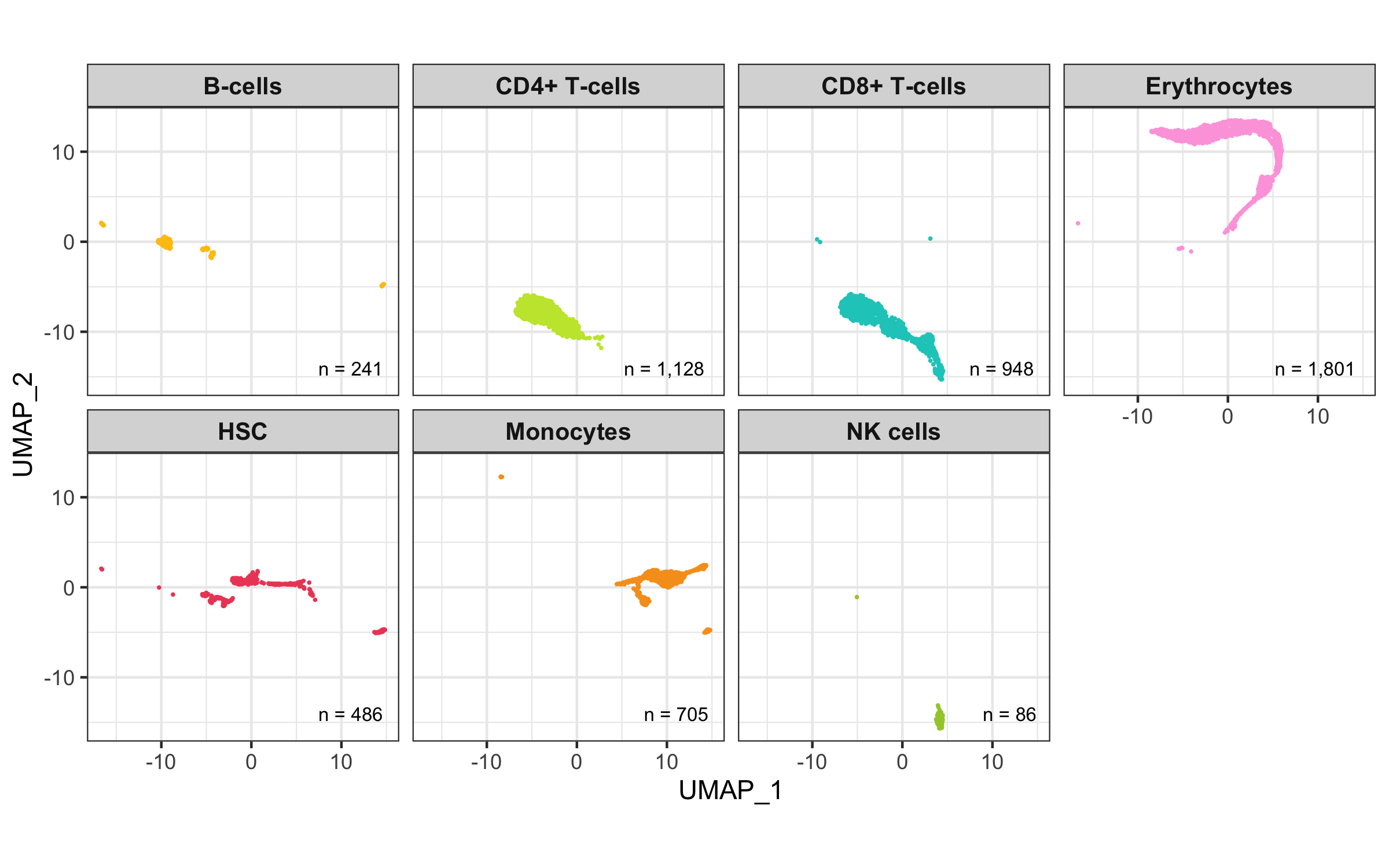
UMAP by assignment score
Lastly, we make another UMAP with the cells colored by their assignment score.
p <- bind_cols(seurat@meta.data, as.data.frame(seurat@reductions$UMAP@cell.embeddings)) %>%
  ggplot(aes(UMAP_1, UMAP_2, color = cell_type_singler_blueprintencode_main_score)) +
  geom_point(size = 0.2) +
  theme_bw() +
  scale_color_viridis(
    name = 'Score', limits = c(0,1), oob = scales::squish,
    guide = guide_colorbar(frame.colour = 'black', ticks.colour = 'black')
  ) +
  labs(color = 'Cell type') +
  theme(legend.position = 'right') +
  coord_fixed() +
  annotate(
    geom = 'text', x = Inf, y = -Inf,
    label = paste0('n = ', format(nrow(seurat@meta.data), big.mark = ',', trim = TRUE)),
    vjust = -1.5, hjust = 1.25, color = 'black', size = 2.5
  )

ggsave(
  'plots/umap_by_cell_type_singler_blueprintencode_main_score.png',
  p,
  height = 5,
  width = 5.5
)
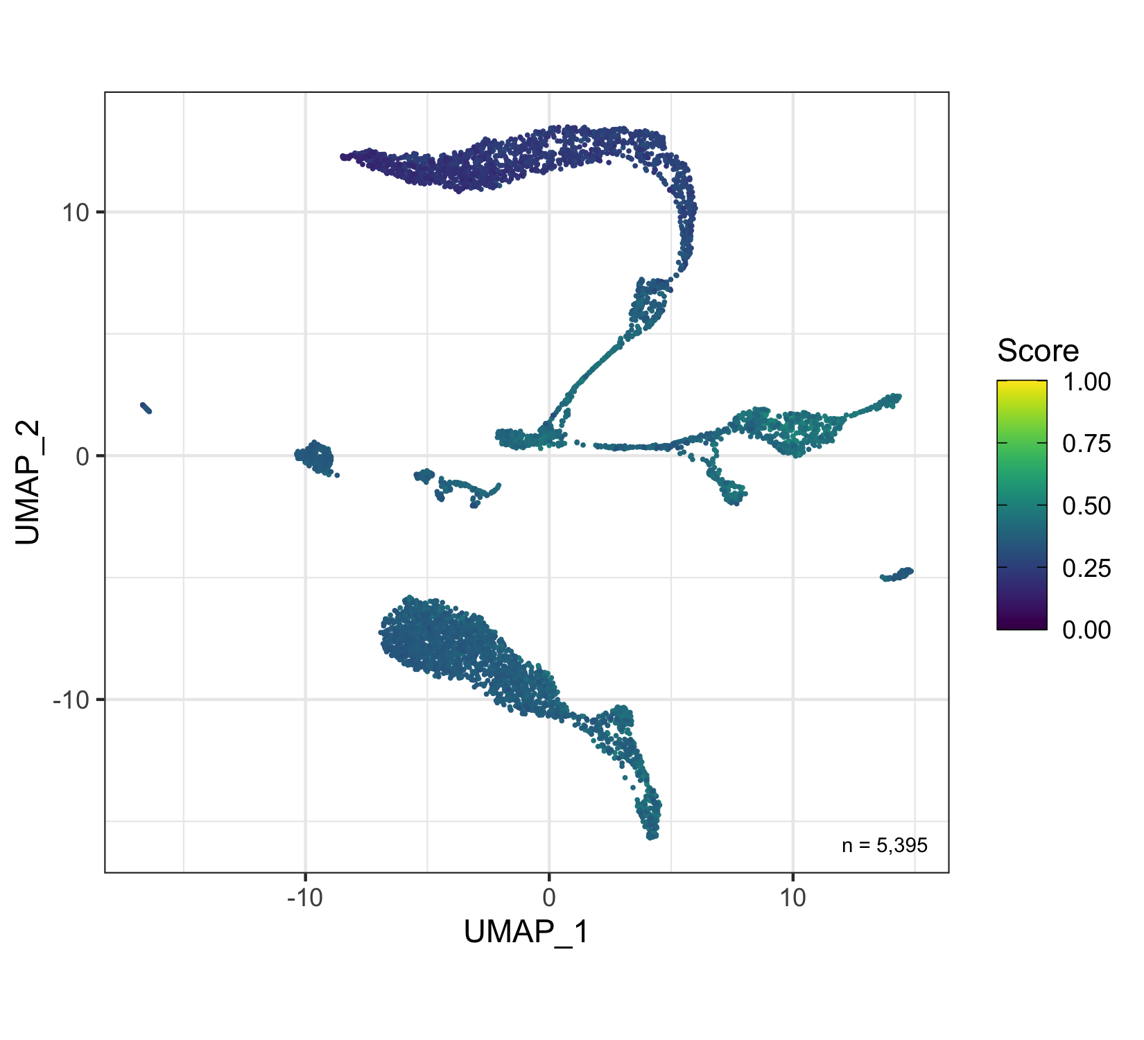
Perform analysis for Cerebro
To allow further investigation of the data set in Cerebro [4], we now add some more meta data, calculate marker genes, pathway enrichment of the marker genes, and export the data set. This procedure largely follows the workflow described on the cerebroApp website.
Add meta data
seurat@misc$experiment <- list(
  experiment_name = 'bone_marrow_donor_cells',
  organism = 'hg',
  date_of_analysis = Sys.Date()
)

seurat@misc$parameters <- list(
  gene_nomenclature = 'gene_name',
  discard_genes_expressed_in_fewer_cells_than = 6,
  keep_mitochondrial_genes = TRUE,
  variables_to_regress_out = 'nCount',
  number_PCs = 15,
  cluster_resolution = 0.8
)

seurat@misc$parameters$filtering <- list(
  UMI_min = thresholds_nCount[1],
  UMI_max = thresholds_nCount[2],
  genes_min = thresholds_nFeature[1],
  genes_max = thresholds_nFeature[2],
  pct_mito_min = thresholds_percent_MT[1],
  pct_mito_max = thresholds_percent_MT[2]
)

seurat@misc$technical_info$cerebroApp_version <- utils::packageVersion('cerebroApp')
seurat@misc$technical_info$Seurat <- utils::packageVersion('Seurat')
seurat@misc$technical_info <- list(
  'R' = capture.output(devtools::session_info())
)
Calculate relationship trees
Here, we calculate a relationship tree - just like the one we made before for the clusters - for all three grouping variables: samples, clusters, and cell types. Each of them is added to the @misc slot of the Seurat object so it can be extracted to Cerebro.
Samples:
Idents(seurat) <- "sample"
seurat <- BuildClusterTree(
  seurat,
  dims = 1:15,
  reorder = FALSE,
  reorder.numeric = FALSE
)
seurat@misc$trees$sample <- seurat@tools$BuildClusterTree
Clusters:
Idents(seurat) <- "seurat_clusters"
seurat <- BuildClusterTree(
  seurat,
  dims = 1:15,
  reorder = FALSE,
  reorder.numeric = FALSE
)
seurat@misc$trees$seurat_clusters <- seurat@tools$BuildClusterTree
Cell types:
Idents(seurat) <- "cell_type_singler_blueprintencode_main"
seurat <- BuildClusterTree(
  seurat,
  dims = 1:15,
  reorder = FALSE,
  reorder.numeric = FALSE
)
seurat@misc$trees$cell_type_singler_blueprintencode_main <- seurat@tools$BuildClusterTree
cerebroApp steps
Here, we calculate the percentage of mitochondrial and ribosomal transcripts, get most expressed and marker genes, test for enriched pathways, and perform gene set enrichment analysis.
seurat <- cerebroApp::addPercentMtRibo(
  seurat,
  organism = 'hg',
  gene_nomenclature = 'name'
)

seurat <- cerebroApp::getMostExpressedGenes(
  seurat,
  assay = 'RNA',
  groups = c('sample','seurat_clusters','cell_type_singler_blueprintencode_main')
)

seurat <- cerebroApp::getMarkerGenes(
  seurat,
  assay = 'RNA',
  organism = 'hg',
  groups = c('sample','seurat_clusters','cell_type_singler_blueprintencode_main'),
  name = 'cerebro_seurat',
  only_pos = TRUE
)

seurat <- cerebroApp::getEnrichedPathways(
  seurat,
  marker_genes_input = 'cerebro_seurat',
  adj_p_cutoff = 0.01,
  max_terms = 100
)

seurat <- cerebroApp::performGeneSetEnrichmentAnalysis(
  seurat,
  assay = 'RNA',
  GMT_file = 'h.all.v7.2.symbols.gmt',
  groups = c('sample','seurat_clusters','cell_type_singler_blueprintencode_main'),
  thresh_p_val = 0.05,
  thresh_q_val = 0.1,
  parallel.sz = 1,
  verbose = FALSE
)
Export
Finally, we can export the data to a .crb file that can be loaded into Cerebro.
cerebroApp::exportFromSeurat(
  seurat,
  assay = 'RNA',
  slot = 'data',
  experiment_name = 'bone_marrow_donor_cells',
  file = glue::glue("data/Cerebro_bone_marrow_donor_cells_{Sys.Date()}.crb"),
  organism = 'hg',
  groups = c('sample','seurat_clusters','cell_type_singler_blueprintencode_main'),
  cell_cycle = c('cell_cycle_seurat'),
  nUMI = 'nCount_RNA',
  nGene = 'nFeature_RNA',
  add_all_meta_data = TRUE
)
Expression of individual genes
Violin plot (single gene)
This seems very trivial, just take the log-normalized expression values and plot them, right?
I’d just like to mention three things.
Firstly, I find it useful to scale the violins by width, as opposed to area.
Secondly, I suggest trimming the violin to avoid the violin extending into the negative scale, which doesn’t make sense since there aren’t any negative expression values.
Thirdly, it might make sense to add a bit of noise to the data to avoid highlighting distinct values at the bottom end of the scale, e.g. log(1), log(2), etc.
This is done by default (there isn’t even an option) when plotting expression values with Seurat.
In this case, the difference is quite subtle, as you can see below (erythrocytes and monocytes).
p1 <- seurat@meta.data %>%
  mutate(expression = seurat@assays$SCT@data['CD69',]) %>%
  ggplot(aes(x = cell_type_singler_blueprintencode_main, y = expression, fill = cell_type_singler_blueprintencode_main)) +
  geom_violin(draw_quantiles = c(0.5), scale = 'width', trim = TRUE) +
  theme_bw() +
  scale_fill_manual(values = custom_colors$discrete) +
  scale_x_discrete() +
  scale_y_continuous(name = 'Log-normalized expression', labels = scales::comma) +
  labs(title = "CD69 expression (without noise)") +
  theme(
    axis.title.x = element_blank(),
    axis.text.x = element_text(angle = 45, hjust = 1),
    panel.grid.major.x = element_blank(),
    panel.grid.minor.x = element_blank(),
    legend.position = 'none'
  )

p2 <- seurat@meta.data %>%
  mutate(
    expression = seurat@assays$SCT@data['CD69',],
    expression = expression + rnorm(nrow(.))/200
  ) %>%
  ggplot(aes(x = cell_type_singler_blueprintencode_main, y = expression, fill = cell_type_singler_blueprintencode_main)) +
  geom_violin(draw_quantiles = c(0.5), scale = 'width', trim = TRUE) +
  theme_bw() +
  scale_fill_manual(values = custom_colors$discrete) +
  scale_x_discrete() +
  scale_y_continuous(name = 'Log-normalized expression', labels = scales::comma) +
  labs(title = "CD69 expression (with noise)") +
  theme(
    axis.title.x = element_blank(),
    axis.text.x = element_text(angle = 45, hjust = 1),
    panel.grid.major.x = element_blank(),
    panel.grid.minor.x = element_blank(),
    legend.position = 'none'
  )

ggsave(
  'plots/expression_cd69_violin_plot.png',
  p1 + p2 + plot_layout(ncol = 1),
  height = 6, width = 9
)
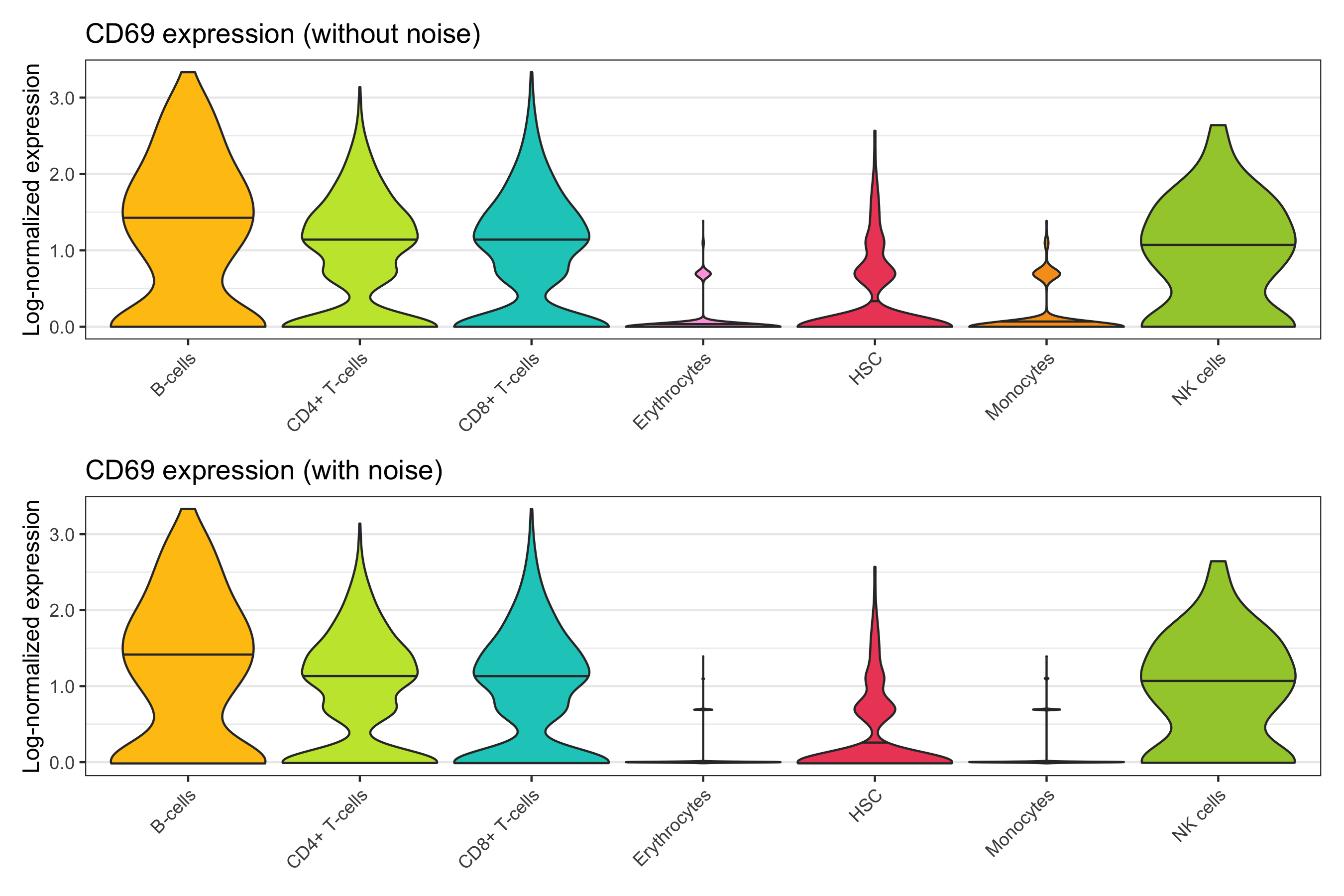
Dot plot (multiple genes)
Dot plots can be a useful method to show the expression of multiple genes by a certain grouping variable. As an example, we will use the marker genes that we detected for cell types and clusters.
By cell type
# cells will be grouped by samples that they have been assigned to
group_ids <- unique(seurat@meta.data$cell_type_singler_blueprintencode_main)

# select a set of genes for which we want to show expression
genes_to_show <- seurat@misc$marker_genes$cerebro_seurat$cell_type_singler_blueprintencode_main %>%
  group_by(cell_type_singler_blueprintencode_main) %>%
  arrange(p_val_adj) %>%
  filter(row_number() == 1) %>%
  arrange(cell_type_singler_blueprintencode_main) %>%
  pull(gene)

# for every sample-gene combination, calculate the average expression across
# all cells and then transform the data into a data frame
expression_levels_per_group <- vapply(
    group_ids, FUN.VALUE = numeric(length(genes_to_show)), function(x) {
      cells_in_current_group <- which(seurat@meta.data$cell_type_singler_blueprintencode_main == x)
      Matrix::rowMeans(seurat@assays$SCT@data[genes_to_show,cells_in_current_group])
    }
  ) %>%
  t() %>%
  as.data.frame() %>%
  mutate(cell_type_singler_blueprintencode_main = rownames(.)) %>%
  select(cell_type_singler_blueprintencode_main, everything()) %>%
  pivot_longer(
    cols = c(2:ncol(.)),
    names_to = 'gene'
  ) %>%
  dplyr::rename(expression = value) %>%
  mutate(id_to_merge = paste0(cell_type_singler_blueprintencode_main, '_', gene))

# for every sample-gene combination, calculate the percentage of cells in the
# respective group that has at least 1 transcript (this means we consider it
# as expressing the gene) and then transform the data into a data frame
percentage_of_cells_expressing_gene <- vapply(
    group_ids, FUN.VALUE = numeric(length(genes_to_show)), function(x) {
      cells_in_current_group <- which(seurat@meta.data$cell_type_singler_blueprintencode_main == x)
      Matrix::rowSums(seurat@assays$SCT@data[genes_to_show,cells_in_current_group] != 0)
    }
  ) %>%
  t() %>%
  as.data.frame() %>%
  mutate(cell_type_singler_blueprintencode_main = rownames(.)) %>%
  select(cell_type_singler_blueprintencode_main, everything()) %>%
  pivot_longer(
    cols = c(2:ncol(.)),
    names_to = 'gene'
  ) %>%
  dplyr::rename(cell_count = value) %>%
  left_join(
    .,
    seurat@meta.data %>%
      group_by(cell_type_singler_blueprintencode_main) %>%
      tally(),
    by = 'cell_type_singler_blueprintencode_main') %>%
  mutate(
    id_to_merge = paste0(cell_type_singler_blueprintencode_main, '_', gene),
    percent_cells = cell_count / n
  )

# merge the two data frames created before and plot the data
p <- left_join(
    expression_levels_per_group,
    percentage_of_cells_expressing_gene %>% select(id_to_merge, percent_cells),
    by = 'id_to_merge'
  ) %>%
  mutate(
    cell_type_singler_blueprintencode_main = factor(cell_type_singler_blueprintencode_main, levels = rev(group_ids)),
    gene = factor(gene, levels = genes_to_show)
  ) %>%
  arrange(gene) %>%
  ggplot(aes(gene, cell_type_singler_blueprintencode_main)) +
  geom_point(aes(color = expression, size = percent_cells)) +
  scale_color_distiller(
    palette = 'Reds',
    direction = 1,
    name = 'Log-normalised\nexpression',
    guide = guide_colorbar(frame.colour = "black", ticks.colour = "black")
  ) +
  scale_size(name = 'Percent\nof cells', labels = scales::percent) +
  labs(y = 'Cell type', color = 'Expression') +
  coord_fixed() +
  theme_bw() +
  theme(
    axis.title = element_blank(),
    axis.text.x = element_text(angle = 45, hjust = 1)
  )

ggsave('plots/marker_genes_by_cell_type_as_dot_plot.png', p, height = 5, width = 6)
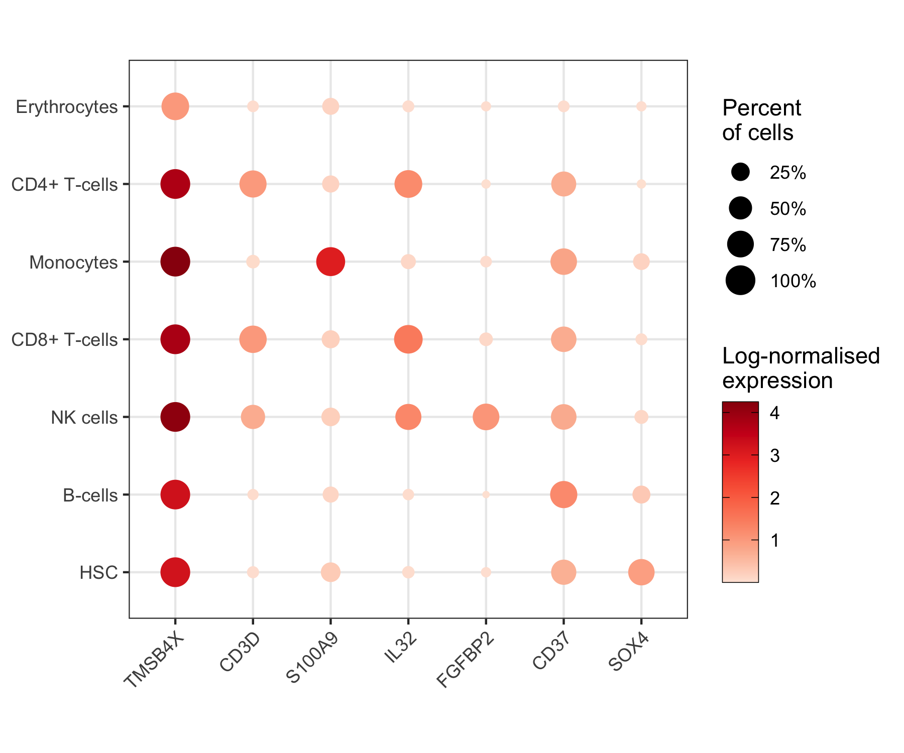
By cluster
NOTE: No marker gene was identified for cluster 6.
group_ids <- levels(seurat@meta.data$seurat_clusters)

genes_to_show <- seurat@misc$marker_genes$cerebro_seurat$seurat_clusters %>%
  group_by(seurat_clusters) %>%
  arrange(p_val_adj) %>%
  filter(row_number() == 1) %>%
  arrange(seurat_clusters) %>%
  pull(gene)

expression_levels_per_group <- vapply(
    group_ids, FUN.VALUE = numeric(length(genes_to_show)), function(x) {
      cells_in_current_group <- which(seurat@meta.data$seurat_clusters == x)
      Matrix::rowMeans(seurat@assays$SCT@data[genes_to_show,cells_in_current_group])
    }
  ) %>%
  t() %>%
  as.data.frame() %>%
  mutate(cluster = rownames(.)) %>%
  select(cluster, everything()) %>%
  pivot_longer(
    cols = c(2:ncol(.)),
    names_to = 'gene'
  ) %>%
  dplyr::rename(expression = value) %>%
  mutate(id_to_merge = paste0(cluster, '_', gene))

percentage_of_cells_expressing_gene <- vapply(
    group_ids, FUN.VALUE = numeric(length(genes_to_show)), function(x) {
      cells_in_current_group <- which(seurat@meta.data$seurat_cluster == x)
      Matrix::rowSums(seurat@assays$SCT@data[genes_to_show,cells_in_current_group] != 0)
    }
  ) %>%
  t() %>%
  as.data.frame() %>%
  mutate(cluster = rownames(.)) %>%
  select(cluster, everything()) %>%
  pivot_longer(
    cols = c(2:ncol(.)),
    names_to = 'gene'
  ) %>%
  dplyr::rename(cell_count = value) %>%
  left_join(
    .,
    seurat@meta.data %>%
      group_by(seurat_clusters) %>%
      tally() %>%
      dplyr::rename(cluster = seurat_clusters),
    by = 'cluster') %>%
  mutate(
    id_to_merge = paste0(cluster, '_', gene),
    percent_cells = cell_count / n
  )

p <- left_join(
    expression_levels_per_group,
    percentage_of_cells_expressing_gene %>% select(id_to_merge, percent_cells),
    by = 'id_to_merge'
  ) %>%
  mutate(
    cluster = factor(cluster, levels = rev(group_ids)),
    gene = factor(gene, levels = genes_to_show)
  ) %>%
  arrange(gene) %>%
  ggplot(aes(gene, cluster)) +
  geom_point(aes(color = expression, size = percent_cells)) +
  scale_color_distiller(
    palette = 'Reds',
    direction = 1,
    name = 'Log-normalised\nexpression',
    guide = guide_colorbar(frame.colour = "black", ticks.colour = "black")
  ) +
  scale_size(name = 'Percent\nof cells', labels = scales::percent) +
  labs(y = 'Cluster', color = 'Expression') +
  coord_fixed() +
  theme_bw() +
  theme(
    axis.title.x = element_blank(),
    axis.text.x = element_text(angle = 45, hjust = 1)
  )

ggsave('plots/marker_genes_by_cluster_as_dot_plot.png', p, height = 7, width = 8)
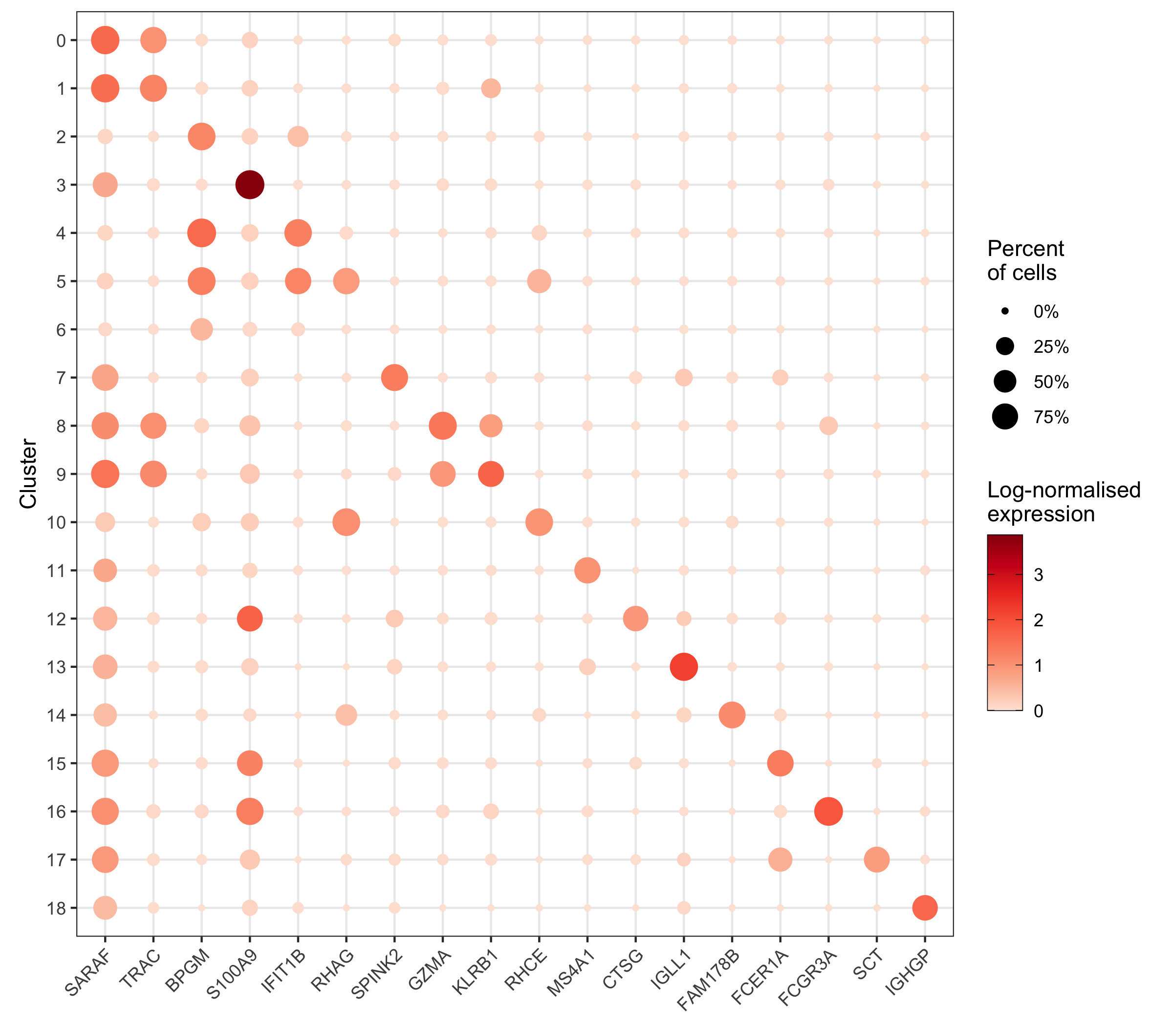
Expression of gene sets
Let’s check the expression of the genes in the GO term “B_CELL_ACTIVATION” downloaded from the MSigDB by cell type.
library(msigdbr)

gene_set <- msigdbr(species = 'Homo sapiens', category = 'C5', subcategory = 'BP') %>%
  filter(gs_name == 'GO_B_CELL_ACTIVATION') %>%
  pull(gene_symbol) %>%
  unique()

gene_set_present <- gene_set[which(gene_set %in% rownames(seurat@assays$SCT@data))]

head(gene_set_present)
# [1] "ABL1"    "ADA"     "ADAM17"  "ADGRG3"  "AHR"     "AKAP17A"
Mean log-expression
temp_labels <- seurat@meta.data %>%
  group_by(cell_type_singler_blueprintencode_main) %>%
  tally() %>%
  dplyr::rename('cell_type' = cell_type_singler_blueprintencode_main)

p <- tibble(
  cell_type = seurat@meta.data$cell_type_singler_blueprintencode_main,
  mean_expression = Matrix::colMeans(seurat@assays$SCT@data[gene_set_present,])
  ) %>%
  ggplot(aes(x = cell_type, y = mean_expression, fill = cell_type)) +
  geom_violin(draw_quantiles = c(0.5), scale = 'area', trim = FALSE) +
  geom_text(
    data = temp_labels,
    aes(
      x = cell_type,
      y = -Inf,
      label = paste0('n = ', format(n, big.mark = ',', trim = TRUE)),
      vjust = -1
    ),
    color = 'black', size = 2.8
  ) +
  theme_bw() +
  scale_fill_manual(values = custom_colors$discrete) +
  scale_x_discrete() +
  scale_y_continuous(name = 'Mean log expression', labels = scales::comma, expand = c(0.08, 0)) +
  labs(title = "GO term 'B_CELL_ACTIVATION'") +
  theme(
    axis.title.x = element_blank(),
    axis.text.x = element_text(angle = 45, hjust = 1),
    panel.grid.major.x = element_blank(),
    panel.grid.minor.x = element_blank(),
    legend.position = 'none'
  )

ggsave('plots/gene_set_expression_b_cell_activation_mean.png', p, height = 4, width = 7)
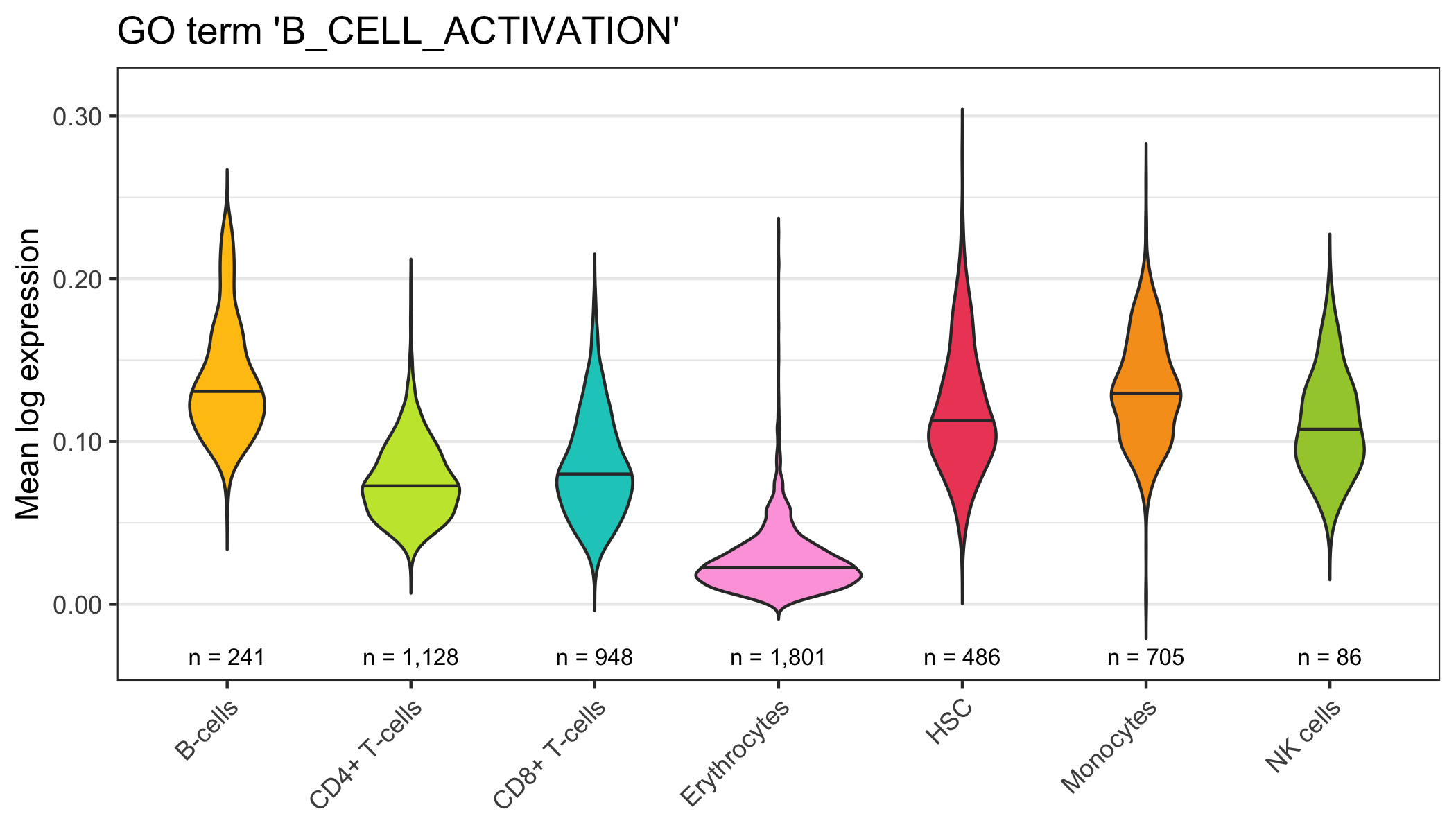
Module score
seurat <- AddModuleScore(
  seurat,
  features = list(gene_set_present),
  name = 'GO_B_CELL_ACTIVATION',
  assay = 'SCT'
)

temp_labels <- seurat@meta.data %>%
  group_by(cell_type_singler_blueprintencode_main) %>%
  tally()

p <- seurat@meta.data %>%
  ggplot(
    aes(
      x = cell_type_singler_blueprintencode_main,
      y = GO_B_CELL_ACTIVATION1,
      fill = cell_type_singler_blueprintencode_main
    )
  ) +
  geom_violin(draw_quantiles = c(0.5), scale = 'area', trim = FALSE) +
  geom_text(
    data = temp_labels,
    aes(
      x = cell_type_singler_blueprintencode_main,
      y = -Inf,
      label = paste0('n = ', format(n, big.mark = ',', trim = TRUE)),
      vjust = -1
    ),
    color = 'black', size = 2.8
  ) +
  theme_bw() +
  scale_fill_manual(values = custom_colors$discrete) +
  scale_x_discrete() +
  scale_y_continuous(name = 'Module score', labels = scales::comma, expand = c(0.08, 0)) +
  labs(title = "GO term 'B_CELL_ACTIVATION'") +
  theme(
    axis.title.x = element_blank(),
    axis.text.x = element_text(angle = 45, hjust = 1),
    panel.grid.major.x = element_blank(),
    panel.grid.minor.x = element_blank(),
    legend.position = 'none'
  )

ggsave('plots/gene_set_expression_b_cell_activation_module_score.png', p, height = 4, width = 7)
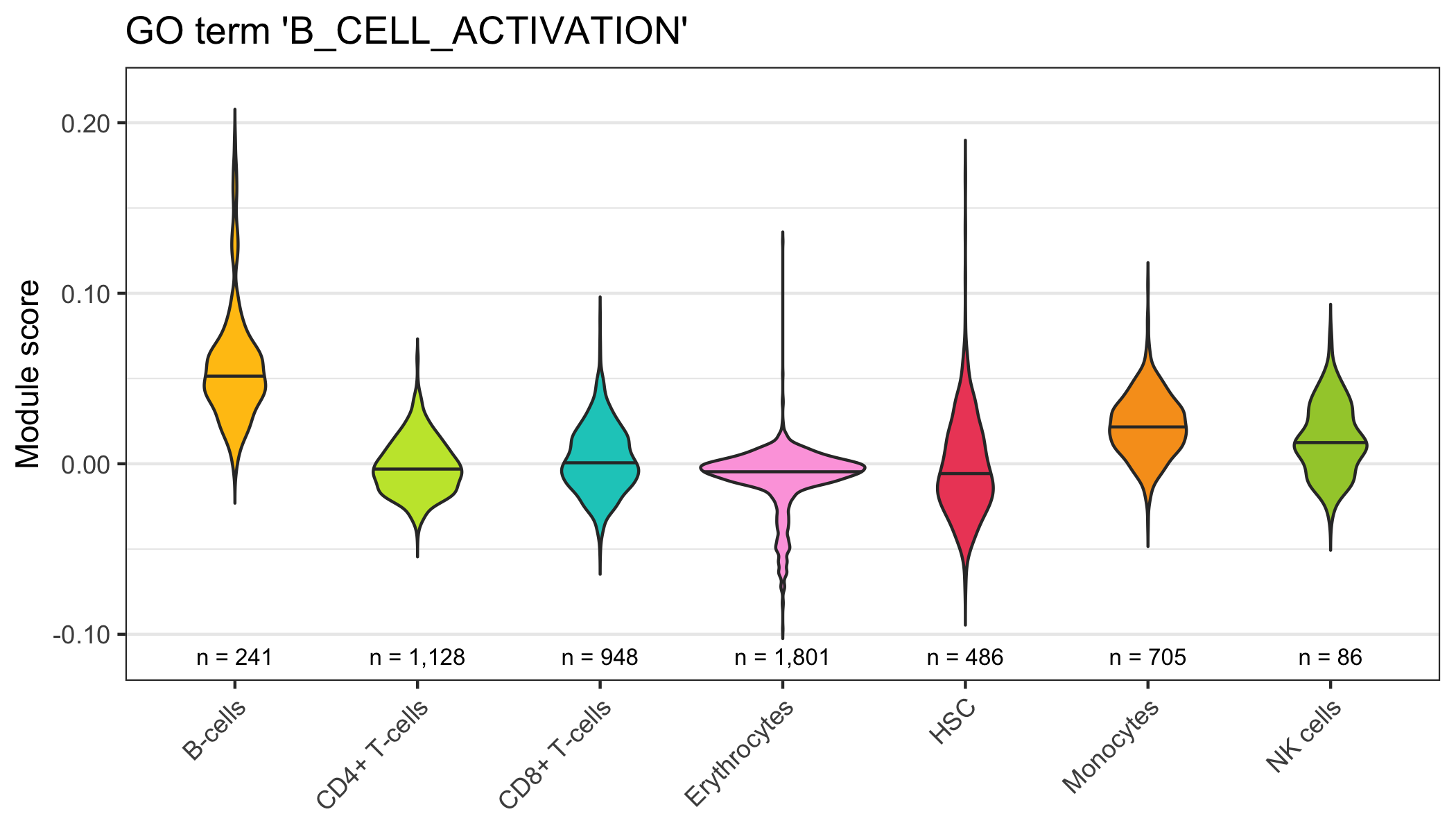
Gene set enrichment analysis
GSVA
For illustrative reasons, we will use the 50 hallmark gene sets from MSigDB and compare monocytes to hematopoietic stem cells (HSC; control).
Thanks to Alessandro Raveane for letting me start from his code.
# function to read GMT file
read_GMT_file <- function(file) {
  gmt <- readr::read_delim(
    file,
    delim = ';',
    col_names = c('X1'),
    col_types = readr::cols()
  )

  gene_set_genes <- list()
  for ( i in seq_len(nrow(gmt)) )
  {
    temp_genes <- strsplit(gmt$X1[i], split = '\t')[[1]] %>% unlist()
    temp_genes <- temp_genes[3:length(temp_genes)]
    gene_set_genes[[i]] <- temp_genes
  }
  gene_set_loaded <- list(
    genesets = gene_set_genes,
    geneset.names = lapply(strsplit(gmt$X1, split = '\t'), '[', 1) %>% unlist(),
    geneset.description = lapply(
        strsplit(gmt$X1, split = '\t'), '[', 2
      ) %>% unlist()
  )

  return(gene_set_loaded)
}

# load gene sets from GMT file
gene_sets <- read_GMT_file('h.all.v7.2.symbols.gmt')

# set gene set names
names(gene_sets$genesets) <- gene_sets$geneset.names

# get indices of cells which are either HSC or monocytes
cells_to_analyze <- seurat@meta.data %>%
  mutate(row_number = row_number()) %>%
  filter(grepl(cell_type_singler_blueprintencode_main, pattern = 'HSC|Monocytes')) %>%
  arrange(cell_type_singler_blueprintencode_main) %>%
  pull(row_number)

# get list of genes unique genes across all gene sets
genes_to_analyze <- gene_sets$genesets %>% unlist() %>% unique()
# filter gene list for those which are present in the data set
genes_to_analyze <- genes_to_analyze[which(genes_to_analyze %in% rownames(seurat@assays$SCT@counts))]

# get expression matrix and reduce it to cells and genes of interest
expression_matrix <- seurat@assays$SCT@counts[ genes_to_analyze , cells_to_analyze] %>% as.matrix()

# perform GSVA
gsva <- GSVA::gsva(
  expression_matrix,
  gset.idx.list = gene_sets$genesets,
  parallel.sz = 1
)

# load limma library for statistical testing
library(limma)

# generate design matrix
design_matrix <- tibble(
  control = 1,
  test = c(
    rep(0, seurat@meta.data %>% filter(cell_type_singler_blueprintencode_main == 'HSC') %>% nrow()),
    rep(1, seurat@meta.data %>% filter(cell_type_singler_blueprintencode_main == 'Monocytes') %>% nrow())
  )
)

head(design_matrix)
# A tibble: 6 x 2
#   control  test
#     <dbl> <dbl>
# 1       1     0
# 2       1     0
# 3       1     0
# 4       1     0
# 5       1     0
# 6       1     0

# fit linear model, followed by empirical Bayes statistics for differential
# enrichment analysis
fit <- lmFit(gsva, design_matrix)
fit <- eBayes(fit)

# prepare data for plotting
data <- topTable(fit, coef = 'test', number = 50) %>%
  mutate(gene_set = rownames(fit$t)) %>%
  arrange(t) %>%
  mutate(
    gene_set = factor(gene_set, levels = gene_set),
    just = ifelse(t < 0, 0, 1),
    nudge_y = ifelse(t < 0, 1, -1),
    color = ifelse(t < -5 | t > 5, 'black', 'grey')
  )

DataFrame(data)
# DataFrame with 50 rows and 10 columns
#         logFC     AveExpr         t      P.Value    adj.P.Val         B                            gene_set      just   nudge_y       color
#     <numeric>   <numeric> <numeric>    <numeric>    <numeric> <numeric>                            <factor> <numeric> <numeric> <character>
# 1   -0.369443  -0.1569690  -35.1619 1.26066e-186 1.05055e-185   415.980  HALLMARK_TGF_BETA_SIGNALING                0         1       black
# 2   -0.251413  -0.0820012  -27.2261 1.96152e-127 8.91598e-127   279.761  HALLMARK_NOTCH_SIGNALING                   0         1       black
# 3   -0.288169  -0.1202293  -26.1464 1.40712e-119 5.41201e-119   261.689  HALLMARK_ESTROGEN_RESPONSE_EARLY           0         1       black
# 4   -0.135034  -0.1511146  -22.3565  8.50194e-93  2.36165e-92   200.094  HALLMARK_INTERFERON_ALPHA_RESPONSE         0         1       black
# 5   -0.203651  -0.1049498  -22.0728  7.44006e-91  1.95791e-90   195.628  HALLMARK_INTERFERON_GAMMA_RESPONSE         0         1       black
# ...       ...         ...       ...          ...          ...       ...                                 ...       ...       ...         ...
# 46   0.200259  0.25341594   35.9250 2.31901e-192 2.31901e-191   429.182 HALLMARK_WNT_BETA_CATENIN_SIGNALING         1        -1       black
# 47   0.293113 -0.08115610   36.1995 2.00784e-194 2.50980e-193   433.929 HALLMARK_MITOTIC_SPINDLE                    1        -1       black
# 48   0.338449  0.11583774   36.2560 7.56196e-195 1.26033e-193   434.906 HALLMARK_CHOLESTEROL_HOMEOSTASIS            1        -1       black
# 49   0.251678  0.00262136   37.5117 2.86772e-204 7.16930e-203   456.592 HALLMARK_HYPOXIA                            1        -1       black
# 50   0.282907 -0.05021404   48.5971 1.72523e-285 8.62616e-284   643.571 HALLMARK_TNFA_SIGNALING_VIA_NFKB            1        -1       black

# plot t-value
p <- ggplot(data = data, aes(x = gene_set, y = t, fill = t)) +
  geom_col() +
  geom_hline(yintercept = c(-5,5), linetype = 'dashed', color = 'grey80') +
  geom_text(
    aes(
      x = gene_set,
      y = 0,
      label = gene_set,
      hjust = just,
      color = color
    ),
    nudge_y = data$nudge_y, size = 3
  ) +
  scale_x_discrete(name = '', labels = NULL) +
  scale_y_continuous(name = 't-value', limits = c(-55,55)) +
  scale_fill_distiller(palette = 'Spectral', limits = c(-max(data$t), max(data$t))) +
  scale_color_manual(values = c('black' = 'black', 'grey' = 'grey')) +
  coord_flip() +
  theme_bw() +
  theme(
    panel.grid = element_blank(),
    axis.ticks.y =  element_blank(),
    legend.position = 'none'
  )

ggsave('plots/gsva_hallmark_gene_sets_monocytes_vs_hsc.png', height = 7.5, width = 7.5)
Store data
Finally, we store our Seurat object so we can continue the analysis later.
saveRDS(seurat, 'data/seurat.rds')
Session info
Here we report information about the version of R and R packages we used.
# devtools::session_info()
# ─ Session info ───────────────────────────────────────────────────────────────────────────────────
#  setting  value
#  version  R version 4.0.2 Patched (2020-08-19 r79057)
#  os       macOS Catalina 10.15.7
#  system   x86_64, darwin17.0
#  ui       X11
#  language (EN)
#  collate  en_US.UTF-8
#  ctype    en_US.UTF-8
#  tz       Europe/Amsterdam
#  date     2020-10-07
#
# ─ Packages ───────────────────────────────────────────────────────────────────────────────────────
#  package                * version  date       lib source
#  abind                    1.4-5    2016-07-21 [1] CRAN (R 4.0.2)
#  annotate                 1.66.0   2020-04-28 [1] Bioconductor
#  AnnotationDbi            1.50.3   2020-07-25 [1] Bioconductor
#  AnnotationHub            2.20.2   2020-08-18 [1] Bioconductor
#  ape                      5.4-1    2020-08-13 [1] CRAN (R 4.0.2)
#  aplot                    0.0.6    2020-09-03 [1] CRAN (R 4.0.2)
#  askpass                  1.1      2019-01-13 [1] CRAN (R 4.0.2)
#  assertthat               0.2.1    2019-03-21 [1] CRAN (R 4.0.2)
#  backports                1.1.9    2020-08-24 [1] CRAN (R 4.0.2)
#  beeswarm                 0.2.3    2016-04-25 [1] CRAN (R 4.0.2)
#  Biobase                * 2.48.0   2020-04-27 [1] Bioconductor
#  BiocFileCache            1.12.1   2020-08-04 [1] Bioconductor
#  BiocGenerics           * 0.34.0   2020-04-27 [1] Bioconductor
#  BiocManager              1.30.10  2019-11-16 [1] CRAN (R 4.0.2)
#  BiocNeighbors            1.6.0    2020-04-27 [1] Bioconductor
#  BiocParallel             1.22.0   2020-04-27 [1] Bioconductor
#  BiocSingular             1.4.0    2020-04-27 [1] Bioconductor
#  BiocVersion              3.11.1   2020-04-07 [1] Bioconductor
#  biomaRt                  2.44.1   2020-06-17 [1] Bioconductor
#  bit                      4.0.4    2020-08-04 [1] CRAN (R 4.0.2)
#  bit64                    4.0.2    2020-07-30 [1] CRAN (R 4.0.2)
#  bitops                   1.0-6    2013-08-17 [1] CRAN (R 4.0.2)
#  blob                     1.2.1    2020-01-20 [1] CRAN (R 4.0.2)
#  broom                    0.7.0    2020-07-09 [1] CRAN (R 4.0.2)
#  callr                    3.4.3    2020-03-28 [1] CRAN (R 4.0.2)
#  cellranger               1.1.0    2016-07-27 [1] CRAN (R 4.0.2)
#  cerebroApp               1.3.0    2020-10-07 [1] Github (romanhaa/cerebroApp@7fb55f0)
#  cli                      2.0.2    2020-02-28 [1] CRAN (R 4.0.2)
#  cluster                * 2.1.0    2019-06-19 [1] CRAN (R 4.0.2)
#  coda                     0.19-4   2020-09-30 [1] CRAN (R 4.0.2)
#  codetools                0.2-16   2018-12-24 [1] CRAN (R 4.0.2)
#  colorspace               1.4-1    2019-03-18 [1] CRAN (R 4.0.2)
#  colourpicker             1.0      2017-09-27 [1] CRAN (R 4.0.2)
#  cowplot                  1.0.0    2019-07-11 [1] CRAN (R 4.0.2)
#  crayon                   1.3.4    2017-09-16 [1] CRAN (R 4.0.2)
#  crosstalk                1.1.0.1  2020-03-13 [1] CRAN (R 4.0.2)
#  curl                     4.3      2019-12-02 [1] CRAN (R 4.0.1)
#  data.table               1.13.0   2020-07-24 [1] CRAN (R 4.0.2)
#  DBI                      1.1.0    2019-12-15 [1] CRAN (R 4.0.2)
#  dbplyr                   1.4.4    2020-05-27 [1] CRAN (R 4.0.2)
#  DelayedArray           * 0.14.1   2020-07-14 [1] Bioconductor
#  DelayedMatrixStats       1.10.1   2020-07-03 [1] Bioconductor
#  deldir                   0.1-28   2020-07-15 [1] CRAN (R 4.0.2)
#  desc                     1.2.0    2018-05-01 [1] CRAN (R 4.0.2)
#  devtools                 2.3.1    2020-07-21 [1] CRAN (R 4.0.2)
#  digest                   0.6.25   2020-02-23 [1] CRAN (R 4.0.2)
#  dplyr                  * 1.0.2    2020-08-18 [1] CRAN (R 4.0.2)
#  dqrng                    0.2.1    2019-05-17 [1] CRAN (R 4.0.2)
#  DT                       0.15     2020-08-05 [1] CRAN (R 4.0.2)
#  edgeR                    3.30.3   2020-06-02 [1] Bioconductor
#  ellipsis                 0.3.1    2020-05-15 [1] CRAN (R 4.0.2)
#  ExperimentHub            1.14.2   2020-08-18 [1] Bioconductor
#  fansi                    0.4.1    2020-01-08 [1] CRAN (R 4.0.2)
#  farver                   2.0.3    2020-01-16 [1] CRAN (R 4.0.2)
#  fastmap                  1.0.1    2019-10-08 [1] CRAN (R 4.0.2)
#  fastmatch                1.1-0    2017-01-28 [1] CRAN (R 4.0.2)
#  fitdistrplus             1.1-1    2020-05-19 [1] CRAN (R 4.0.2)
#  forcats                * 0.5.0    2020-03-01 [1] CRAN (R 4.0.2)
#  fs                       1.5.0    2020-07-31 [1] CRAN (R 4.0.2)
#  future                   1.18.0   2020-07-09 [1] CRAN (R 4.0.2)
#  future.apply             1.6.0    2020-07-01 [1] CRAN (R 4.0.2)
#  generics                 0.0.2    2018-11-29 [1] CRAN (R 4.0.2)
#  GenomeInfoDb           * 1.24.2   2020-06-15 [1] Bioconductor
#  GenomeInfoDbData         1.2.3    2020-08-26 [1] Bioconductor
#  GenomicRanges          * 1.40.0   2020-04-27 [1] Bioconductor
#  ggbeeswarm               0.6.0    2017-08-07 [1] CRAN (R 4.0.2)
#  ggforce                * 0.3.2    2020-06-23 [1] CRAN (R 4.0.2)
#  gghalves               * 0.1.0    2020-03-28 [1] CRAN (R 4.0.2)
#  ggnetwork              * 0.5.8    2020-02-12 [1] CRAN (R 4.0.2)
#  ggplot2                * 3.3.2    2020-06-19 [1] CRAN (R 4.0.2)
#  ggrepel                  0.8.2    2020-03-08 [1] CRAN (R 4.0.2)
#  ggridges               * 0.5.2    2020-01-12 [1] CRAN (R 4.0.2)
#  ggtree                   2.2.4    2020-07-28 [1] Bioconductor
#  globals                  0.12.5   2019-12-07 [1] CRAN (R 4.0.2)
#  glue                     1.4.2    2020-08-27 [1] CRAN (R 4.0.2)
#  goftest                  1.2-2    2019-12-02 [1] CRAN (R 4.0.2)
#  graph                    1.66.0   2020-04-27 [1] Bioconductor
#  gridExtra                2.3      2017-09-09 [1] CRAN (R 4.0.2)
#  GSEABase                 1.50.1   2020-05-29 [1] Bioconductor
#  GSVA                     1.36.2   2020-06-17 [1] Bioconductor
#  gtable                   0.3.0    2019-03-25 [1] CRAN (R 4.0.2)
#  haven                    2.3.1    2020-06-01 [1] CRAN (R 4.0.2)
#  highr                    0.8      2019-03-20 [1] CRAN (R 4.0.2)
#  hms                      0.5.3    2020-01-08 [1] CRAN (R 4.0.2)
#  htmltools                0.5.0    2020-06-16 [1] CRAN (R 4.0.2)
#  htmlwidgets              1.5.1    2019-10-08 [1] CRAN (R 4.0.2)
#  httpuv                   1.5.4    2020-06-06 [1] CRAN (R 4.0.2)
#  httr                     1.4.2    2020-07-20 [1] CRAN (R 4.0.2)
#  ica                      1.0-2    2018-05-24 [1] CRAN (R 4.0.2)
#  igraph                   1.2.5    2020-03-19 [1] CRAN (R 4.0.2)
#  interactiveDisplayBase   1.26.3   2020-06-02 [1] Bioconductor
#  intrinsicDimension       1.2.0    2019-06-07 [1] CRAN (R 4.0.2)
#  IRanges                * 2.22.2   2020-05-21 [1] Bioconductor
#  irlba                    2.3.3    2019-02-05 [1] CRAN (R 4.0.2)
#  jsonlite                 1.7.0    2020-06-25 [1] CRAN (R 4.0.2)
#  KernSmooth               2.23-17  2020-04-26 [1] CRAN (R 4.0.2)
#  knitr                    1.29     2020-06-23 [1] CRAN (R 4.0.2)
#  labeling                 0.3      2014-08-23 [1] CRAN (R 4.0.2)
#  later                    1.1.0.1  2020-06-05 [1] CRAN (R 4.0.2)
#  lattice                  0.20-41  2020-04-02 [1] CRAN (R 4.0.2)
#  lazyeval                 0.2.2    2019-03-15 [1] CRAN (R 4.0.2)
#  leiden                   0.3.3    2020-02-04 [1] CRAN (R 4.0.2)
#  lifecycle                0.2.0    2020-03-06 [1] CRAN (R 4.0.2)
#  limma                  * 3.44.3   2020-06-12 [1] Bioconductor
#  listenv                  0.8.0    2019-12-05 [1] CRAN (R 4.0.2)
#  lmtest                   0.9-37   2019-04-30 [1] CRAN (R 4.0.2)
#  locfit                   1.5-9.4  2020-03-25 [1] CRAN (R 4.0.2)
#  lubridate                1.7.9    2020-06-08 [1] CRAN (R 4.0.2)
#  magrittr                 1.5      2014-11-22 [1] CRAN (R 4.0.2)
#  MASS                     7.3-52   2020-08-18 [1] CRAN (R 4.0.2)
#  Matrix                   1.2-18   2019-11-27 [1] CRAN (R 4.0.2)
#  matrixStats            * 0.56.0   2020-03-13 [1] CRAN (R 4.0.2)
#  memoise                  1.1.0    2017-04-21 [1] CRAN (R 4.0.2)
#  mgcv                     1.8-32   2020-08-19 [1] CRAN (R 4.0.2)
#  mime                     0.9      2020-02-04 [1] CRAN (R 4.0.2)
#  miniUI                   0.1.1.1  2018-05-18 [1] CRAN (R 4.0.2)
#  modelr                   0.1.8    2020-05-19 [1] CRAN (R 4.0.2)
#  msigdbr                * 7.1.1    2020-05-14 [1] CRAN (R 4.0.2)
#  munsell                  0.5.0    2018-06-12 [1] CRAN (R 4.0.2)
#  network                  1.16.0   2019-12-01 [1] CRAN (R 4.0.2)
#  nlme                     3.1-149  2020-08-23 [1] CRAN (R 4.0.2)
#  openssl                  1.4.3    2020-09-18 [1] CRAN (R 4.0.2)
#  patchwork              * 1.0.1    2020-06-22 [1] CRAN (R 4.0.2)
#  pbapply                  1.4-3    2020-08-18 [1] CRAN (R 4.0.2)
#  pheatmap                 1.0.12   2019-01-04 [1] CRAN (R 4.0.2)
#  pillar                   1.4.6    2020-07-10 [1] CRAN (R 4.0.2)
#  pkgbuild                 1.1.0    2020-07-13 [1] CRAN (R 4.0.2)
#  pkgconfig                2.0.3    2019-09-22 [1] CRAN (R 4.0.2)
#  pkgload                  1.1.0    2020-05-29 [1] CRAN (R 4.0.2)
#  plotly                   4.9.2.1  2020-04-04 [1] CRAN (R 4.0.2)
#  plyr                     1.8.6    2020-03-03 [1] CRAN (R 4.0.2)
#  png                      0.1-7    2013-12-03 [1] CRAN (R 4.0.2)
#  polyclip                 1.10-0   2019-03-14 [1] CRAN (R 4.0.2)
#  prettyunits              1.1.1    2020-01-24 [1] CRAN (R 4.0.2)
#  processx                 3.4.3    2020-07-05 [1] CRAN (R 4.0.2)
#  progress                 1.2.2    2019-05-16 [1] CRAN (R 4.0.2)
#  promises                 1.1.1    2020-06-09 [1] CRAN (R 4.0.2)
#  ps                       1.3.4    2020-08-11 [1] CRAN (R 4.0.2)
#  purrr                  * 0.3.4    2020-04-17 [1] CRAN (R 4.0.2)
#  qvalue                   2.20.0   2020-04-27 [1] Bioconductor
#  R6                       2.4.1    2019-11-12 [1] CRAN (R 4.0.2)
#  randomForest             4.6-14   2018-03-25 [1] CRAN (R 4.0.2)
#  RANN                     2.6.1    2019-01-08 [1] CRAN (R 4.0.2)
#  rappdirs                 0.3.1    2016-03-28 [1] CRAN (R 4.0.2)
#  RColorBrewer             1.1-2    2014-12-07 [1] CRAN (R 4.0.2)
#  Rcpp                     1.0.5    2020-07-06 [1] CRAN (R 4.0.2)
#  RcppAnnoy                0.0.16   2020-03-08 [1] CRAN (R 4.0.2)
#  RCurl                    1.98-1.2 2020-04-18 [1] CRAN (R 4.0.2)
#  readr                  * 1.3.1    2018-12-21 [1] CRAN (R 4.0.2)
#  readxl                   1.3.1    2019-03-13 [1] CRAN (R 4.0.2)
#  remotes                  2.2.0    2020-07-21 [1] CRAN (R 4.0.2)
#  reprex                   0.3.0    2019-05-16 [1] CRAN (R 4.0.2)
#  reshape2                 1.4.4    2020-04-09 [1] CRAN (R 4.0.2)
#  reticulate               1.16     2020-05-27 [1] CRAN (R 4.0.2)
#  rlang                    0.4.7    2020-07-09 [1] CRAN (R 4.0.2)
#  rle                      0.9.2    2020-09-25 [1] CRAN (R 4.0.2)
#  ROCR                     1.0-11   2020-05-02 [1] CRAN (R 4.0.2)
#  rpart                    4.1-15   2019-04-12 [1] CRAN (R 4.0.2)
#  rprojroot                1.3-2    2018-01-03 [1] CRAN (R 4.0.2)
#  RSpectra                 0.16-0   2019-12-01 [1] CRAN (R 4.0.2)
#  RSQLite                  2.2.0    2020-01-07 [1] CRAN (R 4.0.2)
#  rstudioapi               0.11     2020-02-07 [1] CRAN (R 4.0.2)
#  rsvd                     1.0.3    2020-02-17 [1] CRAN (R 4.0.2)
#  Rtsne                    0.15     2018-11-10 [1] CRAN (R 4.0.2)
#  rvcheck                  0.1.8    2020-03-01 [1] CRAN (R 4.0.2)
#  rvest                    0.3.6    2020-07-25 [1] CRAN (R 4.0.2)
#  S4Vectors              * 0.26.1   2020-05-16 [1] Bioconductor
#  scales                   1.1.1    2020-05-11 [1] CRAN (R 4.0.2)
#  scater                   1.16.2   2020-06-26 [1] Bioconductor
#  scDblFinder            * 1.2.0    2020-04-27 [1] Bioconductor
#  scran                  * 1.16.0   2020-04-27 [1] Bioconductor
#  sctransform              0.2.1    2019-12-17 [1] CRAN (R 4.0.2)
#  sessioninfo              1.1.1    2018-11-05 [1] CRAN (R 4.0.2)
#  Seurat                 * 3.2.0    2020-07-16 [1] CRAN (R 4.0.2)
#  shiny                  * 1.5.0    2020-06-23 [1] CRAN (R 4.0.2)
#  shinycssloaders          1.0.0    2020-07-28 [1] CRAN (R 4.0.2)
#  shinydashboard           0.7.1    2018-10-17 [1] CRAN (R 4.0.2)
#  shinyFiles               0.8.0    2020-04-14 [1] CRAN (R 4.0.2)
#  shinyjs                  1.1      2020-01-13 [1] CRAN (R 4.0.2)
#  shinythemes              1.1.2    2018-11-06 [1] CRAN (R 4.0.2)
#  shinyWidgets             0.5.3    2020-06-01 [1] CRAN (R 4.0.2)
#  SingleCellExperiment   * 1.10.1   2020-04-28 [1] Bioconductor
#  SingleR                * 1.2.4    2020-05-25 [1] Bioconductor
#  sna                      2.5      2019-12-10 [1] CRAN (R 4.0.2)
#  spatstat                 1.64-1   2020-05-12 [1] CRAN (R 4.0.2)
#  spatstat.data            1.4-3    2020-01-26 [1] CRAN (R 4.0.2)
#  spatstat.utils           1.17-0   2020-02-07 [1] CRAN (R 4.0.2)
#  statmod                  1.4.34   2020-02-17 [1] CRAN (R 4.0.2)
#  statnet.common           4.4.1    2020-10-03 [1] CRAN (R 4.0.2)
#  stringi                  1.5.3    2020-09-09 [1] CRAN (R 4.0.2)
#  stringr                * 1.4.0    2019-02-10 [1] CRAN (R 4.0.2)
#  SummarizedExperiment   * 1.18.2   2020-07-14 [1] Bioconductor
#  survival                 3.2-3    2020-06-13 [1] CRAN (R 4.0.2)
#  tensor                   1.5      2012-05-05 [1] CRAN (R 4.0.2)
#  testthat                 2.3.2    2020-03-02 [1] CRAN (R 4.0.2)
#  tibble                 * 3.0.3    2020-07-10 [1] CRAN (R 4.0.2)
#  tidyr                  * 1.1.1    2020-07-31 [1] CRAN (R 4.0.2)
#  tidyselect               1.1.0    2020-05-11 [1] CRAN (R 4.0.2)
#  tidytree                 0.3.3    2020-04-02 [1] CRAN (R 4.0.2)
#  tidyverse              * 1.3.0    2019-11-21 [1] CRAN (R 4.0.2)
#  treeio                   1.12.0   2020-04-27 [1] Bioconductor
#  tweenr                   1.0.1    2018-12-14 [1] CRAN (R 4.0.2)
#  usethis                  1.6.1    2020-04-29 [1] CRAN (R 4.0.2)
#  utf8                     1.1.4    2018-05-24 [1] CRAN (R 4.0.2)
#  uwot                     0.1.8    2020-03-16 [1] CRAN (R 4.0.2)
#  vctrs                    0.3.2    2020-07-15 [1] CRAN (R 4.0.2)
#  vipor                    0.4.5    2017-03-22 [1] CRAN (R 4.0.2)
#  viridis                * 0.5.1    2018-03-29 [1] CRAN (R 4.0.2)
#  viridisLite            * 0.3.0    2018-02-01 [1] CRAN (R 4.0.1)
#  withr                    2.3.0    2020-09-22 [1] CRAN (R 4.0.2)
#  xfun                     0.16     2020-07-24 [1] CRAN (R 4.0.2)
#  XML                      3.99-0.5 2020-07-23 [1] CRAN (R 4.0.2)
#  xml2                     1.3.2    2020-04-23 [1] CRAN (R 4.0.2)
#  xtable                   1.8-4    2019-04-21 [1] CRAN (R 4.0.2)
#  XVector                  0.28.0   2020-04-27 [1] Bioconductor
#  yaImpute                 1.0-32   2020-02-17 [1] CRAN (R 4.0.2)
#  yaml                     2.2.1    2020-02-01 [1] CRAN (R 4.0.2)
#  zlibbioc                 1.34.0   2020-04-27 [1] Bioconductor
#  zoo                      1.8-8    2020-05-02 [1] CRAN (R 4.0.2)
#
# [1] /Library/Frameworks/R.framework/Versions/4.0/Resources/library
References
- Human bone marrow assessment by single-cell RNA sequencing, mass cytometry, and flow cytometry. Oetjen et al., JCI (2018) | DOI
- pipeComp, a general framework for the evaluation of computational pipelines, reveals performant single-cell RNA-seq preprocessing tools. Germain et al., bioRxiv (2020) | DOI
- A benchmark of batch-effect correction methods for single-cell RNA sequencing data. Tran et al., Genome Biology (2020) | DOI
- Cerebro: interactive visualization of scRNA-seq data. Hillje et al., Bioinformatics (2019) | DOI
Changelog
07.10.2020
- Removed attempt to write function that prints head and tail of a data frame as the
DataFramestructure of theS4Vectorscan already do that. - Modified
load10xData()function so that it keeps transcript counts in sparse matrix format to reduce memory footprint. - Coherently with the changes to the
load10xData()function, the merging procedure of transcript counts from different samples was adapted to avoid conversion to data frame format and thereby reduce memory consumption. - Update cerebroApp steps to be compatible with v1.3.
- Minor changes to plots.
- Remove individual dots from violin/box plots.
- Properly remove axis titles instead of replacing it with an empty string.
- Add numbers to heatmaps.