Animating the dynamics of training a Poincaré map
Preface
Last Friday, I came across an interesting method called “Poincaré map” to visualize the relationship of cells in single cell RNA-seq data using hyperbolic space. Check this page for an intuitive representation of what hyperbolic space is. During the weekend, I had the chance to experiment with this method to the data set I used in the scRNA-seq workflow. This article is not about finding the right parameters, even if it might help doing so. Instead, it is about (1) finally getting a chance to make animated plots, and (2) visualize what happens during the training process of the Poincaré map.
Links:
- Preprint on bioRxiv: Poincaré Maps for Analyzing Complex Hierarchies in Single-Cell Data
- GitHub repository: facebookresearch/PoincareMaps
Let’s go.
Export log-normalized transcript counts
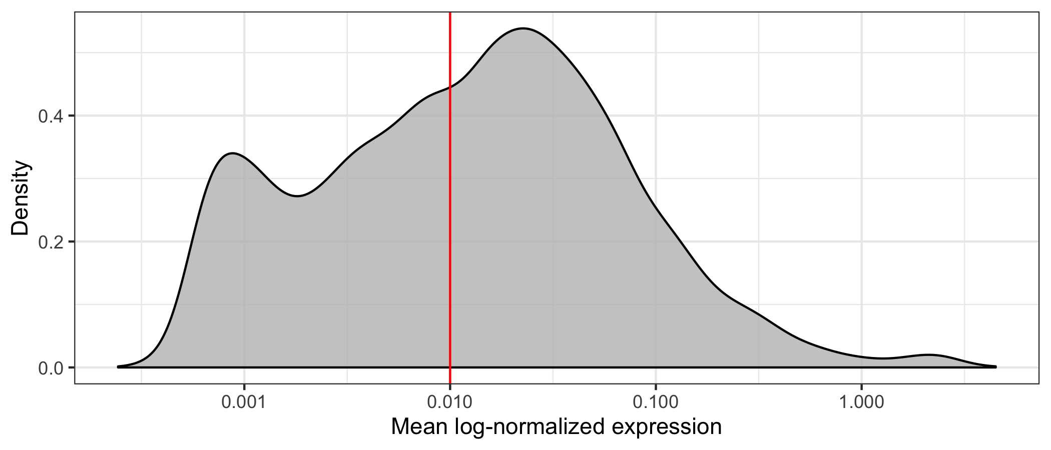
First, we will load our data and identify genes with a mean expression above a visually determined and quite arbitrary threshold (I’m not sure this is the right way to do it but I wanted to reduce computation time). We remove almost half of the genes, having 8,886 genes left.
library(tidyverse)
library(Seurat)

seurat <- readRDS('data/seurat.rds')

average_expression_per_gene <- seurat@assays$SCT@data %>% Matrix::rowMeans()

p <- tibble(value = average_expression_per_gene) %>%
  ggplot(aes(value)) +
  geom_density(fill = 'grey', alpha = 0.8) +
  geom_vline(xintercept = 0.01, color = 'red') +
  scale_x_log10(name = 'Mean log-normalized expression') +
  scale_y_continuous(name = 'Density') +
  theme_bw()
ggsave('mean_log_normalized_expression.png', p, height = 3, width = 7)

length(average_expression_per_gene)
# 15907

length(which(average_expression_per_gene >= 0.01))
# 8886
Then, we write the filtered transcript counts in a transposed format to a CSV file, adding the cell type identified using SingleR as a label.
seurat@assays$SCT@data[which(average_expression_per_gene >= 0.01),] %>%
as.matrix() %>%
t() %>%
as_tibble() %>%
mutate(label = seurat@meta.data$cell_type_singler_blueprintencode_main) %>%
write_csv('data/SCT_data.csv')
Adjust code of Poincaré tool
Before actually generating any Poincaré map, we have to download the tool from GitHub and a few small adjustments to the code.
The tool allows to see intermediate maps (and cell coordinates) through the --debugplot parameter where we specify how often we want to get the intermediate data.
If we set it to 10 (which we will do later), the intermediate data is generated every 10 epochs.
The adjustments in the code are necessary because the intermediate data is overwritten every time they are re-generated.
In the train.py file, in the definition of the train function, we create a new variable temp_fout, which will be the file name of the temporary data, and add the current epoch count to the file name.
Then, we use that temporary name for the intermediate map (in PDF format) and cell coordinates (CSV format).
# ...
        if args.debugplot:
            if (epoch % args.debugplot) == 0:
                d = model.lt.weight.cpu().detach().numpy()
                titlename = 'epoch: {:d}, loss: {:.3e}'.format(
                    epoch, np.mean(epoch_loss))
                temp_fout = fout + "_epoch=" + str(epoch)

                if epoch > 5:
                    plotPoincareDisc(np.transpose(d), labels, temp_fout, titlename, color_dict=color_dict)
                    np.savetxt(temp_fout + '.csv', d, delimiter=",")
# ...
I think this is a quite ugly approach but it gets the job done for now. If the developers think this is useful, I would think about a way to store intermediate results without creating many separate files.
Learn Poincaré map
Now, we can start training the Poincaré map using the same parameters as documented for some of the examples in the GitHub repository.
By default, this process will run for 5,000 epochs (--epochs) or until epsilon (loss) goes below 0.0001 (--earlystop).
I did my early tests on my private laptop which doesn’t have a GPU, which means I had to set --cuda to 0.
I terminated the command below after a about an hour because it had only calculated 290 epochs.
Further tests will have to be run on some proper hardware, but for the purpose of visualizing the process we anyway collected some interesting data.
python3 main.py \
--dset SCT_data \
--path data/ \
--batchsize -1 \
--cuda 0 \
--knn 15 \
--gamma 2.0 \
--sigma 1.0 \
--pca 20 \
--labels 1 \
--mode features \
--debugplot 10
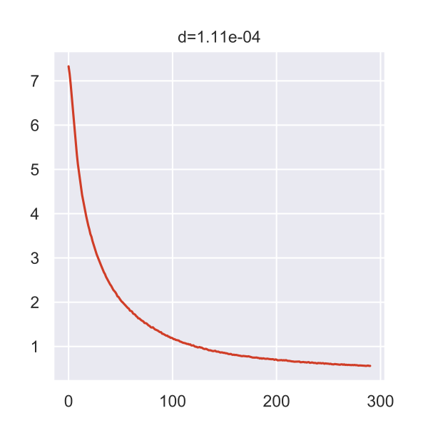
The plot below is generated by the Poincaré tool and shows the loss curve during the training process.
If I interpret it correctly, the top value indicates that we were actually very close to the 0.0001 epsilon that would’ve stopped the analysis.
But maybe I’m wrong, there isn’t too much information.
Anyway, all the intermediate data was put into the results folder of the current working directory.
Prepare R session
Here, we launch an R session, load libraries, load our Seurat object, and define some custom colors.
library(tidyverse)
library(Seurat)
library(plotly)

seurat <- readRDS('data/seurat.rds')

colors_dutch <- c(
  '#FFC312','#C4E538','#12CBC4','#FDA7DF','#ED4C67',
  '#F79F1F','#A3CB38','#1289A7','#D980FA','#B53471',
  '#EE5A24','#009432','#0652DD','#9980FA','#833471',
  '#EA2027','#006266','#1B1464','#5758BB','#6F1E51'
)
Load data
Now, we load the cell coordinates from all available intermediate results. While doing this, we also add an ID and the cell type to every cell.
final_data <- tibble(
  X1 = numeric(),
  X2 = numeric(),
  cell_id = numeric(),
  epoch = numeric(),
  label = character()
)

for ( i in list.files('~/Research/PoincareMaps/results', pattern = 'seed0_epoch=[0-9]{2,4}.csv', full.name = TRUE) ) {
  epoch <- gsub(basename(i), pattern = 'SCT_data_PM15sigma=1.00gamma=2.00minkowskipca=20_seed0_epoch=', replacement = '') %>%
    gsub(pattern = '\\.csv', replacement = '') %>%
    as.integer()
  temp_data <- read_csv(i, col_names = FALSE, col_types = cols()) %>%
    mutate(
      cell_id = row_number(),
      epoch = epoch,
      label = seurat@meta.data$cell_type_singler_blueprintencode_main
    )
  final_data <- bind_rows(final_data, temp_data)
}

final_data <- final_data %>% arrange(epoch, cell_id)

glimpse(final_data)
# Observations: 165,213
# Variables: 5
# $ X1      <dbl> 0.004369234, 0.132621959, 0.127156094, -0.051962741, -0.22114…
# $ X2      <dbl> 0.03714102, 0.13966362, 0.13251643, -0.06476162, -0.18119001,…
# $ cell_id <dbl> 1, 2, 3, 4, 5, 6, 7, 8, 9, 10, 11, 12, 13, 14, 15, 16, 17, 18…
# $ epoch   <dbl> 10, 10, 10, 10, 10, 10, 10, 10, 10, 10, 10, 10, 10, 10, 10, 1…
# $ label   <chr> "HSC", "CD8+ T-cells", "CD8+ T-cells", "Erythrocytes", "Eryth…
Also, we create a named vector that holds the color assignment for each cell type.
colors_here <- colors_dutch$discrete[1:length(unique(final_data$label))]
names(colors_here) <- sort(unique(final_data$label))
Make static plot
To get a sense of the data, I first created a faceted static plot using ggplot2 for the first 1,000 cell ID at every epoch.
data_to_plot <- filter(final_data, cell_id %in% seq(1000))

glimpse(data_to_plot)
# Observations: 29,000
# Variables: 5
# $ X1      <dbl> 0.004369234, 0.132621959, 0.127156094, -0.051962741, -0.22114…
# $ X2      <dbl> 0.03714102, 0.13966362, 0.13251643, -0.06476162, -0.18119001,…
# $ cell_id <dbl> 1, 2, 3, 4, 5, 6, 7, 8, 9, 10, 11, 12, 13, 14, 15, 16, 17, 18…
# $ epoch   <dbl> 10, 10, 10, 10, 10, 10, 10, 10, 10, 10, 10, 10, 10, 10, 10, 1…
# $ label   <chr> "HSC", "CD8+ T-cells", "CD8+ T-cells", "Erythrocytes", "Eryth…

p <- ggplot(data_to_plot, aes(X1, X2)) +
  geom_point(aes(color = label), size = 0.5, show.legend = TRUE) +
  geom_circle(aes(x0 = 0, y0 = 0, r = 1), inherit.aes = FALSE) +
  scale_color_manual(name = 'Cell type', values = custom_colors$discrete) +
  coord_fixed() +
  theme_void() +
  facet_wrap(~epoch, ncol = 8)

system.time({ ggsave('poincare_1000_cells_split.png', p, height = 10, width = 18) })
#    user  system elapsed
# 133.342  37.621 186.061
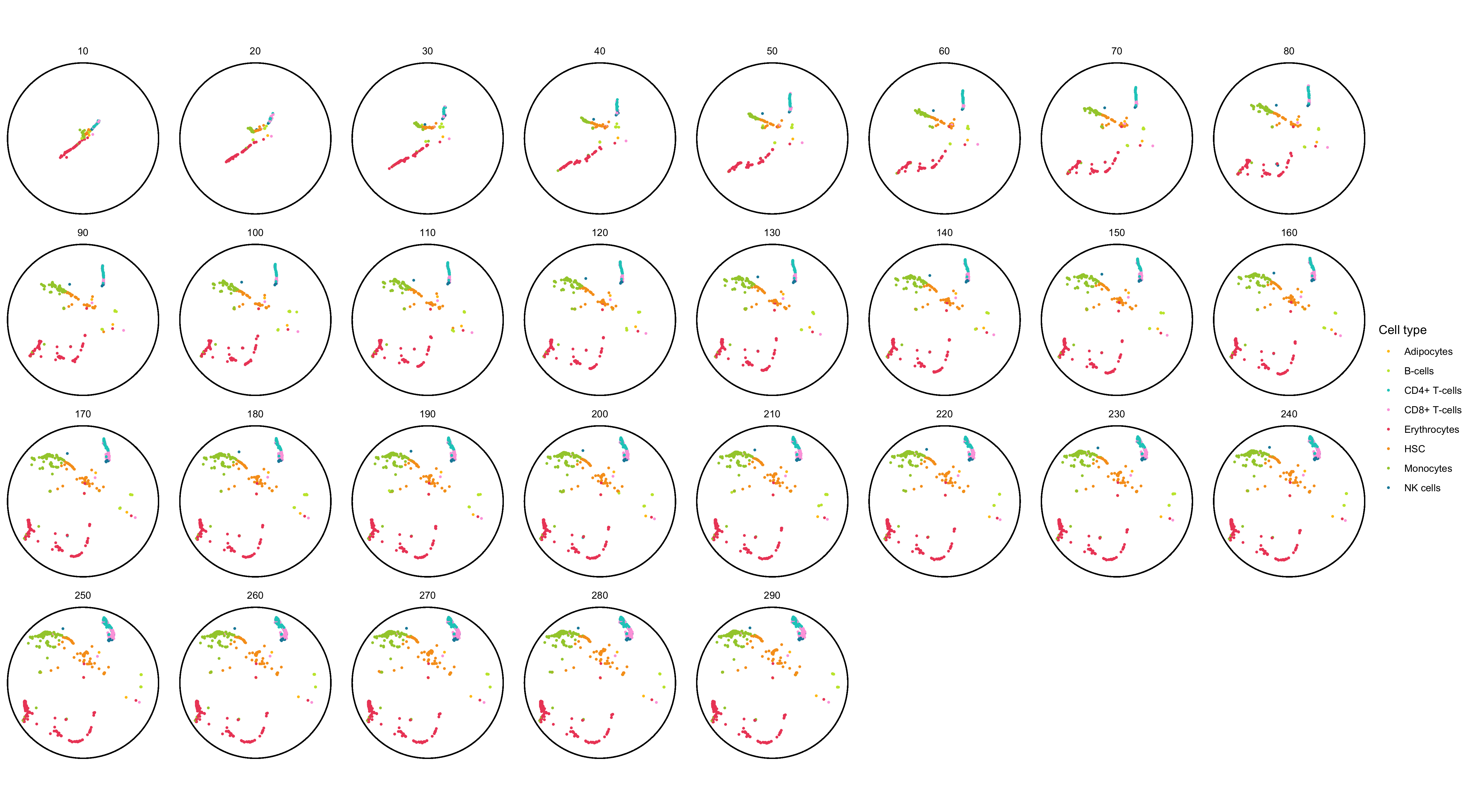
As documented in the code block, this plot already took 3 minutes to generate. I found this unusually long but I don’t know of a way to know if it’s just a feeling or a correct assessment.
Create animation with gganimate
My initial idea was to create the animation using gganimate.
However, after a few attempts, I realized that it takes way too long for it to render.
I was able to make on with the first 100 cell IDs (it took 5 minutes), but even with just 1,000 cells the process crashed due to a lack of memory after about 1 hour.
Note: The full data set contains ~5,700 cells.
data_to_plot <- filter(final_data, cell_id %in% seq(100))

glimpse(data_to_plot)
# Observations: 2,900
# Variables: 5
# $ X1      <dbl> 0.004369234, 0.132621959, 0.127156094, -0.051962741, -0.22114…
# $ X2      <dbl> 0.03714102, 0.13966362, 0.13251643, -0.06476162, -0.18119001,…
# $ cell_id <dbl> 1, 2, 3, 4, 5, 6, 7, 8, 9, 10, 11, 12, 13, 14, 15, 16, 17, 18…
# $ epoch   <dbl> 10, 10, 10, 10, 10, 10, 10, 10, 10, 10, 10, 10, 10, 10, 10, 1…
# $ label   <chr> "HSC", "CD8+ T-cells", "CD8+ T-cells", "Erythrocytes", "Eryth…

p <- ggplot(data_to_plot, aes(X1, X2)) +
  geom_point(aes(color = label), alpha = 0.7, show.legend = TRUE) +
  geom_circle(aes(x0 = 0, y0 = 0, r = 1), inherit.aes = FALSE) +
  scale_color_manual(name = 'Cell type', values = custom_colors$discrete) +
  coord_fixed() +
  theme_void() +
  labs(title = 'Epoch: {format(frame_time, digits = 0)}') +
  transition_time(epoch) +
  shadow_wake(wake_length = 0.1, alpha = FALSE) +
  ease_aes('linear')

system.time({
  animation <- animate(p)
  anim_save('poincare_100_cells_with_tail.gif', animation)
})
#    user  system elapsed
# 280.944  46.455 332.494
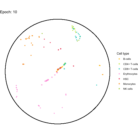
The performance bottleneck is quite a bummer because I like that gganimate can output a GIF file which can be shared in multiple ways.
Also the added tail is quite neat, even though perhaps not very useful with all (~5,000) cells.
Create animation with plotly
After unsuccessfully trying to get around the performance problems in ggplot2, I started looking for alternatives and ended up with the plotly framework.
I worked with plotly quite often and thought I knew it relatively well.
Yet, I was not aware of its capability to generate animations.
And it’s actually also quite easy to set up, using a similar syntax as gganimate (or maybe it’s the other way around, who knows).
fig <- plot_ly(
    final_data,
    type = 'scatter',
    mode = 'markers',
    x = ~X1,
    y = ~X2,
    color = ~label,
    colors = colors_here,
    frame = ~epoch,
    marker = list(size = 8),
    hoverinfo = 'text',
    text = ~paste0(final_data$label, '<br>Cell ID: ', format(final_data$cell_id, big.mark = ','))
  ) %>%
  add_markers(
    data = final_data %>%
      dplyr::select(epoch) %>%
      distinct() %>%
      mutate(x = 0, y = 0, label = 'center'),
    x = ~x,
    y = ~y,
    frame = ~epoch,
    marker = list(
      size = 10,
      line = list(
        color = 'black',
        width = 2
      ),
      symbol = 'x-thin'
    ),
    hoverinfo = 'skip',
    text = ~label,
    showlegend = FALSE
  ) %>%
  layout(
    title = 'Dynamics of training a Poincaré map',
    shapes = list(
      list(
        type = 'circle',
        xref = 'x',
        x0 = -1,
        x1 = 1,
        yref = 'y',
        y0 = -1,
        y1 = 1,
        fillcolor = NA,
        line = list(color = 'black'),
        opacity = 1
      )
    ),
    xaxis = list(
      range = c(-1, 1),
      showgrid = FALSE,
      showticklabels = FALSE,
      zeroline = FALSE,
      title = ''
    ),
    yaxis = list(
      range = c(-1, 1),
      showgrid = FALSE,
      showticklabels = FALSE,
      zeroline = FALSE,
      title = '',
      scaleanchor = 'x'
    )
  )

htmlwidgets::saveWidget(fig, 'poincare_map.html')
Below you find a link to the interactive result, including all cells. Just be warned, it is 16 MB in size.

Conclusion
I must say that I’m quite impressed overall.
Firstly, the plotly framework can create amazing animations for decently large data sets, which apparently make ggplot2 struggle.
Secondly, even though we used non-adjusted parameters and didn’t let the training process finish (it might’ve finished early but I’m not sure), the resulting map has the hematopoietic stem cells (HSC) at its center. While these results are very preliminary, they do make biological sense since these cells should give rise to the other cell types shown in the map. This is an exciting result and makes me look forward to additional tests (hopefully with access to a GPU).