Dot plot
Category: other
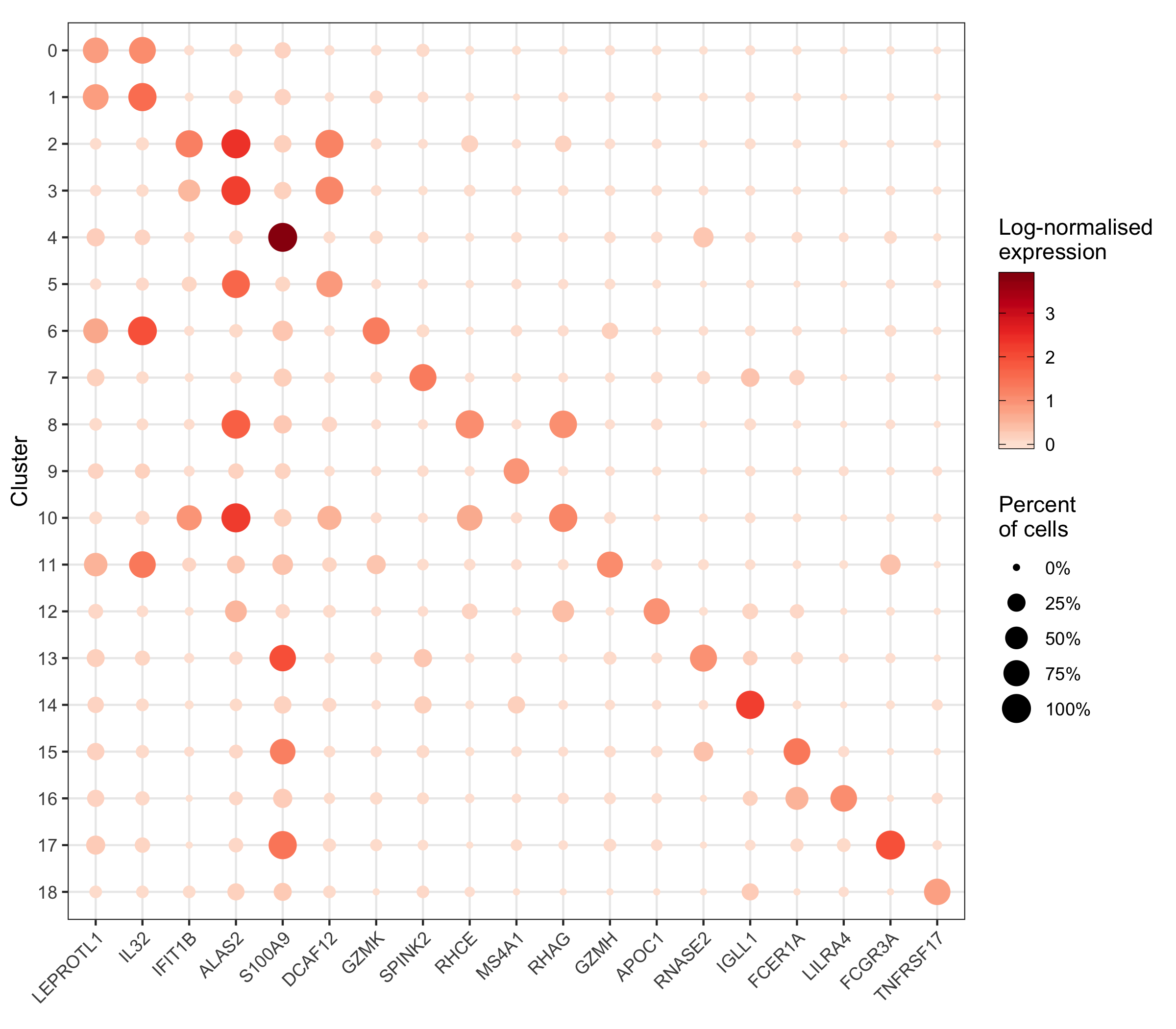
More context (and code) for this plot can be found in my scRNA-seq workflow in the chapter “Expression of individual genes”.
library(tidyverse)
library(Seurat)

# load a single cell expression data set (generated in the lab I work at)
seurat <- readRDS('seurat.rds')

# cells will be grouped by clusters that they have been assigned to
cluster_ids <- levels(seurat@meta.data$seurat_clusters)

# select a set of genes for which we want to show expression
genes_to_show <- seurat@misc$marker_genes$by_cluster %>%
  group_by(cluster) %>%
  arrange(p_val_adj) %>%
  slice(1) %>%
  pull(gene)

# for every cluster-gene combination, calculate the average expression across
# all cells and then transform the data into a data frame
expression_levels_per_cluster <- vapply(
    cluster_ids, FUN.VALUE = numeric(length(cluster_ids)), function(x) {
      cells_in_current_cluster <- which(seurat@meta.data$seurat_cluster == x)
      Matrix::rowMeans(seurat@assays$SCT@data[genes_to_show,cells_in_current_cluster])
    }
  ) %>%
  t() %>%
  as.data.frame() %>%
  mutate(cluster = rownames(.)) %>%
  select(cluster, everything()) %>%
  pivot_longer(
    cols = c(2:ncol(.)),
    names_to = 'gene'
  ) %>%
  rename(expression = value) %>%
  mutate(id_to_merge = paste0(cluster, '_', gene))

# for every cluster-gene combination, calculate the percentage of cells in the
# respective group that has at least 1 transcript (this means we consider it
# as expressing the gene) and then transform the data into a data frame
percentage_of_cells_expressing_gene <- vapply(
    cluster_ids, FUN.VALUE = numeric(length(cluster_ids)), function(x) {
      cells_in_current_cluster <- which(seurat@meta.data$seurat_cluster == x)
      Matrix::rowSums(seurat@assays$SCT@data[genes_to_show,cells_in_current_cluster] != 0)
    }
  ) %>%
  t() %>%
  as.data.frame() %>%
  mutate(cluster = rownames(.)) %>%
  select(cluster, everything()) %>%
  pivot_longer(
    cols = c(2:ncol(.)),
    names_to = 'gene'
  ) %>%
  rename(cell_count = value) %>%
  left_join(
    .,
    seurat@meta.data %>%
      group_by(seurat_clusters) %>%
      tally() %>%
      rename(cluster = seurat_clusters),
    by = 'cluster') %>%
  mutate(
    id_to_merge = paste0(cluster, '_', gene),
    percent_cells = cell_count / n
  )

# merge the two data frames created before and plot the data
p <- left_join(
    expression_levels_per_cluster,
    percentage_of_cells_expressing_gene %>% select(id_to_merge, percent_cells),
    by = 'id_to_merge'
  ) %>%
  mutate(cluster = factor(cluster, levels = rev(cluster_ids))) %>%
  ggplot(aes(gene, cluster)) +
  geom_point(aes(color = expression, size = percent_cells)) +
  scale_color_distiller(
    palette = 'Reds',
    direction = 1,
    name = 'Log-normalised\nexpression',
    guide = guide_colorbar(frame.colour = "black", ticks.colour = "black")
  ) +
  scale_size(name = 'Percent\nof cells', labels = scales::percent) +
  labs(y = 'Cluster', color = 'Expression') +
  coord_fixed() +
  theme_bw() +
  theme(
    axis.title.x = element_blank(),
    axis.text.x = element_text(angle = 45, hjust = 1)
  )
ggsave('4.png', p, height = 7, width = 8)