Visualizing health data
- Project status: closed

The goal is to visualize several types of health data, e.g. recorded by a Xiaomi Mi Band (in this case model 4).
Data sources
I collect the following data:
- Heart rate (once per minute), steps, and sleep data are collected by a Xiaomi Mi Band 4. The data is synched to the Mi Fit app and from the transferred to and exported from the Apple Health app.
- Workout sessions are recorded by Streaks Workout. The data can be exported to a
.csvfile from Streaks Workout app itself. - Running sessions are recorded by Strava. Data can be downloaded from the Strava website as a
.gpxfile.
Preparation
Load packages
library(tidyverse)
library(lubridate)
library(XML)
library(viridis)
Load data
As mentioned before, heart rate, steps and sleep data are synced from the Mi Fi app to Apple Health and from there we export it.
Depending on the amount of data that is stored in Apple Health, these files can become quite large.
The data we want to import is stored in the export.xml file, which we will load using the XML::xmlParse() function.
Then, we transform it into a tibble using the XML::xmlAttrsToDataFrame() function.
xml <- XML::xmlParse('export.xml')
data <- XML:::xmlAttrsToDataFrame(xml['//Record']) %>% as_tibble()
We also export my workout sessions which I recorded with Streaks Workout.
workouts <- read_csv('streaks-workout.csv') %>%
  filter(!is.na(device_name)) %>%
  mutate(
    date = format(starting_time, '%Y-%m-%d'),
    dayofweek = wday(starting_time, label = TRUE, abbr = FALSE),
    date_and_day = paste0(date, ' (', dayofweek, ')')
  )
Heart rate
Ideally, my heart rate is recorded once a minute. However, there are some missing values because sometimes the band is placed in a way that it can’t measure the heart rate.
data_heart_rate <- data %>%
  dplyr::filter(
    type == 'HKQuantityTypeIdentifierHeartRate',
    sourceName == 'Mi Fit'
  ) %>%
  mutate(
    creationDate = ymd_hms(creationDate, tz = 'Europe/Amsterdam'),
    startDate = ymd_hms(startDate, tz = 'Europe/Amsterdam'),
    endDate = ymd_hms(endDate, tz = 'Europe/Amsterdam'),
    date = format(endDate, '%Y-%m-%d'),
    dayofweek = wday(endDate, label = TRUE, abbr = FALSE),
    date_and_day = paste0(date, ' (', dayofweek, ')'),
    hour_minute = as.integer(format(endDate, '%H')) + as.integer(format(endDate, '%M'))/60,
    value = value %>% as.character() %>% as.numeric()
  )
Profile over the day
We use different values for k in the geom_smooth() call to control how smooth the line of the GAM should be.
Workout sessions are marked as grey areas.
p <- data_heart_rate %>%
  filter(date %in% c('2020-01-25','2020-02-07')) %>%
  ggplot() +
  geom_rect(
    data = workouts %>% filter(date %in% c('2020-01-25','2020-02-07')),
    aes(xmin = starting_time, xmax = finishing_time, ymin = -Inf, ymax = Inf),
    fill = "grey", alpha = 0.5
  ) +
  geom_line(aes(x = endDate, y = value), size = 0.5, color = 'grey') +
  geom_point(aes(x = endDate, y = value, color = value), size = 0.5) +
  scale_color_viridis(option = 'magma', direction = -1) +
  scale_y_continuous(name = 'Heart rate [BPM]', limits = c(40,160)) +
  theme_bw() +
  theme(
    axis.title.x = element_blank(),
    legend.position = 'none',
    strip.text.x = element_text(face = 'bold')
  ) +
  facet_wrap(~date_and_day, ncol = 1, scales = 'free_x')
ggsave('heart_rate_profile_day.png', p, height = 7, width = 8)
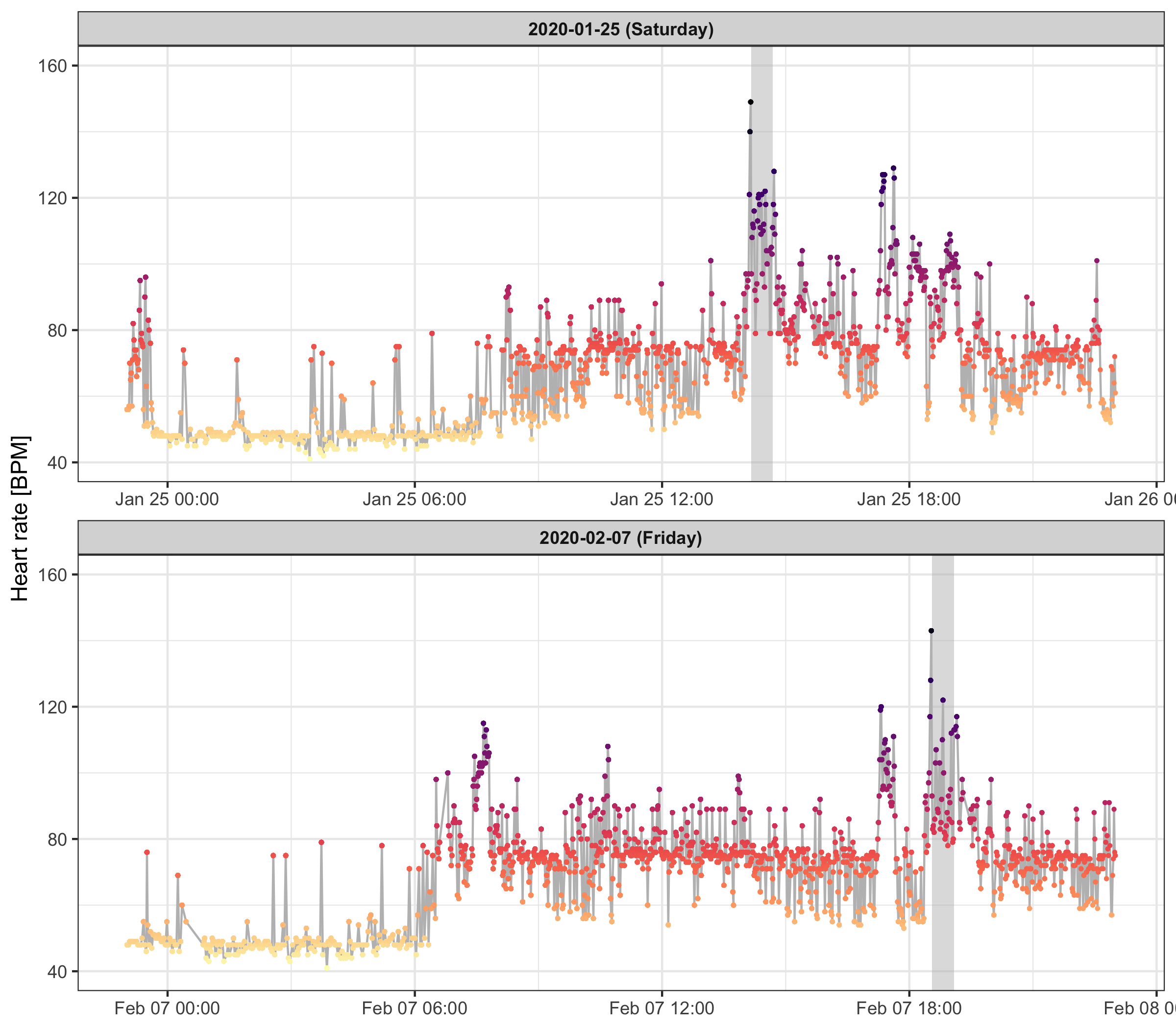
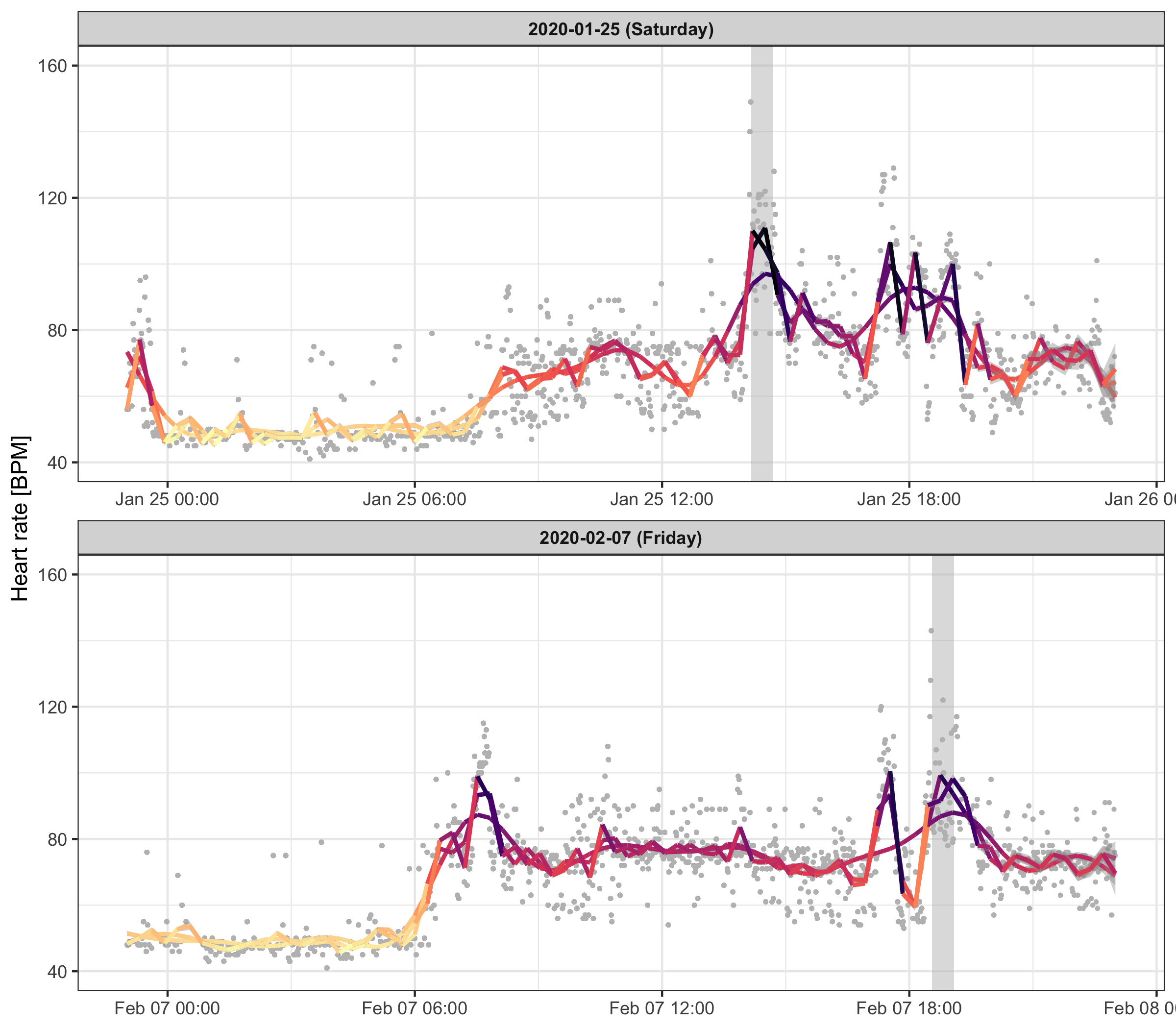
Some measurements look like outliers.
We can deal with that by applying a smoothing line with different k parameter to control how sensitive it should be.
p <- data_heart_rate %>%
  filter(date %in% c('2020-01-25','2020-02-07')) %>%
  ggplot() +
  geom_rect(
    data = workouts %>% filter(date %in% c('2020-01-25','2020-02-07')),
    aes(xmin = starting_time, xmax = finishing_time, ymin = -Inf, ymax = Inf),
    fill = "grey", alpha = 0.5
  ) +
  geom_point(aes(x = endDate, y = value), color = 'grey', size = 0.5) +
  geom_smooth(aes(x = endDate, y = value, color = ..y..), method = 'gam', formula = y ~ s(x, k = 20), size = 1) +
  geom_smooth(aes(x = endDate, y = value, color = ..y..), method = 'gam', formula = y ~ s(x, k = 50), size = 1) +
  geom_smooth(aes(x = endDate, y = value, color = ..y..), method = 'gam', formula = y ~ s(x, k = 100), size = 1) +
  scale_color_viridis(option = 'magma', direction = -1) +
  scale_y_continuous(name = 'Heart rate [BPM]', limits = c(40,160)) +
  theme_bw() +
  theme(
    axis.title.x = element_blank(),
    legend.position = 'none',
    strip.text.x = element_text(face = 'bold')
  ) +
  facet_wrap(~date_and_day, ncol = 1, scales = 'free_x')
ggsave('heart_rate_profile_day_smooth.png', p, height = 7, width = 8)
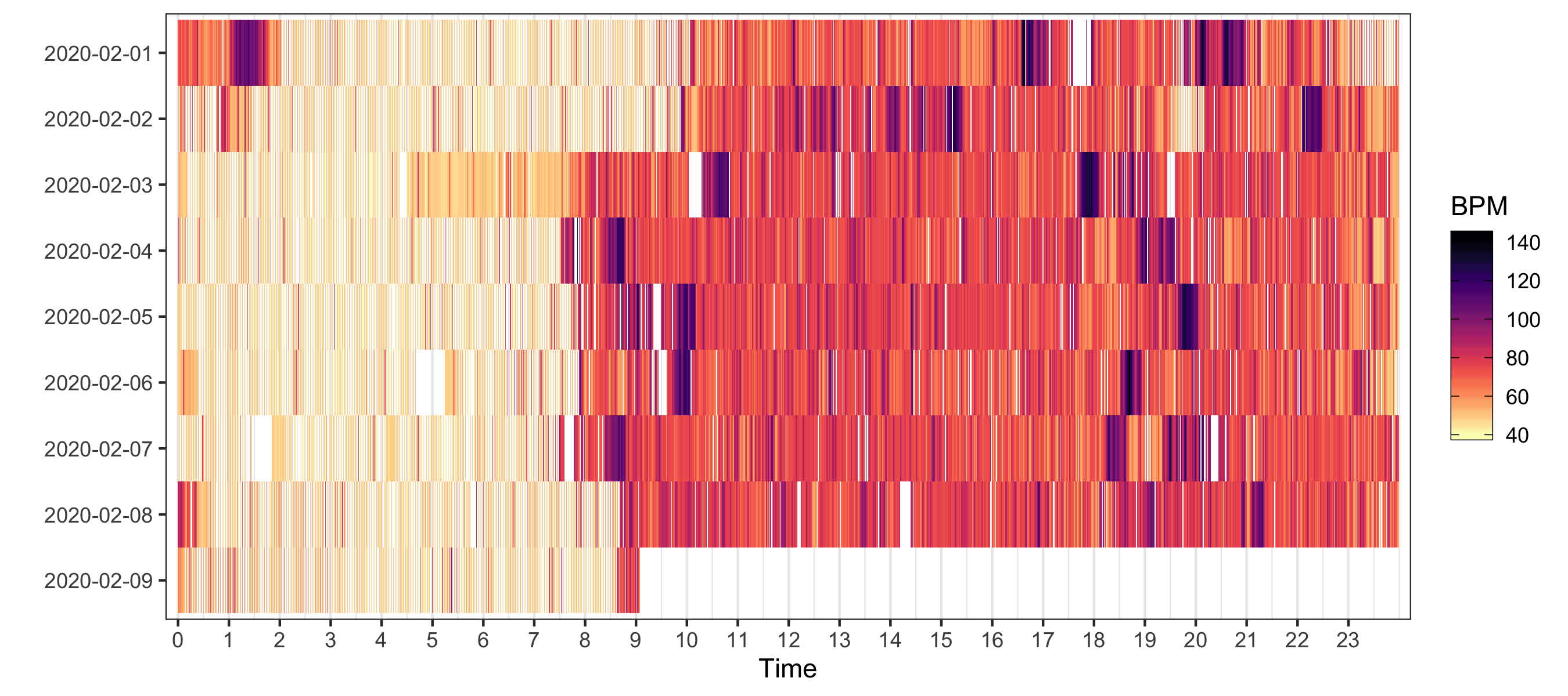
Heatmap
p <- data_heart_rate %>%
  filter(grepl(date, pattern = '2020-02')) %>%
  ggplot(aes(hour_minute, reorder(date, desc(date)))) +
  geom_tile(aes(fill = value)) +
  scale_x_continuous(breaks = seq(0, 23, by = 1), expand = c(0.01, 0)) +
  scale_fill_viridis(
    option = 'magma', direction = -1, na.value = 'white',
    guide = guide_colorbar(frame.colour = 'black', ticks.colour = 'black')
  ) +
  labs(x = 'Time', y = '', fill = 'BPM') +
  theme_bw() +
  theme(
    panel.grid.major.y = element_blank(),
    panel.grid.minor.y = element_blank()
  )
ggsave('heart_rate_heatmap.png', p, height = 4, width = 9)
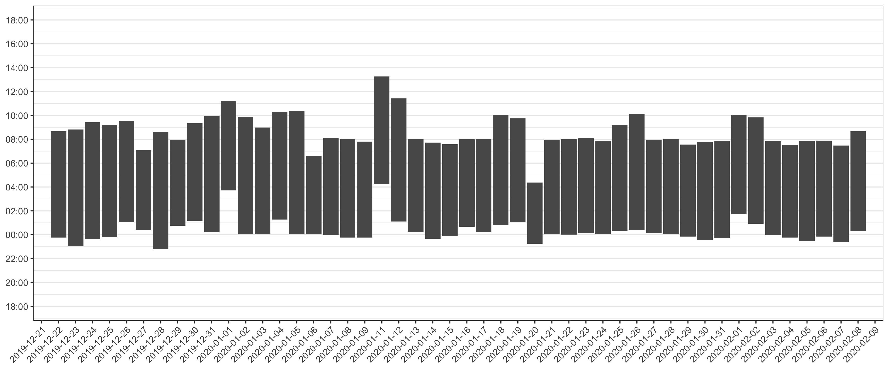
Sleep stats
To show sleeping blocks, we need to do some extra parsing. With this technique, we cut the day into two parts: The part before 18:00, and the part after 18:00.
data_sleep <- data %>%
  filter(
    type == 'HKCategoryTypeIdentifierSleepAnalysis',
    sourceName == 'Mi Fit'
  ) %>%
  mutate(
    creationDate = ymd_hms(creationDate, tz = 'Europe/Amsterdam'),
    startDate = ymd_hms(startDate, tz = 'Europe/Amsterdam'),
    start_hour_minute = ifelse(
      format(startDate, '%H') > 18,
      as.integer(format(startDate, '%H')) - 18 + as.integer(format(startDate, '%M'))/60,
      as.integer(format(startDate, '%H')) + 6 + as.integer(format(startDate, '%M'))/60
    ),
    endDate = ymd_hms(endDate, tz = 'Europe/Amsterdam'),
    end_date = format(endDate, '%Y-%m-%d'),
    end_hour_minute = ifelse(
      format(endDate, '%H') > 18,
      as.integer(format(endDate, '%H')) - 18 + as.integer(format(endDate, '%M'))/60,
      as.integer(format(endDate, '%H')) + 6 + as.integer(format(endDate, '%M'))/60
    )
  ) %>%
  arrange(startDate)

data_sleep$night <- '1'

for ( i in 2:nrow(data_sleep) ) {
  if ( difftime(data_sleep$startDate[i], data_sleep$endDate[i-1], units = 'hours') < 2 ) {
    data_sleep$night[i] <- data_sleep$night[i-1]
  } else {
    data_sleep$night[i] <- as.character(as.integer(data_sleep$night[i-1]) + 1)
  }
}
p <- ggplot(data_sleep) +
  geom_rect(
    aes(
      xmin = as.integer(night) - 0.45,
      xmax = as.integer(night) + 0.45,
      ymin = start_hour_minute,
      ymax = end_hour_minute
    )
  ) +
  scale_x_continuous(
    limits = c(1, data_sleep$end_date %>% unique() %>% length()),
    breaks = seq(1, data_sleep$end_date %>% unique() %>% length(), 1),
    labels = data_sleep$end_date %>% unique(),
    expand = c(0.01,0)
  ) +
  scale_y_continuous(
    limits = c(0, 24), breaks = seq(0, 24, 2),
    labels = c('18:00','20:00','22:00','00:00','02:00','04:00','06:00','08:00','10:00','12:00','14:00','16:00','18:00')
  ) +
  theme_bw() +
  theme(
    axis.title = element_blank(),
    panel.grid.major.x = element_blank(),
    panel.grid.minor.x = element_blank(),
    axis.text.x = element_text(angle = 45, hjust = 1)
  )
ggsave('sleep_by_night.png', p, height = 5, width = 12)
Steps
data_steps <- data %>%
  filter(
    type == 'HKQuantityTypeIdentifierStepCount',
    sourceName == 'Mi Fit'
  ) %>%
  mutate(
    value = value %>% as.character() %>% as.numeric(),
    creationDate = ymd_hms(creationDate, tz = 'Europe/Amsterdam'),
    startDate = ymd_hms(startDate, tz = 'Europe/Amsterdam'),
    start_date = format(startDate, '%Y-%m-%d'),
    start_hour_minute = as.integer(format(startDate, '%H')) + as.integer(format(startDate, '%M'))/60,
    endDate = ymd_hms(endDate, tz = 'Europe/Amsterdam'),
    end_date = format(endDate, '%Y-%m-%d'),
    end_hour_minute = as.integer(format(endDate, '%H')) + as.integer(format(endDate, '%M'))/60
  ) %>%
  arrange(startDate)
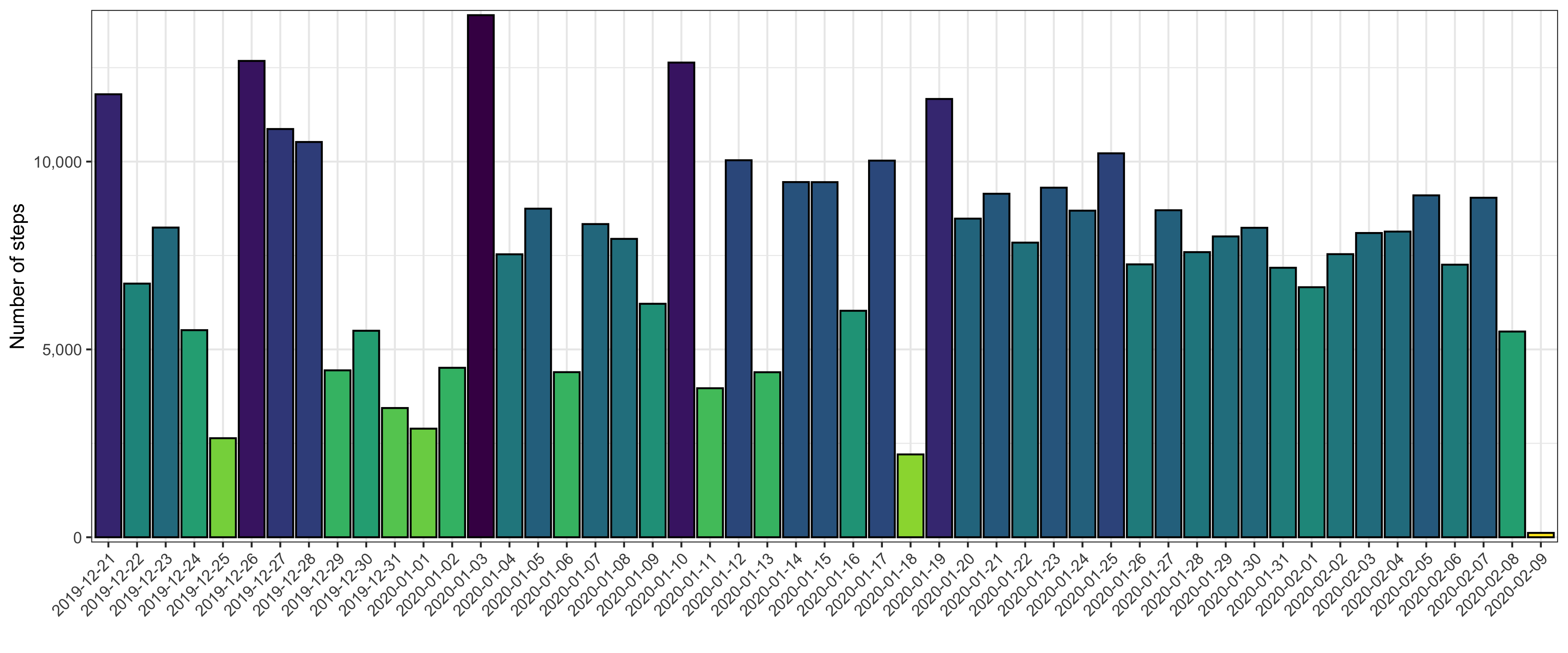
Total steps per day
p <- data_steps %>%
  arrange(startDate) %>%
  group_by(start_date) %>%
  summarize(total_steps = sum(value)) %>%
  ggplot() +
  geom_col(aes(start_date, total_steps, fill = total_steps), color = 'black', show.legend = FALSE) +
  scale_x_discrete(name = '') +
  scale_y_continuous(name = 'Number of steps', labels = scales::comma, expand = c(0.01, 0)) +
  scale_fill_viridis(
    option = 'viridis', direction = -1, na.value = 'white',
    guide = guide_colorbar(frame.colour = 'black', ticks.colour = 'black')
  ) +
  theme_bw() +
  theme(axis.text.x = element_text(angle = 45, hjust = 1))
ggsave('total_steps_by_day.png', p, height = 5, width = 12)
Profile for selected days
p <- data_steps %>%
  filter(startDate >= '2020-02-03') %>%
  ggplot() +
  geom_rect(
    aes(
      xmin = start_hour_minute,
      xmax = end_hour_minute,
      ymin = 0,
      ymax = value,
      fill = value
    ),
    show.legend = FALSE
  ) +
  scale_x_continuous(
    name = 'Time', limits = c(0,24), breaks = seq(0, 24, 2), expand = c(0.01, 0)
  ) +
  scale_y_continuous(
    name = 'Number of steps', labels = scales::comma, expand = c(0.01, 0)
  ) +
  scale_fill_viridis(
    option = 'viridis', direction = -1, na.value = 'white',
    guide = guide_colorbar(frame.colour = 'black', ticks.colour = 'black')
  ) +
  theme_bw() +
  theme(strip.text.x = element_text(face = 'bold')) +
  facet_wrap(~start_date, ncol = 7)
ggsave('steps_in_time_by_day.png', p, height = 4, width = 16)

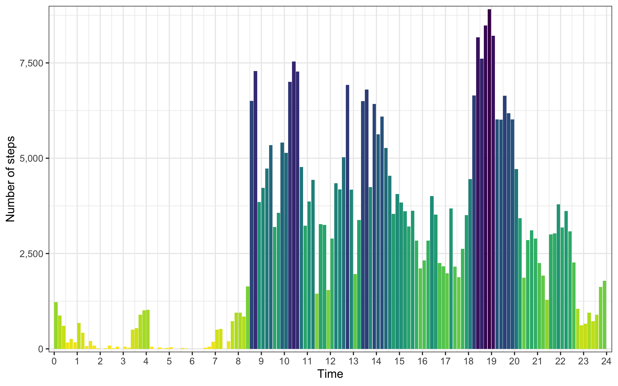
Profile across all days
p <- data_steps %>%
  group_by(start_hour_minute, end_hour_minute) %>%
  summarize(value = sum(value)) %>%
  ggplot() +
  geom_rect(
    aes(
      xmin = start_hour_minute,
      xmax = end_hour_minute,
      ymin = 0,
      ymax = value,
      fill = value
    ),
    show.legend = FALSE
  ) +
  scale_x_continuous(
    name = 'Time', limits = c(0,24), breaks = seq(0, 24, 1), expand = c(0.01,0)
  ) +
  scale_y_continuous(
    name = 'Number of steps', labels = scales::comma, expand = c(0.01,0)
  ) +
  scale_fill_viridis(
    option = 'viridis', direction = -1, na.value = 'white',
    guide = guide_colorbar(frame.colour = 'black', ticks.colour = 'black')
  ) +
  theme_bw()
ggsave('steps_in_time_collapsed_by_day.png', p, height = 5, width = 8)
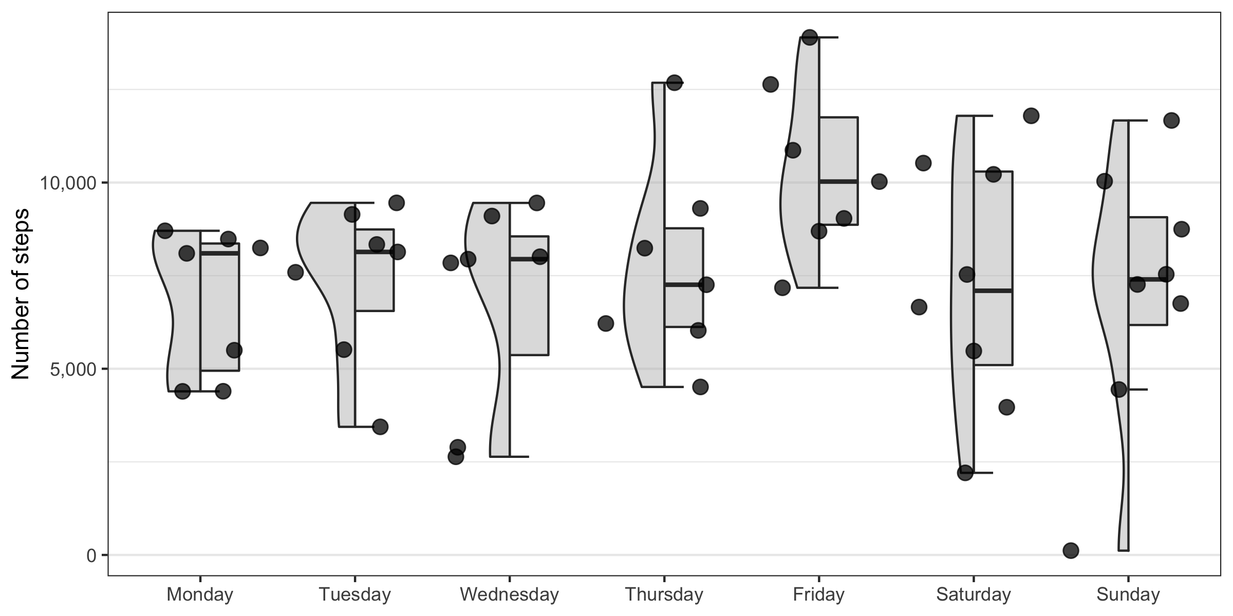
Total number of steps by weekday
p <- data_steps %>%
  arrange(startDate) %>%
  group_by(start_date) %>%
  summarize(total_steps = sum(value)) %>%
  mutate(
    weekday = weekdays(as.Date(start_date, '%Y-%m-%d')),
    weekday = factor(weekday, levels = c('Monday','Tuesday','Wednesday','Thursday','Friday','Saturday','Sunday'))
  ) %>%
  ggplot(aes(weekday, total_steps)) +
  gghalves::geom_half_violin(fill = 'grey', side = 'l', alpha = 0.5) +
  gghalves::geom_half_boxplot(fill = 'grey', side = 'r', outlier.size = 0, width = 0.5, alpha = 0.5) +
  geom_jitter(color = 'black', alpha = 0.75, size = 3) +
  scale_x_discrete() +
  scale_y_continuous(name = 'Number of steps', labels = scales::comma) +
  theme_bw() +
  theme(
    legend.position = 'none',
    axis.title.x = element_blank(),
    panel.grid.major.x = element_blank()
  )
ggsave('total_number_of_steps_by_weekday.png', p, height = 4, width = 8)
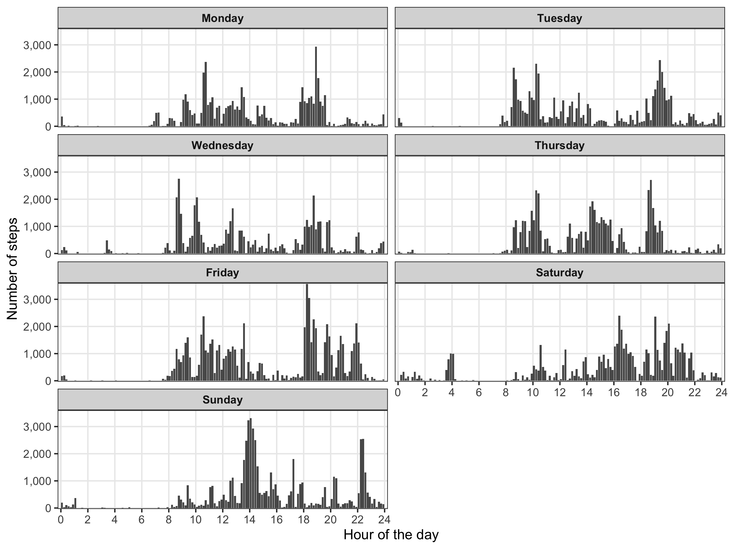
Distribution of steps by weekday
p <- data_steps %>%
  mutate(
    weekday = weekdays(as.Date(start_date, '%Y-%m-%d')),
    weekday = factor(weekday, levels = c('Monday','Tuesday','Wednesday','Thursday','Friday','Saturday','Sunday'))
  ) %>%
  group_by(weekday, start_hour_minute, end_hour_minute) %>%
  summarize(value = sum(value)) %>%
  ggplot() +
  geom_rect(
    aes(
      xmin = start_hour_minute,
      xmax = end_hour_minute,
      ymin = 0,
      ymax = value
    ),
    show.legend = FALSE
  ) +
  scale_x_continuous(
    name = 'Hour of the day', limits = c(0,24), breaks = seq(0, 24, 2), expand = c(0.01,0)
  ) +
  scale_y_continuous(
    name = 'Number of steps', labels = scales::comma, expand = c(0.01,0)
  ) +
  theme_bw() +
  theme(
    legend.position = 'none',
    strip.text = element_text(face = 'bold'),
    panel.grid.minor = element_blank(),

  ) +
  facet_wrap(~weekday, ncol = 2)
ggsave('step_profile_by_weekday.png', p, height = 6, width = 8)
Workouts
Calendar
To plot highlight the days we worked in calendar style, we take advantage of the ggcal() function made by jayjaycobs.
However, we slightly modify it, e.g. so that the week starts on Monday instead of Sunday.
ggcal <- function(dates, fills) {
  months <- format(seq(as.Date('2016-01-01'), as.Date('2016-12-01'), by = '1 month'), '%B')
  mindate <- as.Date(format(min(dates), '%Y-%m-01'))
  maxdate <- (seq(as.Date(format(max(dates), '%Y-%m-01')), length.out = 2, by = '1 month') - 1)[2]
  filler <- tibble(date = seq(mindate, maxdate, by = '1 day'))
  t1 <- tibble(date = dates, fill = fills) %>%
    right_join(filler, by = 'date') %>%
    mutate(dow = as.numeric(strftime(as.Date(date, '%Y-%m-%d'), '%u'))) %>%
    mutate(month = format(date, '%B')) %>%
    mutate(woy = as.numeric(format(date, '%W'))) %>%
    mutate(year = as.numeric(format(date, '%Y'))) %>%
    mutate(month = factor(month, levels = months, ordered = TRUE)) %>%
    arrange(year, month) %>%
    mutate(monlabel = month)
  if (length(unique(t1$year)) > 1) {
    t1$monlabel <- paste(t1$month, t1$year)
  }
  t2 <- t1 %>%
    mutate(monlabel = factor(monlabel, ordered = TRUE)) %>%
    mutate(monlabel = fct_inorder(monlabel)) %>%
    mutate(monthweek = woy - min(woy), y = max(monthweek) - monthweek + 1)
  weekdays <- c('M', 'T', 'W', 'T', 'F', 'S', 'S')

  if ( is.numeric(fills) ) {
    fill_scale <- scale_fill_distiller(palette = 'OrRd', direction = 1, na.value = '#C8C8C8')
  } else if ( is.character(fills) | is.factor(fills) ) {
    fill_scale <- NULL
  }

  ggplot(t2, aes(dow, y, fill = fill)) +
    geom_tile(color = '#505050', show.legend = FALSE) +
    facet_wrap(~monlabel, ncol = 3, scales = 'free') +
    scale_x_continuous(expand = c(0, 0), position = 'top', breaks = seq(1, 7), labels = weekdays) +
    scale_y_continuous(expand = c(0, 0)) +
    fill_scale +
    theme(
      panel.background = element_rect(fill = NA, color = NA),
      strip.background = element_rect(fill = NA, color = NA),
      strip.text.x = element_text(hjust = 0, face = 'bold'),
      legend.title = element_blank(),
      axis.ticks = element_blank(),
      axis.title = element_blank(),
      axis.text.y = element_blank(),
      strip.placement = 'outside'
    )
}

p <- ggcal(
  workouts$starting_time %>% as.Date(),
  workouts %>% mutate(length = finishing_time - starting_time) %>% pull(length) %>% as.numeric()
)
ggsave('workouts_calendar.png', p, height = 4.5, width = 8)
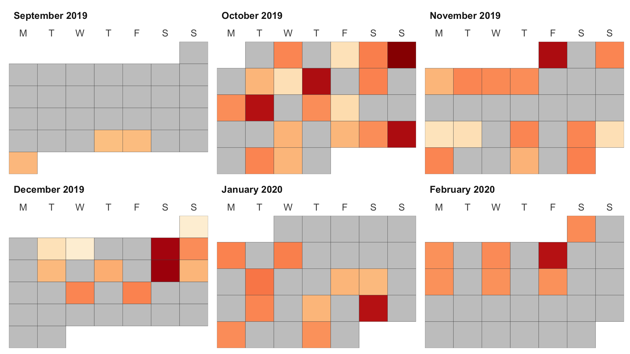
Color reflects the workout length.
Running sessions
WORK IN PROGRESS
I took parts of code from this article: https://rpubs.com/ials2un/gpx1
library(ggmap)
library(plotKML)
library(geosphere)

gpx_file <- readGPX('runs/2020-02-16.gpx')

df <- gpx_file$tracks[[1]][[1]] %>%
  mutate(time = as.POSIXct(time, format = c("%Y-%m-%dT%H:%M:%OSZ")))

for ( i in 1:(nrow(df)-1)) {
  df$distance[i] <- distm(
    c(df$lon[i], df$lat[i]), c(df$lon[i+1], df$lat[i+1]), fun = distHaversine
  )
  df$speed[i] <- ( df$distance[i] / as.numeric(difftime(df$time[i+1], df$time[i], units = 'secs')) ) * 3.6
}

ggplot(df) +
geom_point(aes(x = time, y = speed, color = speed)) +
geom_smooth(aes(x = time, y = speed), color = 'black', method = 'loess', size = 1, span = 2) +
scale_color_distiller(
  name = 'Speed',
  palette = 'Spectral',
  direction = 1,
  limits = c(min(df$speed), quantile(df$speed, probs = 0.95)),
  oob = scales::squish,
  guide = guide_colorbar(frame.colour = 'black', ticks.colour = 'black')
) +
theme_bw()

map_of_Milan <- get_stamenmap(bbox = c(left = 9.146976, bottom = 45.438092, right = 9.229717, top = 45.490344), zoom = 14, maptype = "toner-lines")

ggmap(map_of_Milan) +
geom_point(data = df, aes(x = lon, y = lat, color = speed), size = 2) +
theme_bw() +
theme(
  axis.line = element_blank(),
  axis.text.x = element_blank(),
  axis.text.y = element_blank(),
  axis.ticks = element_blank(),
  axis.title.x = element_blank(),
  axis.title.y = element_blank(),
  panel.background = element_blank(),
  panel.border = element_blank(),
  panel.grid.major = element_blank(),
  panel.grid.minor = element_blank(),
  plot.background = element_blank()
)

df
To do
- Sleep
- Handle sleep blocks over 18:00.
- Merge adjacent sleep blocks.
- Steps
- Profile of steps over time, accumulated and colored by day.
- Running sessions
- Add chapter.
- More
- Correlate steps with heart rate.
- Summaries by day of the week.