Porting PAGA results from scanpy to R
Seurat and scanpy are both great frameworks to analyze single-cell RNA-seq data, the main difference being the language they are designed for. Most of the methods frequently used in the literature are available in both toolkits and the workflow is essentially the same. However, Fabian Theis and his group (with special credit to Alex Wolf) have recently published their PAGA algorithm that attempts to harmonize dimensional reduction with clustering and trajectory analysis. This is very exciting and a step in the right direction as tSNE and UMAP are known to have limitations in this regard. However, if you are a heavy Seurat/R user, you will be bummed to hear that for now (at least to my knowledge) no R port of PAGA exists and I’m not sure the authors have intentions to change this. As far as I know, Cole Trapnell and his lab are working on implementing something similar, if not precisely the PAGA algorithm, in Monocle 3.
For those of you who do most of their analysis in Seurat and want to perform PAGA analysis (and/or can’t wait for Monocle 3), I explain here how to do so.
Requirements
Seuratv2.x; unfortunately, theConvert()function in Seurat v3 doesn’t seem to be able yet to export the Seurat object to the anndata format (which is what we need).- The
reticulateR package for communication between R and Python. scanpy; I installed it usingpip3.
I also use the tidyverse R meta package but they are not technically required as the respective commands can be replaced.
Let’s get started
First we load the packages mentioned above.
library("Seurat")
library("tidyverse")
library("reticulate")
Then we load a Seurat object (this one here was created with Seurat v2.3.4), convert it to the anndata format and save it to a file.
seurat <- readRDS("seurat.rds")

seurat_ad <- Convert(
  from = seurat,
  to = "anndata",
  filename = "seurat.h5ad"
)
Without RNA velocity data
Apply PAGA and UMAP
Now we use the reticulate package to…
- load
scanpy - load the exported anndata file (
sc.read()) - find neighbors (
sc.pp.neighbors()) - cluster cells using the Leiden algorithm (
sc.tl.leiden()) - run PAGA analysis (
sc.tl.paga()) and give it a visual check (sc.pl.paga()) - generate a UMAP using the PAGA results as initial positions (
sc.tl.umap()) - plot UMAP and PAGA side-by-side (
sc.pl.paga_compare())
sc <- import("scanpy", convert = FALSE)

adata = sc$read("seurat.h5ad")

sc$pp$neighbors(adata)
sc$tl$leiden(adata, resolution = 1.0)

sc$tl$paga(adata, groups = "leiden")
sc$pl$paga(adata)

sc$tl$umap(adata, init_pos = "paga")

sc$pl$paga_compare(
  adata,
  basis = "umap",
  threshold = 0.15,
  edge_width_scale = 0.5,
  save = TRUE
)
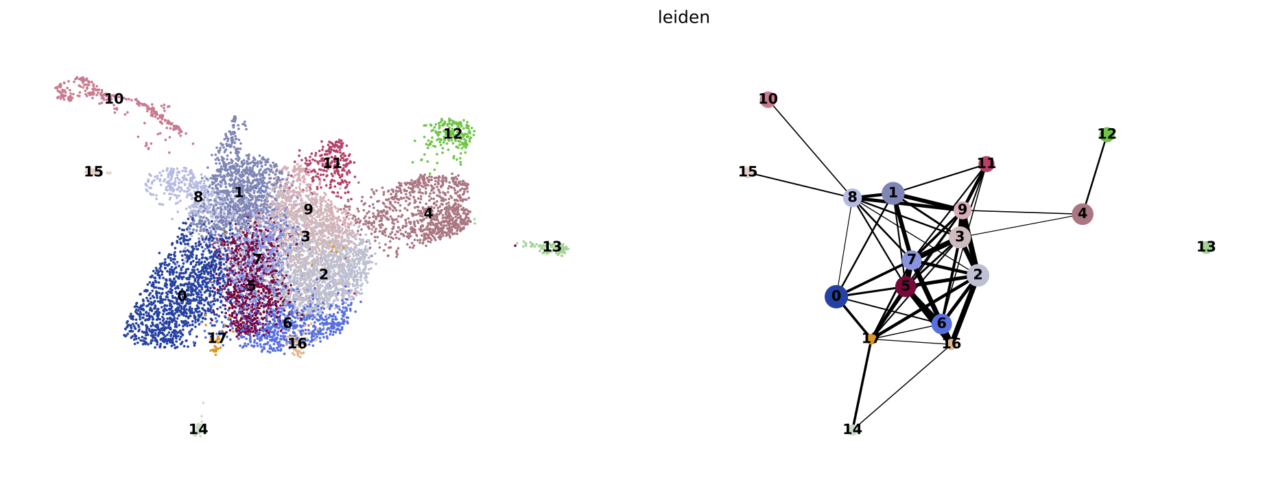
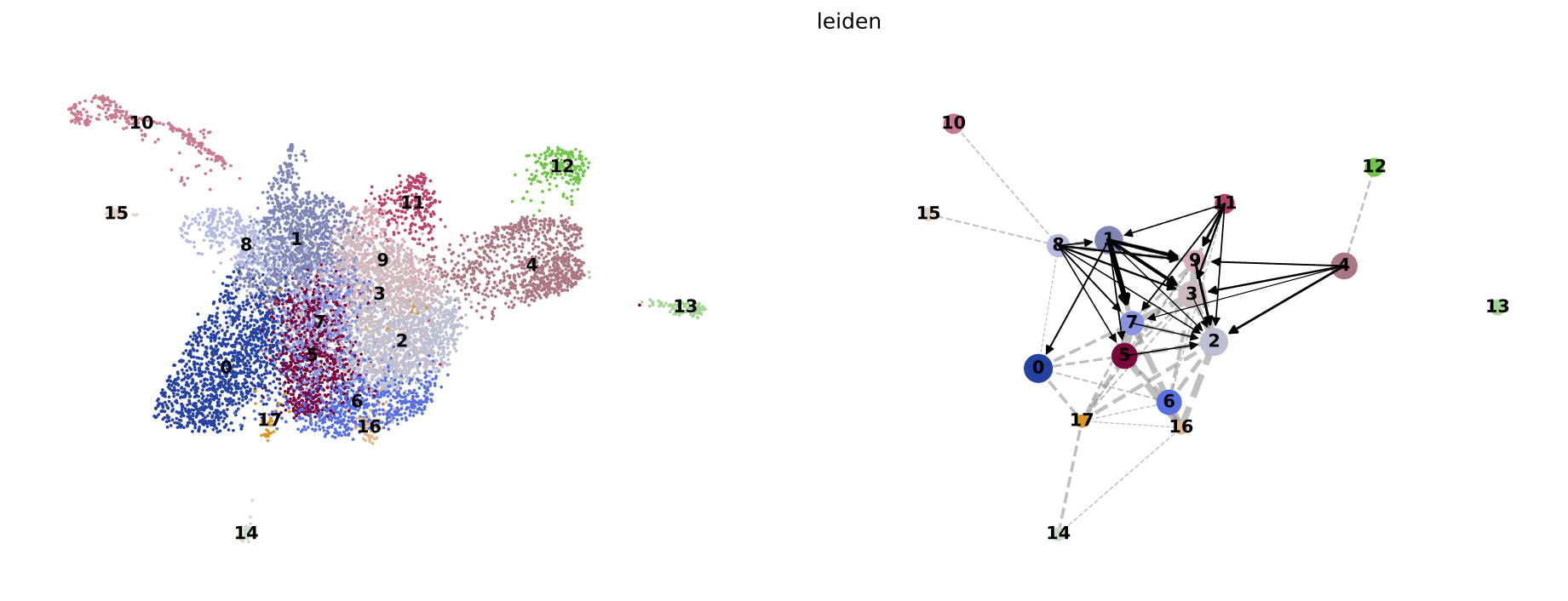
PAGA on the basis of Leiden clusters and derived UMAP plotted with scanpy.
Notes:
- In the previous step we stored the converted Seurat object to disk only to then load it again as an anndata file. This might seem a little silly since we could also use that object directly. However, I ran into some problems with automatic conversion of Python objects to R which can be circumvented by loading the exported file with automatic conversion switched off (
import("scanpy", convert=FALSE)). - Be aware that Python and R start arrays with different indices, namely 0 and 1, respectively.
Export results and store in Seurat object
Next, we store the results in our Seurat object. This is technically not necessary but I think it’s good practice to keep all results in a single file.
seurat@meta.data$leiden <- py_to_r(adata$obs$leiden)

paga <- list(
  connectivities = py_to_r(adata$uns$paga$connectivities$todense()),
  connectivities_tree = py_to_r(adata$uns$paga$connectivities$todense()),
  group_name = py_to_r(adata$uns$paga$groups),
  groups = levels(py_to_r(adata$obs$leiden)),
  group_colors = setNames(py_to_r(adata$uns$leiden_colors), c(0:(nrow(py_to_r(adata$uns$paga$pos))-1))),
  position = tibble(
    group = levels(py_to_r(adata$obs$leiden)),
    x = as.data.frame(py_to_r(adata$uns$paga$pos))$V1,
    y = as.data.frame(py_to_r(adata$uns$paga$pos))$V2
  ),
  umap = tibble(
    UMAP_1 = as.data.frame(py_to_r(adata$obsm$X_umap))$V1,
    UMAP_2 = as.data.frame(py_to_r(adata$obsm$X_umap))$V2
  )
)

rownames(paga$connectivities) <- c(1:nrow(paga$pos))
colnames(paga$connectivities) <- c(1:nrow(paga$pos))

seurat@misc$paga <- paga
Process PAGA results
Then we turn the PAGA results in a plot-able format.
paga_edges <- tibble(
  group1 = rownames(paga$connectivities)[row(paga$connectivities)[upper.tri(paga$connectivities)]],
  group2 = colnames(paga$connectivities)[col(paga$connectivities)[upper.tri(paga$connectivities)]],
  weight = paga$connectivities[upper.tri(paga$connectivities)]
) %>%
mutate(
  x1 = paga$position$x[match(.$group1, rownames(paga$position))],
  y1 = paga$position$y[match(.$group1, rownames(paga$position))],
  x2 = paga$position$x[match(.$group2, rownames(paga$position))],
  y2 = paga$position$y[match(.$group2, rownames(paga$position))]
) %>%
filter(weight >= 0.15)
We have removed all connections with a weight lower than 0.15.
This value was arbitrarily chosen and you can adjust this to your data set.
The lower the cut-off, the more connection will be visible.
Plot PAGA with ggplot2
Now we can plot the graph generated by PAGA and the derived UMAP using ggplot2, in particular geom_segment.
paga <- ggplot(paga$position, aes(x, y)) +
geom_segment(
  data = paga_edges,
  aes(x = x1, y = y1, xend = x2, yend = y2),
  size = paga_edges$weight*3,
  colour = "black",
  show.legend = FALSE
) +
geom_point(aes(color = group), size = 7, alpha = 1, show.legend = FALSE) +
scale_color_manual(values = paga$group_colors) +
geom_text(aes(label = group), color = "black", fontface = "bold") +
labs(x = "UMAP_1", y = "UMAP_2") +
theme_bw() +
theme(
  axis.title = element_blank(),
  axis.text = element_blank(),
  axis.ticks = element_blank(),
  axis.line = element_blank(),
  panel.grid.major = element_blank(),
  panel.grid.minor = element_blank(),
  panel.border = element_blank()
)

ggsave(paga, filename = "r_paga.pdf", height = 5, width = 7)
ggsave(paga, filename = "r_paga.png", height = 5, width = 7)
umap <- tibble(
  UMAP_1 = paga$umap$UMAP_1,
  UMAP_2 = paga$umap$UMAP_2,
  group = py_to_r(adata$obs$leiden)
)

group_centers <- umap %>%
  group_by(group) %>%
  summarize(x = median(UMAP_1), y = median(UMAP_2))

umap_plot <- umap %>%
ggplot(aes(UMAP_1, UMAP_2, color = group)) +
geom_point(size = 0.1, show.legend = FALSE) +
geom_text(
  data = group_centers,
  mapping = aes(x, y, label = group),
  size = 4.5,
  color = "black",
  fontface = "bold",
  show.legend = FALSE
) +
scale_color_manual(values = paga$group_colors) +
theme_bw() +
theme(
  axis.title = element_blank(),
  axis.text = element_blank(),
  axis.ticks = element_blank(),
  axis.line = element_blank(),
  panel.grid.major = element_blank(),
  panel.grid.minor = element_blank(),
  panel.border = element_blank()
)

ggsave(umap_plot, filename = "r_umap.pdf", height = 5, width = 7)
ggsave(umap_plot, filename = "r_umap.png", height = 5, width = 7)
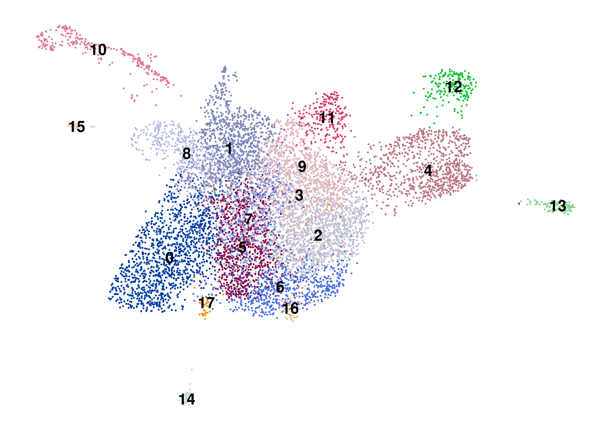
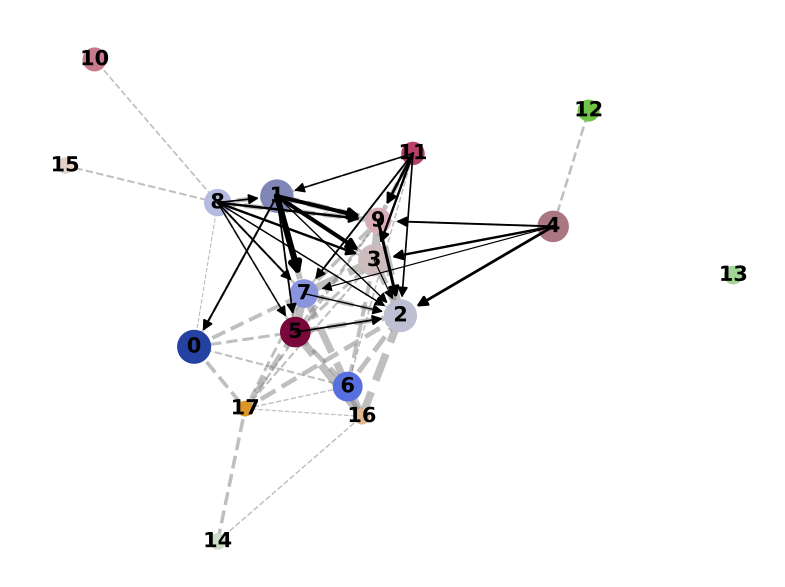
PAGA on the basis of Leiden clusters and derived UMAP plotted with ggplot2.
Result
Direct comparison scanpy vs ggplot2:
Adaptation for RNA velocity-based transitions between clusters
scanpy offers to use RNA velocity information to predict transitions between clusters in the PAGA results.
I won’t go into detail on how to do that but can recommend to use scVelo which directly integrates into the scanpy framework.
Here, I’ll assume you have already generated the PAGA using RNA velocity data, e.g. as shown below.
sc$tl$paga(adata, groups = "leiden", use_rna_velocity = TRUE)
sc$pl$paga(
  adata,
  basis = "umap",
  threshold = 0.15,
  arrowsize = 10,
  edge_width_scale = 0.5,
  transitions = "transitions_confidence",
  dashed_edges = "connectivities",
  save = TRUE
)
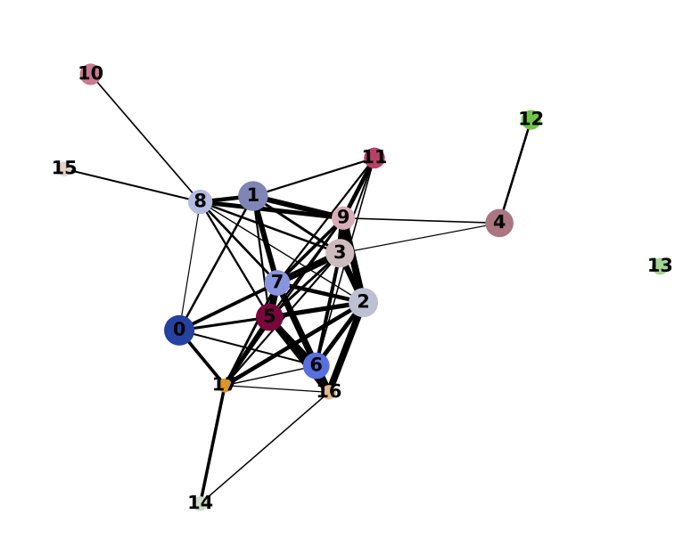
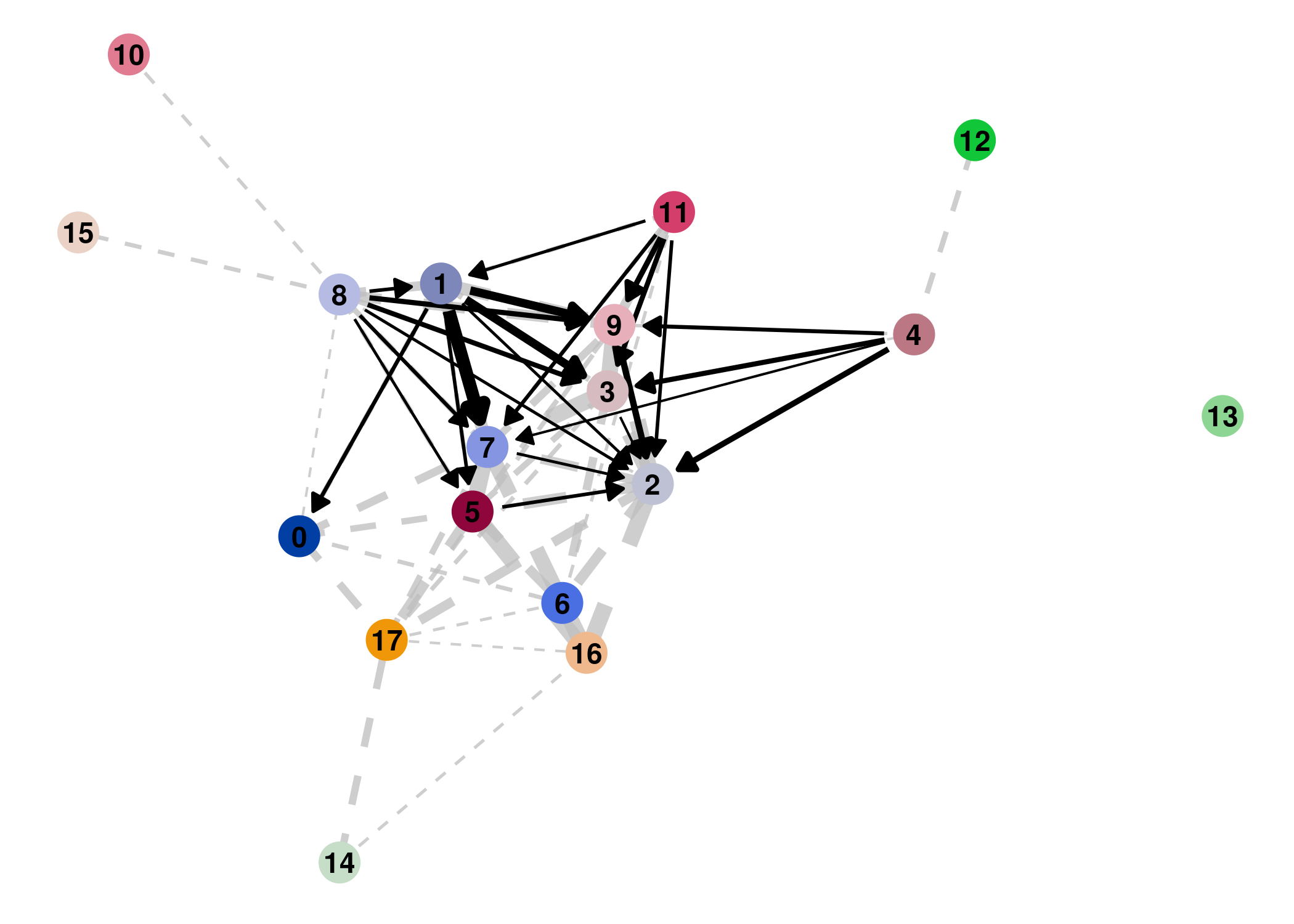
PAGA on the basis of Leiden clusters and derived UMAP plotted with scanpy.
Extract PAGA results
When exporting the results to R and plotting them with ggplot2 we will have to extract more information and add a layer for the transition arrows.
Below you can see the same step as before, however also extracting the transitions_confidence matrix that represents the RNA velocity results.
paga <- list(
  connectivities = py_to_r(adata$uns$paga$connectivities$todense()),
  connectivities_tree = py_to_r(adata$uns$paga$connectivities$todense()),
  transitions_confidence = py_to_r(adata$uns$paga$transitions_confidence$todense()),
  group_name = py_to_r(adata$uns$paga$groups),
  groups = levels(py_to_r(adata$obs$leiden)),
  group_colors = setNames(py_to_r(adata$uns$leiden_colors), c(0:(nrow(py_to_r(adata$uns$paga$pos))-1))),
  position = tibble(
    group = levels(py_to_r(adata$obs$leiden)),
    x = as.data.frame(py_to_r(adata$uns$paga$pos))$V1,
    y = as.data.frame(py_to_r(adata$uns$paga$pos))$V2
  ),
  umap = tibble(
    UMAP_1 = as.data.frame(py_to_r(adata$obsm$X_umap))$V1,
    UMAP_2 = as.data.frame(py_to_r(adata$obsm$X_umap))$V2
  )
)

rownames(paga$connectivities) <- c(1:nrow(paga$pos))
colnames(paga$connectivities) <- c(1:nrow(paga$pos))

rownames(paga$transitions_confidence) <- c(1:nrow(paga$pos))
colnames(paga$transitions_confidence) <- c(1:nrow(paga$pos))
seurat@misc$paga <- paga
Transform matrices to tibbles
Then, we generate tibbles that contain information about the connectivities between clusters (paga_edges) as well as the transition confidence (paga_arrows).
paga_edges <- tibble(
  group1 = rownames(paga$connectivities)[row(paga$connectivities)[upper.tri(paga$connectivities)]],
  group2 = colnames(paga$connectivities)[col(paga$connectivities)[upper.tri(paga$connectivities)]],
  weight = paga$connectivities[upper.tri(paga$connectivities)]
) %>%
mutate(
  x1 = paga$position$x[match(.$group1, rownames(paga$position))],
  y1 = paga$position$y[match(.$group1, rownames(paga$position))],
  x2 = paga$position$x[match(.$group2, rownames(paga$position))],
  y2 = paga$position$y[match(.$group2, rownames(paga$position))]
)
Next, we need to convert the transition confidences into a format that ggplot2, more precisely the geom_segment function, can handle.
To do so, we…
- create an empty tibble for the data
- check the transition confidence for every combination of clusters
- check which direction is more confident and store only that value
- skip comparisons between clusters that have already been done
- shorten the arrow to avoid overlap with the cluster nodes
There is probably a more elegant way to do this, perhaps using tools such as ggnetwork or ggnet2, but this gets the job done for now.
paga_arrows <- tibble(
  group1 = character(),
  group2 = character(),
  weight = double(),
  x1 = double(),
  y1 = double(),
  x2 = double(),
  y2 = double()
)

paga_arrows_dimensions <- nrow(paga$transitions_confidence)

comparisons_done <- c()

arrow_gap <- 0.5

for ( i in 1:paga_arrows_dimensions ) {
  # loop through columns
  for ( j in 1:paga_arrows_dimensions ) {
    # skip cell if on diagonal
    if ( i == j ) {
      next
    # skip cell if transition between these clusters has already been extracted
    } else if ( paste0(i, "/", j) %in% comparisons_done | paste0(j, "/", i) %in% comparisons_done ) {
      next
    # if none of the above, go ahead
    } else {
      # get value for transition i to j
      i_to_j <- paga$transitions_confidence[j,i]
      # get value for transition j to i (other side of diagonal)
      j_to_i <- paga$transitions_confidence[i,j]
      # if i to j is more confident than j to i
      if ( i_to_j > j_to_i ) {
        x1 <- paga$position$x[i]
        y1 <- paga$position$y[i]
        x2 <- paga$position$x[j]
        y2 <- paga$position$y[j]
        x_length = x2 - x1
        y_length = y2 - y1
        gap = arrow_gap / sqrt(x_length ^ 2 + y_length ^ 2)
        x1_new = x1 + gap * x_length
        y1_new = y1 + gap * y_length
        x2_new = x1 + (1 - gap) * x_length
        y2_new = y1 + (1 - gap) * y_length
        new_entry <- tibble(
          group1 = (i - 1),
          group2 = (j - 1),
          weight = i_to_j,
          x1 = x1_new,
          y1 = y1_new,
          x2 = x2_new,
          y2 = y2_new
        )
        paga_arrows <- rbind(
          paga_arrows,
          new_entry
        )
      # if j to i is more confident than i to j
      } else if ( j_to_i > i_to_j ) {
        x1 <- paga$position$x[j]
        y1 <- paga$position$y[j]
        x2 <- paga$position$x[i]
        y2 <- paga$position$y[i]
        x_length = x2 - x1
        y_length = y2 - y1
        gap = arrow_gap / sqrt(x_length ^ 2 + y_length ^ 2)
        x1_new = x1 + gap * x_length
        y1_new = y1 + gap * y_length
        x2_new = x1 + (1 - gap) * x_length
        y2_new = y1 + (1 - gap) * y_length
        new_entry <- tibble(
          group1 = (j - 1),
          group2 = (i - 1),
          weight = j_to_i,
          x1 = x1_new,
          y1 = y1_new,
          x2 = x2_new,
          y2 = y2_new
        )
        paga_arrows <- rbind(
          paga_arrows,
          new_entry
        )
      # else (for example both 0)
      } else {
        next
      }
      # add comparison to list of already performed comparisons
      comparisons_done <- c(comparisons_done, paste0(i,"/",j))
    }
  }
}
Filter connections
Similar to what we’ve done before, we remove connections and arrows below a threshold of confidence.
Here, this threshold is 0.15.
paga_edges <- paga_edges %>%
  filter(weight >= 0.15)

paga_arrows <- paga_arrows %>%
  filter(weight >= 0.15)
Plotting
Finally, we put everything together. These are the steps:
- Set up plot.
- Add connectivities between clusters using dashed lines.
- Add arrows between clusters.
- Add cluster nodes.
- Add text to cluster nodes.
- Customize cluster color and layout.
- Save plot to file.
plot <- ggplot()

plot <- plot + geom_segment(
    data = paga_edges,
    aes(x = x1, y = y1, xend = x2, yend = y2),
    size = paga_edges$weight*3,
    linetype = 2,
    colour = "grey",
    alpha = 0.75,
    show.legend = FALSE
  )

plot <- plot + geom_segment(
    data = paga_arrows,
    aes(x = x1, y = y1, xend = x2, yend = y2),
    size = paga_arrows$weight*3,
    arrow = arrow(length = unit(0.02, "npc"), type = "closed"),
    show.legend = FALSE
  )

plot <- plot + geom_point(
    data = paga$position,
    aes(x, y, color = group),
    size = 7,
    show.legend = FALSE
  )

plot <- plot + geom_text(
    data = paga$position,
    aes(x, y, label = group),
    color = "black",
    fontface = "bold"
  )

plot <- plot + scale_color_manual(values = paga$group_colors) +
  labs(x = "UMAP_1", y = "UMAP_2") +
  theme_bw() +
  theme(
    axis.title = element_blank(),
    axis.text = element_blank(),
    axis.ticks = element_blank(),
    axis.line = element_blank(),
    panel.grid.major = element_blank(),
    panel.grid.minor = element_blank(),
    panel.border = element_blank()
  )

ggsave(plot = plot, filename = "r_paga_velocity.pdf", height = 5, width = 7)
ggsave(plot = plot, filename = "r_paga_velocity.png", height = 5, width = 7)
Note that there are some parameters that you might have to adjust:
arrow_gap: How much to shorten the length of the transition arrows.- Filter threshold for connectivities and transitions, here set to
0.15. - Scaling factors for connectivities (dashed lines) and transitions (arrows), currently set to
3.
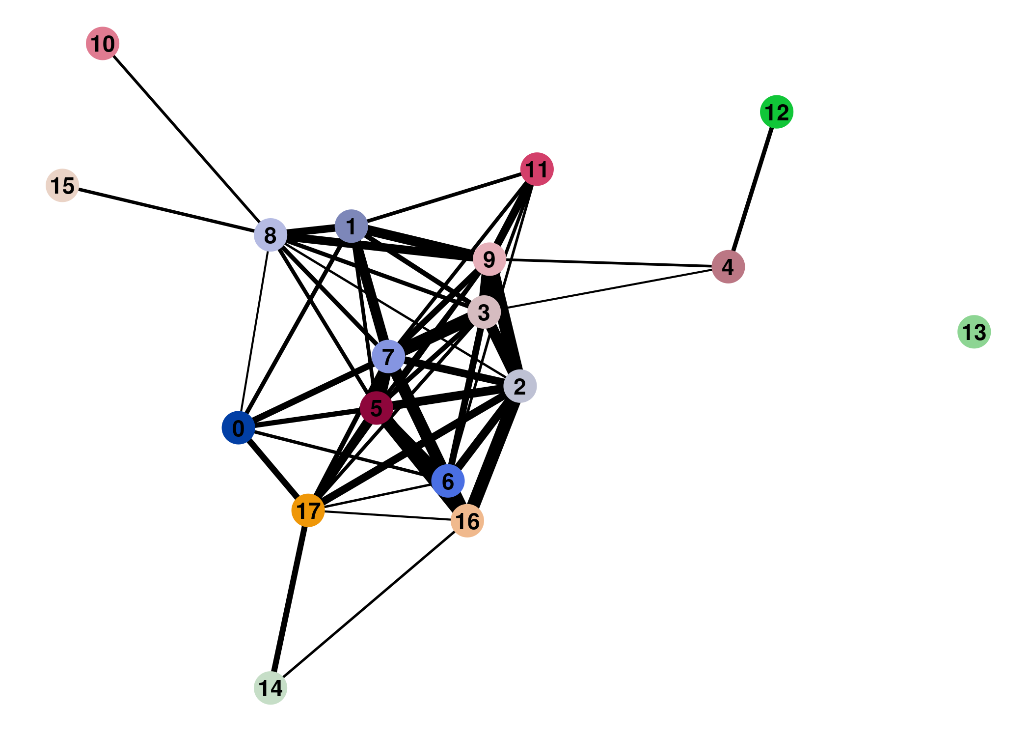
Result
Direct comparison scanpy vs ggplot2:
From here you can tweak the plots as you prefer, for example by scaling the point size in the PAGA results by the number of cells in that group/cluster.
Parameter optimization is another topic, but I find this analysis very useful to understand the relationship between identified clusters.
That’s it for now.
You can use the same process explained here to perform other analysis provided by scanpy, such as diffusion pseudotime (tl.dpt()).
If you have questions, comments, point out improvements/errors or simply reach out, please do so on Twitter @fakechek1
Session info
Analysis was performed in a Docker container: romanhaa/r_github:2019-04-12_r_3.5.2
Obligatory sessionInfo():
R version 3.5.2 (2018-12-20)
Platform: x86_64-pc-linux-gnu (64-bit)
Running under: Debian GNU/Linux buster/sid

Matrix products: default
BLAS: /usr/lib/x86_64-linux-gnu/blas/libblas.so.3.8.0
LAPACK: /usr/lib/x86_64-linux-gnu/lapack/liblapack.so.3.8.0

locale:
 [1] LC_CTYPE=en_US.UTF-8       LC_NUMERIC=C
 [3] LC_TIME=en_US.UTF-8        LC_COLLATE=en_US.UTF-8
 [5] LC_MONETARY=en_US.UTF-8    LC_MESSAGES=en_US.UTF-8
 [7] LC_PAPER=en_US.UTF-8       LC_NAME=C
 [9] LC_ADDRESS=C               LC_TELEPHONE=C
[11] LC_MEASUREMENT=en_US.UTF-8 LC_IDENTIFICATION=C

attached base packages:
[1] stats     graphics  grDevices utils     datasets  methods   base

other attached packages:
 [1] Seurat_2.3.4      Matrix_1.2-17     cowplot_0.9.4     reticulate_1.11.1
 [5] colorout_1.2-0    forcats_0.4.0     stringr_1.4.0     dplyr_0.8.0.1
 [9] purrr_0.3.2       readr_1.3.1       tidyr_0.8.3       tibble_2.1.1
[13] ggplot2_3.1.1     tidyverse_1.2.1

loaded via a namespace (and not attached):
  [1] Rtsne_0.15          colorspace_1.4-1    ggridges_0.5.1
  [4] class_7.3-15        modeltools_0.2-22   mclust_5.4.3
  [7] htmlTable_1.13.1    base64enc_0.1-3     proxy_0.4-23
 [10] rstudioapi_0.10     npsurv_0.4-0        bit64_0.9-7
 [13] flexmix_2.3-15      fansi_0.4.0         mvtnorm_1.0-10
 [16] lubridate_1.7.4     xml2_1.2.0          codetools_0.2-16
 [19] splines_3.5.2       R.methodsS3_1.7.1   lsei_1.2-0
 [22] robustbase_0.93-4   knitr_1.22          Formula_1.2-3
 [25] jsonlite_1.6        ica_1.0-2           broom_0.5.2
 [28] cluster_2.0.8       kernlab_0.9-27      png_0.1-7
 [31] R.oo_1.22.0         compiler_3.5.2      httr_1.4.0
 [34] backports_1.1.3     assertthat_0.2.1    lazyeval_0.2.2
 [37] cli_1.1.0           lars_1.2            acepack_1.4.1
 [40] htmltools_0.3.6     tools_3.5.2         igraph_1.2.4
 [43] gtable_0.3.0        glue_1.3.1          reshape2_1.4.3
 [46] RANN_2.6.1          Rcpp_1.0.1          cellranger_1.1.0
 [49] trimcluster_0.1-2.1 ape_5.3             gdata_2.18.0
 [52] nlme_3.1-138        iterators_1.0.10    fpc_2.1-11.1
 [55] lmtest_0.9-36       gbRd_0.4-11         xfun_0.6
 [58] rvest_0.3.2         irlba_2.3.3         gtools_3.8.1
 [61] DEoptimR_1.0-8      zoo_1.8-5           MASS_7.3-51.3
 [64] scales_1.0.0        hms_0.4.2           doSNOW_1.0.16
 [67] parallel_3.5.2      RColorBrewer_1.1-2  pbapply_1.4-0
 [70] gridExtra_2.3       segmented_0.5-3.0   rpart_4.1-13
 [73] latticeExtra_0.6-28 stringi_1.4.3       foreach_1.4.4
 [76] checkmate_1.9.1     caTools_1.17.1.2    bibtex_0.4.2
 [79] dtw_1.20-1          Rdpack_0.10-1       SDMTools_1.1-221
 [82] rlang_0.3.4         pkgconfig_2.0.2     prabclus_2.2-7
 [85] bitops_1.0-6        lattice_0.20-38     ROCR_1.0-7
 [88] htmlwidgets_1.3     labeling_0.3        bit_1.1-14
 [91] tidyselect_0.2.5    plyr_1.8.4          magrittr_1.5
 [94] R6_2.4.0            snow_0.4-3          gplots_3.0.1.1
 [97] generics_0.0.2      Hmisc_4.2-0         pillar_1.3.1
[100] haven_2.1.0         foreign_0.8-71      withr_2.1.2
[103] mixtools_1.1.0      fitdistrplus_1.0-14 survival_2.44-1.1
[106] nnet_7.3-12         tsne_0.1-3          hdf5r_1.1.1
[109] modelr_0.1.4        crayon_1.3.4        KernSmooth_2.23-15
[112] utf8_1.1.4          grid_3.5.2          readxl_1.3.1
[115] data.table_1.12.2   metap_1.1           digest_0.6.18
[118] diptest_0.75-7      R.utils_2.8.0       stats4_3.5.2
[121] munsell_0.5.0
And Python + scanpy version:
system("python3 --version")
Python 3.7.3rc1

system("python3 -c 'import scanpy; print(scanpy.__version__)'")
1.4