Calculate EC50 and plot dose response curve
Suppose you performed an experiment where you treated cells with different doses of a certain drug and measured how many cells are left alive after a given delay. Often, people estimate the potency of a drug by its EC50 value, the concentration at which we observe half-maximal response.
Calculating that value and visualizing the data behind it is usually a fairly simple procedure using popular software solutions such as Origin or GraphPad Prism. Doing so in R was just a bit more difficult than what I anticipated. That’s why I decided to document the process here. For me when I have to do this again and for those of you who have to do the same.
Load packages
We will need packages from the tidyverse meta package for data processing and plotting.
The drc package provides us with the required statistics to calculate the EC50.
Finally, the wesanderson package has some nice color scales but apart from that is not necessary.
library(tidyverse)
library(drc)
library(wesanderson)
The data
You can load the data from a file or define it manually as shown below. The important thing is that we have pairs of concentrations and the corresponding fraction of viable cells, and multiple replicates for each pair.
data_measured <- tribble(
    ~concentration, ~replicate, ~viable_cells,
    0, 'A', 104.157,
    0, 'B', 98.893,
    0, 'C', 96.949,
    0.05, 'A', 95.677,
    0.05, 'B', 98.282,
    0.05, 'C', 90.958,
    0.25, 'A', 92.661,
    0.25, 'B', 95.644,
    0.25, 'C', 93.670,
    0.50, 'A', 91.201,
    0.50, 'B', 90.660,
    0.50, 'C', 84.912,
    1.00, 'A', 75.417,
    1.00, 'B', 69.602,
    1.00, 'C', 70.904,
    2.50, 'A', 35.073,
    2.50, 'B', 36.386,
    2.50, 'C', 33.440,
    5.00, 'A', 24.422,
    5.00, 'B', 20.010,
    5.00, 'C', 11.135,
    10.00, 'A', 4.315,
    10.00, 'B', 5.741,
    10.00, 'C', 5.835,
    25.00, 'A', 3.988,
    25.00, 'B', 4.883,
    25.00, 'C', 4.208,
  ) %>%
  mutate(viable_cells = viable_cells/100)

glimpse(data_measured)
# Observations: 27
# Variables: 3
# $ concentration <dbl> 0.00, 0.00, 0.00, 0.05, 0.05, 0.05, 0.25, 0.25, 0.25, 0…
# $ replicate     <chr> "A", "B", "C", "A", "B", "C", "A", "B", "C", "A", "B", …
# $ viable_cells  <dbl> 1.04157, 0.98893, 0.96949, 0.95677, 0.98282, 0.90958, 0…
Estimate EC50
Now, we use the drm() function from the drc package to generate a dose-response model from the data we defined/loaded before.
curve_fit <- drm(
  formula = viable_cells ~ concentration,
  data = data_measured,
  fct = LL.4(names = c('hill', 'min_value', 'max_value', 'ec_50'))
)

ec50 <- curve_fit$coefficients['ec_50:(Intercept)']

curve_fit
# A 'drc' model.
# Call:
# drm(formula = viable_cells ~ concentration, data = data_measured, fct = LL.4(names = c("hill", "min_value", "max_value", "ec_50")))
# Coefficients:
#      hill:(Intercept)  min_value:(Intercept)  max_value:(Intercept)
#               1.73801                0.02867                0.97646
#     ec_50:(Intercept)
#               1.75972
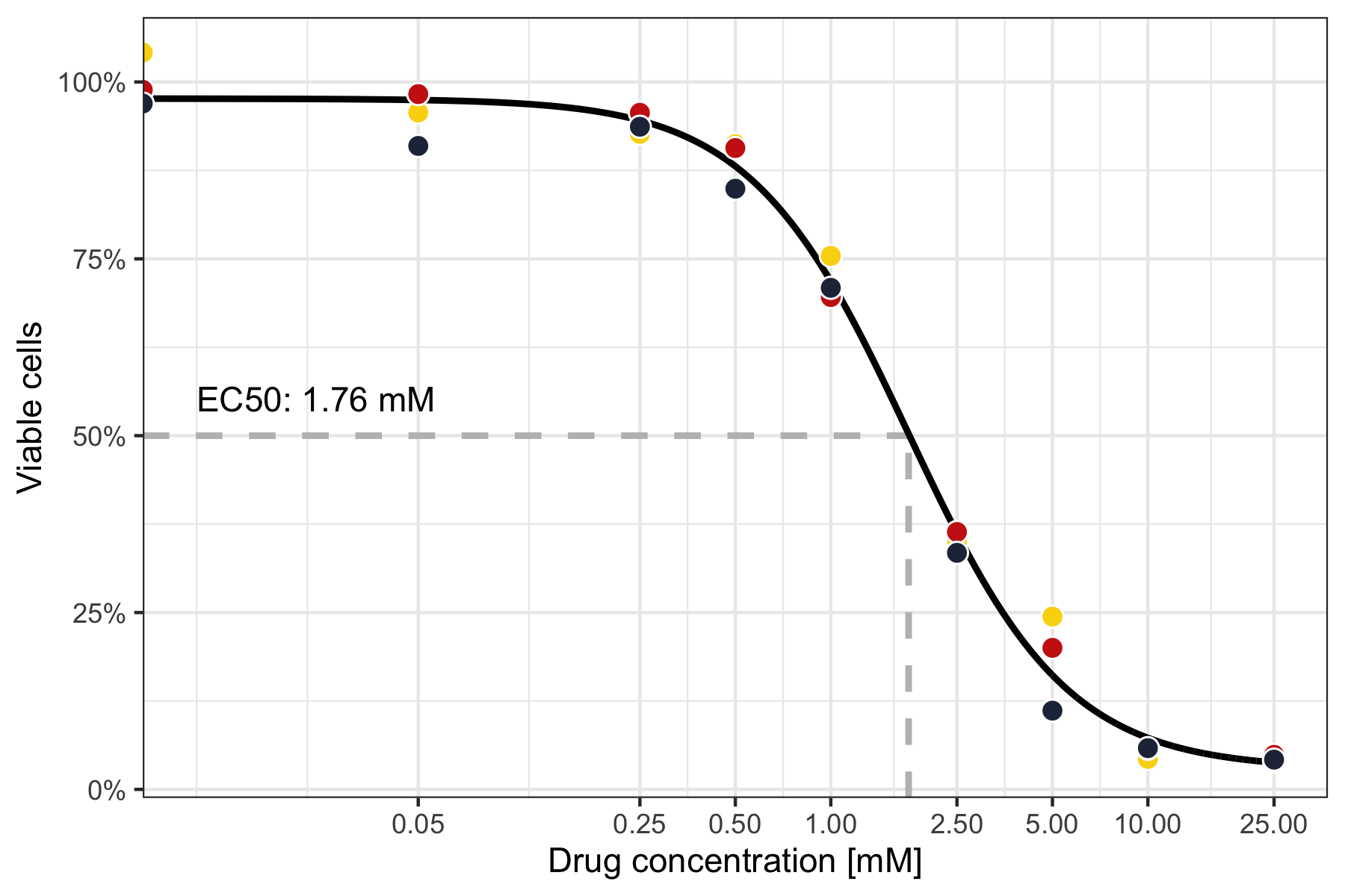
In this particular case, we find the EC50 to be a concentration of 1.76 mM.
Predict values with finer scale
Using the model, we predict values for the range of tested concentrations, however at a finer resolution so the curve will look nicer.
data_predicted <- tibble(
  concentration = seq(min(data_measured$concentration), max(data_measured$concentration), 0.01)
)

data_predicted$predicted <- predict(
  curve_fit,
  newdata = as.data.frame(data_predicted)
)

glimpse(data_predicted)
# Observations: 2,501
# Variables: 2
# $ concentration <dbl> 0.00, 0.01, 0.02, 0.03, 0.04, 0.05, 0.06, 0.07, 0.08, 0…
# $ predicted     <dbl> 0.9764612, 0.9763426, 0.9760657, 0.9756614, 0.9751433, …
Plot dose-response curve
Now, we are ready to plot the dose-response curve, together with the measured data and lines to highlight the EC50.
lines_to_highlight_ec50 <- tribble(
  ~x,   ~xend, ~y,   ~yend,
  ec50, ec50,  -Inf, 0.5,
  0,    ec50,  0.5,  0.5
)

p <- ggplot() +
  geom_segment(
    data = lines_to_highlight_ec50,
    aes(x = x, y = y, xend = xend, yend = yend),
    color = 'grey', linetype = 'dashed', size = 1
  ) +
  geom_line(data = data_predicted, aes(x = concentration, y = predicted), size = 1) +
  geom_point(
    data = data_measured,
    aes(x = concentration, y = viable_cells, fill = replicate),
    shape = 21, size = 3, color = 'white', show.legend = FALSE
  ) +
  annotate(
    'text', x = 0.01, y = 0.5, label = paste0('EC50: ', round(ec50, digits = 3), ' mM'),
    hjust = 0, vjust = -1
  ) +
  scale_x_log10(name = 'Drug concentration [mM]', breaks = unique(data_measured$concentration)) +
  scale_y_continuous(name = 'Viable cells', labels = scales::percent) +
  scale_fill_manual(values = wes_palette('BottleRocket2')) +
  theme_bw()

ggsave('dose_response_curve.png', p, height = 4, width = 6)